


Pandas is a cross-platform library (abstraction) written in Python, Cython and C by Wes McKinney for the Python programming language. It is used for data analysis and data manipulation. This article lists a few important features of this library.
It is easy to install Pandas. Download Anaconda for your operating system and the latest Python version, and run the installer as available at https://pandas.pydata.org/getting_started.html. Pandas can be installed using pip from PyPI using the command pip install pandas.
You can verify the Python version by using the command python –version.
Output: Python 3.8.3
pip list and pip freeze will generate a list of installed packages:
1. pip freeze
2. anchorecli==0.8.2
3. astroid==2.4.2
4. .
5. .
6. .
7. openpyxl==3.0.5
8. .
9. pandas==1.1.3
10. .
11. py==1.8.2
12. .
13. .
14. .
15. xlrd==1.2.0
16. XlsxWriter==1.3.7
Table 1 lists some of the modules utilised in our script.
| Module | Description |
| Pandas | Data import, merge, experimentation, clean-up, and analysis |
| OpenPyXL | Read/write Excel 2010 xlsx/xlsm files |
| xlrd | Read Excel data |
| XlsxWriter | Write to Excel (xlsx) files |
| matplotlib | Data visualisation |
| ConfigParser | Configuration file parser |
Table 1: Module details
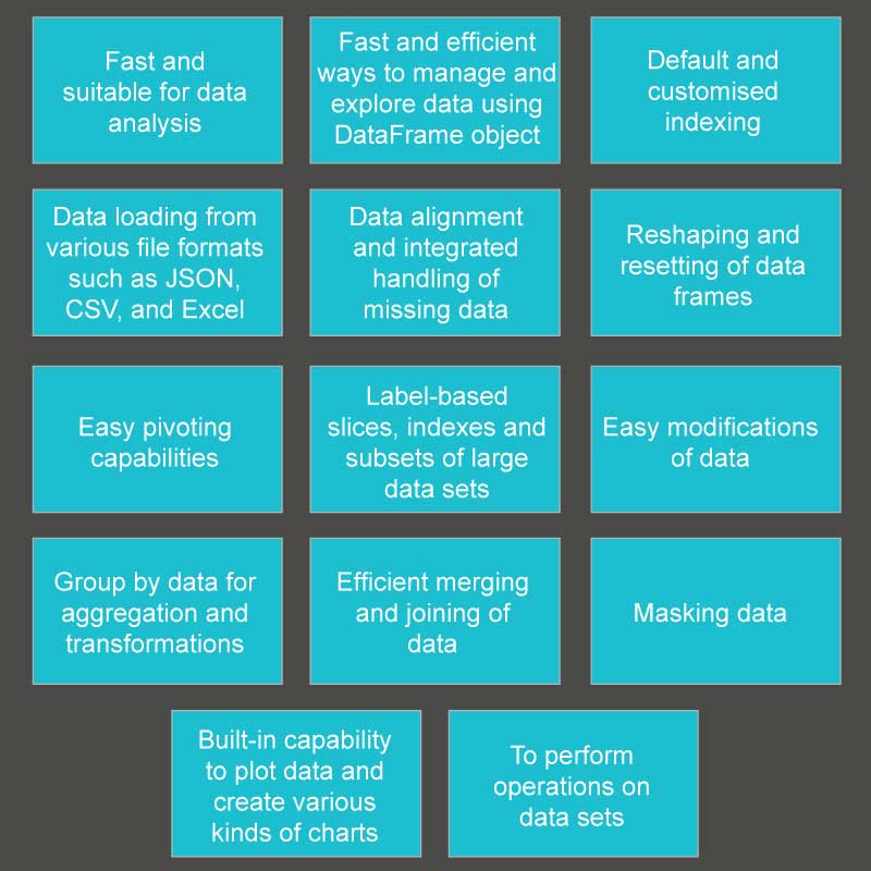
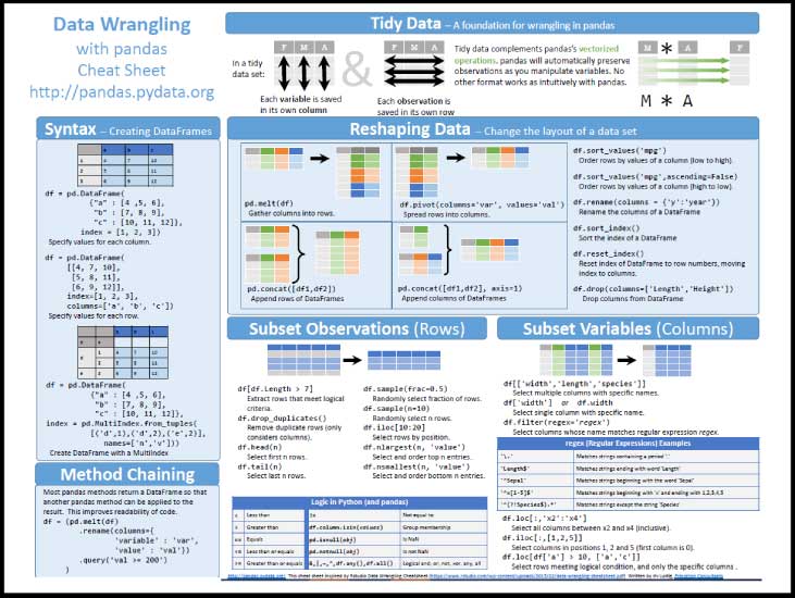
Figure 1 offers a quick look at Pandas features and Figure 2 gives a Pandas cheat sheet.
Let’s first read a configuration file using the Python script. A configuration file looks like this:
1. [FileLocations]
2. master.filename=project-data.xlsx
3. auditstatus.filename=audit-status.xlsx
To read this file, use the following script:
1. import pandas as pd
2. import numpy as np
3. import configparser as cfg
4. import array as arr
5. from pandas import DataFrame
6. import matplotlib.pyplot as plt
7. import io
8.
9. #Read Properties file
10. config = cfg.RawConfigParser()
11. config.read(‘master.properties’)
12. #access data from properties file
13. print(config.get(‘FileLocations’, ‘master.filename’))
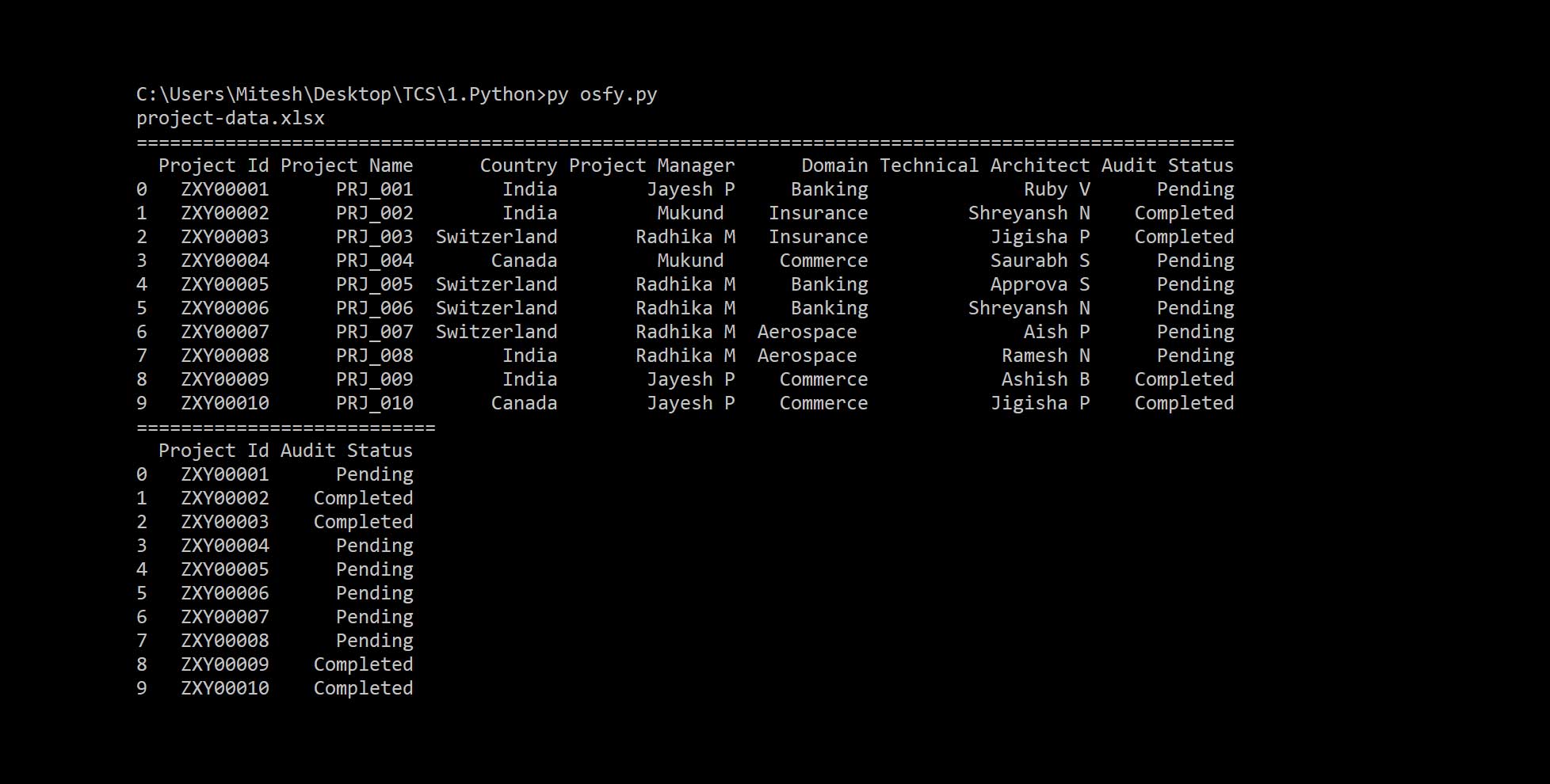
Let’s now read data from the Excel file, the name for which is available in the properties file:
1. #Read Data
2. projectData = pd.read_excel(config.get(‘FileLocations’, ‘master.filename’))
3. auditStatus = pd.read_excel(config.get(‘FileLocations’, ‘auditstatus.filename’))
4. #Print data on console
5. print “=================================== ======================+++++++++++++++++=========== ===============”)
6. print(projectData)
7. print(“=====================”)
8. print(auditStatus)
Figure 3 gives the output of two DataFrames.
Next, let’s merge the data of both Excel files based on the project ID. Merge the DataFrame with a database-style join on columns or indexes:
1. resultData = pd.merge(projectData, auditStatus, how=’left’)
2. print(resultData)
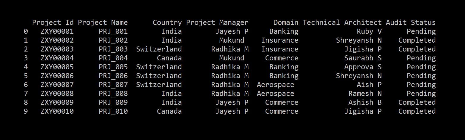
Figure 4 shows the merged data set.
Now if you want to merge specific columns of specific DataFrames, type:
1. resultData = pd.merge(projectData[[“Project Id”,”Project Name”,”Project Manager”]], auditStatus, how=’left’)
The result is given in Table 2.
| Project ID | Project name | Project manager | Audit status |
| ZXY00001 | PRJ_001 | Jayesh P | Pending |
| ZXY00002 | PRJ_002 | Mukund | Completed |
| ZXY00003 | PRJ_003 | Radhika M | Completed |
| ZXY00004 | PRJ_004 | Mukund | Pending |
| ZXY00005 | PRJ_005 | Radhika M | Pending |
| ZXY00006 | PRJ_006 | Radhika M | Pending |
| ZXY00007 | PRJ_007 | Radhika M | Pending |
| ZXY00008 | PRJ_008 | Radhika M | Pending |
| ZXY00009 | PRJ_009 | Jayesh P | Completed |
| ZXY00010 | PRJ_010 | Jayesh P | Completed |
Table 2: Data with specific columns
To save a DataFrame to the Excel file, use the to_excel method:
1. #Write Data Frame to Excel
2. resultData.to_excel(‘Results.xlsx’, index = False, header=True)
To get specific column data from a DataFrame, use auditStatus[“Audit Status”].
Creating a pivot table using Pandas
We will create a spreadsheet-style pivot table as a DataFrame using pivot_table. We will add values in the properties file to create pivot tables, as follows:
1. [FileLocations]
2. master.filename=project-data.xlsx
3. auditstatus.filename=audit-status.xlsx
4. [Pivot]
5. index-level-0=Project Manager
6. index-level-1=Project Manager,Domain
7. index-level-2=Project Manager,Domain,Technical Architect
8. columns=Audit Status
9. values=Project Id
Let’s create a pivot table using a single column index (see Table 3):
1. pivot = pd.pivot_table(resultData,index=config.get(‘Pivot’, ‘index-level-0’).split(‘,’),columns=config.get(‘Pivot’, ‘columns’).split(‘,’),values=config.get(‘Pivot’, ‘values’),aggfunc=len,margins=True,fill_value=0)
2. print(pivot)
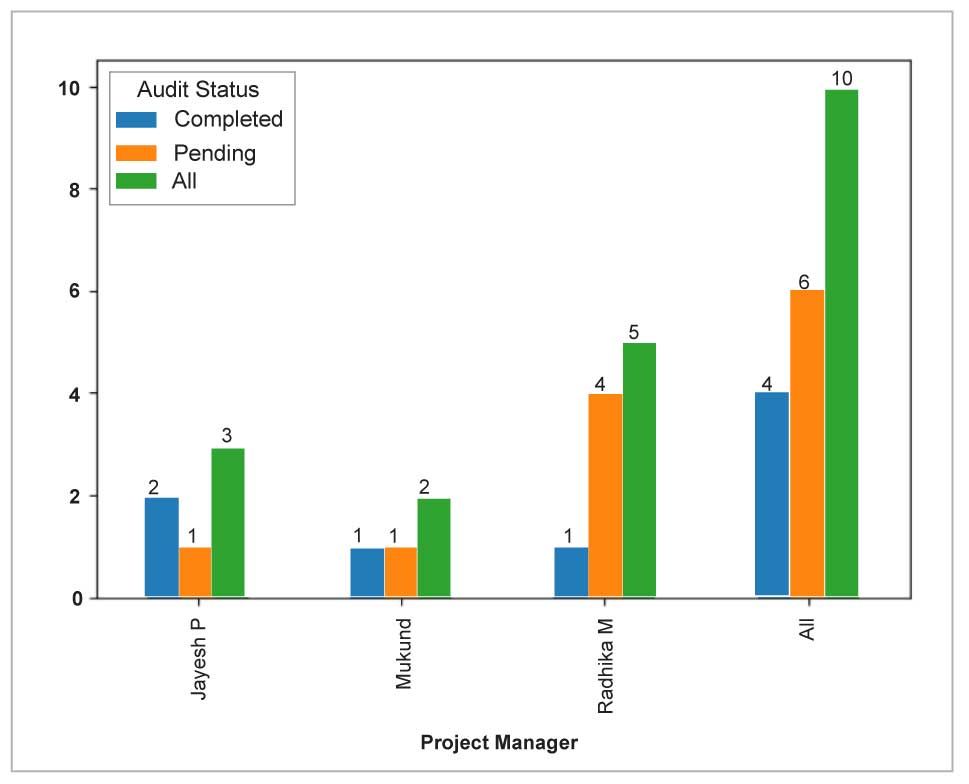
| Project manager | Completed | Pending | All |
| Jayesh P | 2 | 1 | 3 |
| Mukund | 1 | 1 | 2 |
| Radhika M | 1 | 4 | 5 |
| All | 4 | 6 | 10 |
Table 3: Pivot table with one index
Now let’s create a pivot table using two-column indexes (see Table 4):
1. pivot = pd.pivot_table(resultData,index=config.get(‘Pivot’, ‘index-level-1’).split(‘,’),columns=config.get(‘Pivot’, ‘columns’).split(‘,’),values=config.get(‘Pivot’, ‘values’),aggfunc=len,margins=True,fill_value=0)
| Project manager | Domain | Completed | Pending | All |
| Jayesh P | Banking | 0 | 1 | 0 |
| Commerce | 2 | 0 | 2 | |
| Mukund | Commerce | 0 | 1 | 1 |
| Insurance | 1 | 0 | 1 | |
| Radhika M | Aerospace | 0 | 2 | 2 |
| Banking | 0 | 2 | 2 | |
| All | Insurance | 1 | 0 | 1 |
| 4 | 6 | 10 | ||
Table 4: Pivot table with two indexes
To create a pivot table using three-column indexes (Table 5), type:
1. pivot = pd.pivot_table(resultData,index=config.get(‘Pivot’, ‘index-level-3’).split(‘,’),columns=config.get(‘Pivot’, ‘columns’).split(‘,’),values=config.get(‘Pivot’, ‘values’),aggfunc=len,margins=True,fill_value=0)
| Project manager | Domain | Technical architect | Completed | Pending | All |
| Jayesh P | Banking | Ruby V | 0 | 1 | 1 |
| Commerce | Ashish B | 1 | 0 | 1 | |
| Jigisha P | 1 | 0 | 1 | ||
| Mukund | Commerce | Saurabh S | 0 | 1 | 1 |
| Insurance | Shreyansh N | 1 | 0 | 1 | |
| Aerospace | Aish P | 0 | 1 | 1 | |
| Radhika M | Ramesh N | 0 | 1 | 1 | |
| Banking | Approva S | 0 | 1 | 1 | |
| Shreyansh N | 0 | 1 | 1 | ||
| Insurance | Jigisha P | 1 | 0 | 1 | |
| All | 4 | 6 | 10 |
Table 5: Pivot table with three indexes
In the next section, we will create charts using Python.
Charts using Pandas
In this section, we will create charts using Python script. Let’s create chart data with pivot, as follows (see Table 6):
1. chartData = pd.pivot_table(resultData,index=config.get(‘Pivot’, ‘index-level-0’).split(‘,’),columns=config.get(‘Pivot’, ‘columns’).split(‘,’),values=config.get(‘Pivot’, ‘values’),aggfunc=len,margins=True,fill_value=0)
| Project manager | Completed | Pending | All |
| Jayesh P | 2 | 1 | 3 |
| Mukund | 1 | 1 | 2 |
| Radhika M | 1 | 4 | 5 |
| All | 4 | 6 | 10 |
Table 6: Chart data
You can create and plot a chart based on the chart data given in Table 6:
1. ax = chartData.plot(kind=’bar’)
2. for p in ax.patches:
3. ax.annotate(str(p.get_height()), (p.get_x() * 1.005, p.get_height() * 1.005))
4. plt.show()
The following script helps to create a bar chart that is editable in the Excel file:
1. # pip install xlsxwriter
2. writer = pd.ExcelWriter(‘Results.xlsx’, engine=’xlsxwriter’)
3. #store data frames in a Dictionary object, where the key is the sheet name
4. frames = {‘MasterData’: chartData}
5. #store data frames in a Dictionary object, where the key is the sheet name
6. for sheet, frame in frames.items():
7. frame.to_excel(writer, sheet_name = sheet)
8.
9. worksheet = writer.sheets[‘MasterData’]
10. workbook = writer.book
11. chart = workbook.add_chart({‘type’: ‘column’})
12. # Some alternative colors for the chart.
13. colors = [‘#4DAF4A’, ‘#E41A1C’, ‘#377EB8’]
14.
15. chart.add_series({
16. ‘name’: ‘=MasterData!$C$1’,
17. ‘categories’: ‘=MasterData!$B$2:$B$6’,
18. ‘values’: ‘=MasterData!$C$2:$C$7’,
19. ‘fill’: {‘color’: colors[0]},
20. ‘overlap’: -10,
21. ‘gap’: 400,
22. ‘data_labels’: {‘value’: True},
23. })
24.
25. chart.add_series({
26. ‘name’: ‘=MasterData!$D$1’,
27. ‘categories’: ‘=MasterData!$B$2:$B$6’,
28. ‘values’: ‘=MasterData!$D$2:$D$7’,
29. ‘fill’: {‘color’: colors[1]},
30. ‘gap’: 400,
31. ‘data_labels’: {‘value’: True},
32. })
33.
34. chart.add_series({
35. ‘name’: ‘=MasterData!$E$1’,
36. ‘categories’: ‘=MasterData!$B$2:$B$6’,
37. ‘values’: ‘=MasterData!$E$2:$E$7’,
38. ‘fill’: {‘color’: colors[2]},
39. ‘gap’: 400,
40. ‘data_labels’: {‘value’: True},
41. })
42. chart.set_style(11)
43. # Add a chart title
44. chart.set_title ({‘name’: ‘Project Manager-wise Data’})
45.
46. # Add x-axis label
47. chart.set_x_axis({
48.
49. ‘name’: ‘Project Manager’,
50. ‘major_gridlines’: {
51. ‘visible’: True,
52. ‘line’: {‘width’: 1.25, ‘dash_type’: ‘dash’}
53. },
54. })
55.
56. # Add y-axis label
57. chart.set_y_axis({‘name’: ‘Audit Status’})
58.
59. chart.set_size({‘width’: 720, ‘height’: 576})
60.
61. worksheet.insert_chart(‘H1’, chart)
62.
63. #critical last step
64. writer.save()
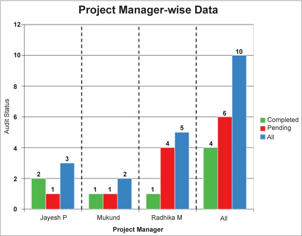
A chart created using Python script is shown in Figure 6.


