


Rising air pollution levels in cities around the world are a matter of concern. This script uses two Python libraries — Pandas and Folium — to plot the air quality index (AQI) for India.
This project uses two Python libraries. The first is Pandas, which is a well-known library for data science. But it also has capabilities for downloading data and even plotting data. The second library is Folium, which is a ‘Python port’ of an excellent JavaScript library called Leaflet.
For better understanding, this script is written in the steps given below.
1. Download the air quality index (AQI) data. This step consists of the following sub-steps:
- Get a token from the aqicn.org website.
- Understand how to construct the API for downloading data.
- Create the bounding box for which the AQI data is to be downloaded.
- Use the read_json() function of Pandas to make an API call.
2. Create a Pandas DataFrame from the downloaded data.
3. Clean the data.
4. Create a heat map.
5. Plot the measuring stations on the Folium map.
Step 1: Downloading AQI data
The data source for this script is the World Air Quality Index project at https://aqicn.org/. The website provides many different APIs to download data. However, to do this, you need an access token, for which you need to register on the website with your email and name. Once you do the token will be delivered to your mail ID almost immediately.
Having got the access token, you can use it to download data. You need to send two items to the Web server as part of your query. These are the access token and the bounding box. There can be other forms of the API query, but we will focus only on the bounding box. The bounding box is of the format: lat1, lon1, lat2, lon2. Here, lat1 is the latitude and lon1 is the longitude of the bottom left corner of the bounding box. Similarly, lat2 and lon2 are the latitude and longitude of the top right corner of the bounding box.
In this script, I have set the boundary box to cover the extent of India (excluding Andaman and Nicobar Islands). To make the script easier to understand, I have divided the API call URL into two parts (which are both Python strings) — base URL and trailing URL. The trailing URL part contains two parameters — the token and the bounding box. Finally, the two parts are concatenated using the plus (+) operator. One thing to note is that I have used ‘f-strings’, which is a newer way to format strings starting Python 3.6. In Python, f-strings are what may be called ‘formatted string literals’. They begin with an ‘f’ and have curly braces ({ and }), which contain expressions that are replaced by their values at ‘run time’. However, in case you are using an older version of Python, you may have to change this line of code and use something like str.format() or % formatting. In case you are interested in knowing more about f-strings, take a look at PEP 498 available at https://www.python.org/dev/peps/pep-0498/.
Having constructed the string for the API call, all you need to do is to use it. In this script, I have used a Pandas function read_json(). In fact, it’s not well known that Pandas can be used to directly download data from a URL. Not only that, the data can be downloaded in a variety of formats. This function read_json() returns a JSON object. However, if you are not familiar with the download capabilities of Pandas, you can always use the popular requests library as an alternative. In my script I have added some print functions so that you can see the output. Also, the token I have used has certain characters replaced with ‘X’ to preserve privacy:
# Author:- Anurag Gupta Email:- 999.anuraggupta@mail.com
import pandas as pd
import folium
from folium.plugins import HeatMap
###-STEP 1 DOWNLOAD DATA
# See details of API at:- https://aqicn.org/api/
base_url = “https://api.waqi.info”
# Get token from:- https://aqicn.org/data-platform/token/#/
tok = ‘5c173abcXXXXXXX XXXXXXXX402471de46bb352f6’
# (lat, long)-> bottom left, (lat, lon)-> top right
# India is 8N 61E to 37N, 97E approx
latlngbox = “8.0000,61.0000,37.0000,97.0000” # For India
trail_url=f”/map/bounds/?latlng={latlngbox}&token={tok}” #
my_data = pd.read_json(base_url + trail_url) # Join parts of URL
print(‘columns->’, my_data.columns) #2 cols ‘status’ and ‘data’
The following points about the downloaded data are noteworthy:
- This data has two columns — status and data.
- The status column has the value ‘ok’ for all rows. So, this column is not of much use.
- The data column is in fact a dictionary, which is of our interest. So, we need to convert this column (in the form of a dictionary) to another Pandas DataFrame, which we will do in the next step.
Step 2: Creating a DataFrame table
Even though the downloaded data is a DataFrame, we need to create another DataFrame that has the following four columns: station name, station latitude, station longitude and the air quality index.
To extract these values, we use a for loop. The one point to note is that the value corresponding to the key station is itself a dictionary; so in order to extract the station name, we need to use two keys of the type [each_row[‘station’][‘name’].
###-STEP 2: Create table like DataFrame
all_rows = []
for each_row in my_data[‘data’]:
all_rows.append([each_row[‘station’][‘name’],
each_row[‘lat’],
each_row[‘lon’],
each_row[‘aqi’]])
df = pd.DataFrame(all_rows,
columns=[‘station_name’, ‘lat’, ‘lon’, ‘aqi’])
Step 3: Cleaning the data
The heat map that we intend to create must have a numeric value for the column aqi. So we need to convert all values in the column aqi to numerics. Moreover, in case a particular value for the column aqi cannot be coerced into a numeric, we will replace it with a NaN (Not a Number). To do this, for the DataFrame method to_numeric(), we must provide a parameter errors with a value of coerce. Having done that, we also need to remove all such rows that have a value of NaN for the column aqi. Removing NaN can be done by the DataFrame method df.dropna(subset = [‘aqi’]). The original DataFrame was df and its shape was (152, 4), while the new DataFrame (with NaN dropped) is df1 and its shape is (144, 4). So, we can conclude that there were eight rows in the DataFrame df1 which had a NaN for the column aqi.
###-STEP 3:- Clean the DataFrame
df[‘aqi’] = pd.to_numeric(df.aqi,
errors=’coerce’) # Invalid parsing to NaN
print(‘with NaN->’, df.shape) # Comes out as (152, 4)
# Remove NaN (Not a Number) entries in col
df1 = df.dropna(subset = [‘aqi’])
print(‘without NaN->’, df1.shape) # (144, 4)
Step 4: Plotting the heat map
We can first use the Map class of the Folium library to create a map. We can have a map with a particular centre and a particular zoom level. Note that Folium creates interactive maps; so even if you want to move to a different map centre or a different zoom level, you can do so by interacting with the map generated. The signature of the Map class is given below:
class folium.folium.Map(location=None, width=’100%’, height=’100%’,
left=’0%’, top=’0%’, position=’relative’, tiles=’OpenStreetMap’, attr=None,
min_zoom=0, max_zoom=18, zoom_start=10, min_lat=- 90, max_lat=90, min_lon=- 180,
max_lon=180, max_bounds=False, crs=’EPSG3857’, control_scale=False,
prefer_canvas=False, no_touch=False, disable_3d=False, png_enabled=False,
zoom_control=True, **kwargs)
The Folium library provides a class HeatMap, which can construct a heat map. The signature of this class is as follows:
class folium.plugins.HeatMap(data, name=None, min_opacity=0.5,
max_zoom=18, max_val=1.0, radius=25, blur=15, gradient=None, overlay=True,
control=True, show=True, **kwargs)
The two parameters of importance are data and max_val. The other parameters are only for changing the look of the heat map. For the data parameter, we will provide a DataFrame with three columns, namely, latitude, longitude and aqi. So we will create a new DataFrame df2 which has only three columns. For the parameter max_val, we will provide the maximum value in the aqi column (because the heat of the map will depend upon the value of this column). The other parameters are all by default and can be ignored:
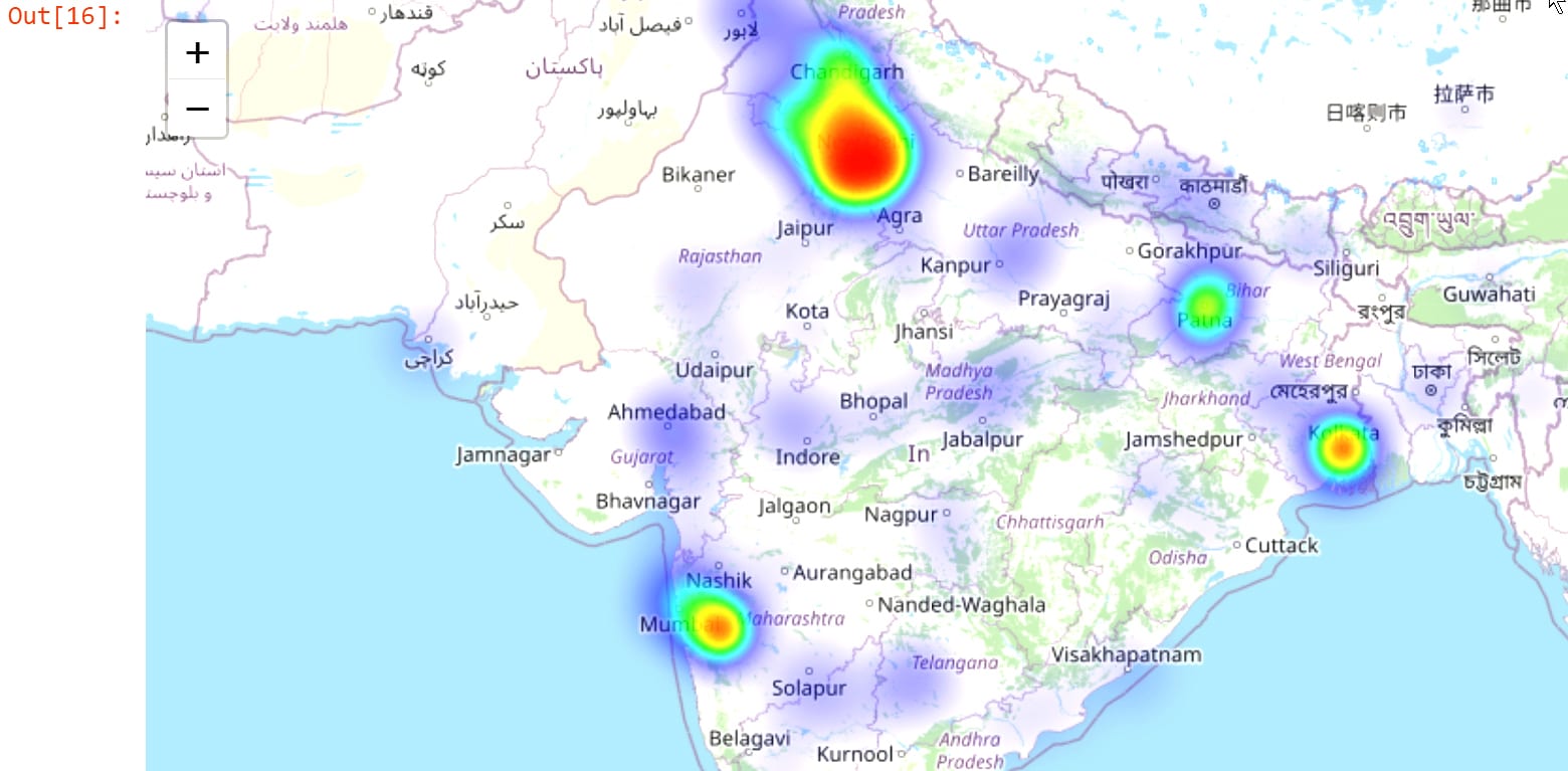
###-STEP 4: Make folium heat map
init_loc = [23, 77] # Approx over Bhopal
max_aqi = int(df1[‘aqi’].max())
print(‘max_aqi->’, max_aqi)
m = folium.Map(location = init_loc, zoom_start = 5)

heat_aqi = HeatMap(df2, min_opacity = 0.1, max_val = max_aqi,
radius = 20, blur = 20, max_zoom = 2)
m.add_child(heat_aqi)
m # Show the map
The heat map on Jupyter notebook looks somewhat like what’s shown in Figure 1.
Step 5: Plotting the stations
Suppose you don’t want a heat map, but rather would like to plot all the stations. This can be easily done in Folium.
We again use the Map class to create a Map object. As before, we will provide a value for the parameter location. Note that the default value for the parameter tiles is OpenStreetMap. In the Map I created, I used the value Stamen-Terrain. You can experiment with various tiles, as given below:
“OpenStreetMap”
“Mapbox Bright” (Limited levels of zoom for free tiles)
“Mapbox Control Room” (Limited levels of zoom for free tiles)
“Stamen” (Terrain, Toner, and Watercolor)
“Cloudmade” (Must pass API key)
“Mapbox” (Must pass API key)
“CartoDB” (positron and dark_matter)
Having created a Map object, you can use the Marker class to add points to the map. We will add the markers one by one by iterating over them in a for loop. We have also coloured the markers as per the value of the aqi. So if the value of aqi is above 300, the colour is red, and so on. The signature of the Marker class (along with the description of the two parameters of interest, namely, location and popup) is as below:
class folium.map.Marker(location, popup=None, tooltip=None, icon=None,
draggable=False, **kwargs)
Parameters
• location (tuple or list) – Latitude and Longitude of Marker (Northing, Easting)
• popup (string or folium.Popup, default None) – Label for the Marker; either an escaped HTML string to initialize folium.Popup or a folium.Popup instance.
The code for Step 5 is as follows:
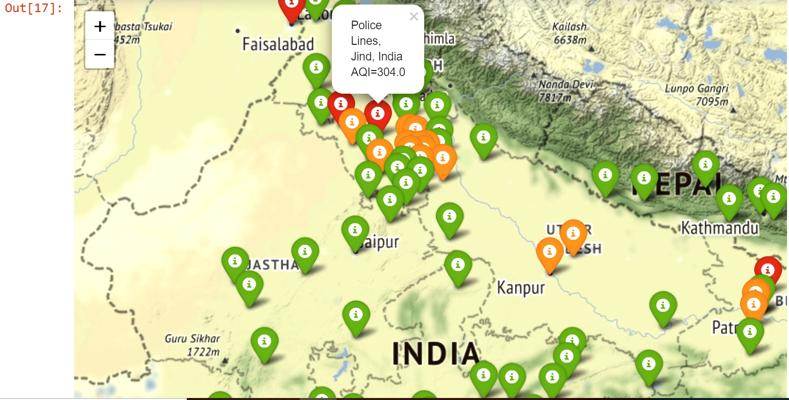
###-STEP 5: Plot stations on map
centre_point = [23.25, 77.41] # Approx over Bhopal
m2 = folium.Map(location = centre_point,
tiles = ‘Stamen Terrain’,
zoom_start= 6)
for idx, row in df1.iterrows():
lat = row[‘lat’]
lon = row[‘lon’]
station = row[‘station_name’] + ‘ AQI=’ + str(row[‘aqi’])
station_aqi = row[‘aqi’]
if station_aqi > 300: ## Red for very bad AQI
pop_color = ‘red’
elif station_aqi > 200:
pop_color = ‘orange’ ## Orange for moderate AQI
else:
pop_color = ‘green’ ## Green for good AQI
folium.Marker(location= [lat, lon],
popup = station,
icon = folium.Icon(color = pop_color)).add_to(m2)
m2
The plotted station map (on Jupyter notebook) looks somewhat like what’s shown in Figure 2.
The entire script is available on my GitHub page. Finally, the complete code at one place is as follows (but if you want to see the heat map, then remove the code relating to Step 5):
# Author:- Anurag Gupta Email:- 999.anuraggupta@mail.com
import pandas as pd
import folium
from folium.plugins import HeatMap
###-STEP 1 DOWNLOAD DATA

# See details of API at:- https://aqicn.org/api/
base_url = “https://api.waqi.info”

# Get token from:- https://aqicn.org/data-platform/token/#/
tok = ‘5c173abcXXXXXXXXX XXXXXX402471de46bb352f6’

# (lat, long)-> bottom left, (lat, lon)-> top right

# India is 8N 61E to 37N, 97E approx
latlngbox = “8.0000,61.0000,37.0000,97.0000” # For India
trail_url=f”/map/bounds/?latlng={latlngbox}&token={tok}” #
my_data = pd.read_json(base_url + trail_url) # Join parts of URL
print(‘columns->’, my_data.columns) #2 cols ‘status’ and ‘data’
###-STEP 2:- Create table like DataFrame
all_rows = []
for each_row in my_data[‘data’]:
all_rows.append([each_row[‘station’][‘name’],
each_row[‘lat’],
each_row[‘lon’],
each_row[‘aqi’]])
df = pd.DataFrame(all_rows,
columns=[‘station_name’, ‘lat’, ‘lon’, ‘aqi’])
###-STEP 3:- Clean the DataFrame
df[‘aqi’] = pd.to_numeric(df.aqi,
errors=’coerce’) # Invalid parse to NaN
print(‘with NaN->’, df.shape) # Comes out as (152, 4)

# Remove NaN (Not a Number) entries in col
df1 = df.dropna(subset = [‘aqi’])
print(‘without NaN->’, df1.shape) # (144, 4)
###-STEP 4:- Make folium heat map
df2 = df1[[‘lat’, ‘lon’, ‘aqi’]]
# print(df2.head) # Uncomment to see DataFrame
init_loc = [23, 77] # Approx over Bhopal
max_aqi = int(df1[‘aqi’].max())
print(‘max_aqi->’, max_aqi)
m = folium.Map(location = init_loc, zoom_start = 5)

heat_aqi = HeatMap(df2, min_opacity = 0.1, max_val = max_aqi,
radius = 20, blur = 20, max_zoom = 2)
m.add_child(heat_aqi)
m # Show the map
###-STEP 5 : Plot stations on map
centre_point = [23.25, 77.41] # Approx over Bhopal
m2 = folium.Map(location = centre_point,
tiles = ‘Stamen Terrain’,
zoom_start= 6)
for idx, row in df1.iterrows():
lat = row[‘lat’]
lon = row[‘lon’]
station = row[‘station_name’] + ‘ AQI=’ + str(row[‘aqi’])
station_aqi = row[‘aqi’]
if station_aqi > 300: ## Red for very bad AQI
pop_color = ‘red’
elif station_aqi > 200:
pop_color = ‘orange’ ## Orange for moderate AQI
else:
pop_color = ‘green’ ## Green for good AQI
folium.Marker(location= [lat, lon],
popup = station,
icon = folium.Icon(color = pop_color)).

add_to(m2)
m2 # Display map


