


Data visualisation is the graphical representation of information and data. By using visual elements like charts, graphs, and maps, data visualisation tools provide an accessible way to see and understand trends, outliers, and patterns in data. This article explains the basic functionalities of Tableau.
In the world of Big Data, data visualisation tools and technologies are essential to analyse enormous amounts of information and make data-driven decisions. These tools provide real-time data insights in a matter of minutes. The better you can convey things visually, whether in a dashboard or a slide deck, the better you can leverage that information. Effective data visualisation is a delicate balancing act between form and function. Tableau Public users have created visualisations on every possible topic such as music, sports and politics.
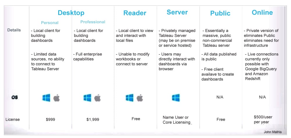
Tableau Public is a free, fast, easy to use tool for telling visual interactive stories on the Web. It has very good compatibility with different types of databases and can be connected to spreadsheets, Big Data and different types of cloud systems. The target demographic includes students, bloggers, journalists, writers, data analysts and business intelligence (BI) enthusiasts.
Installation
Out of the five products offered by Tableau, Tableau Desktop, Tableau Public and Tableau Online offer data visual creation. Tableau Public is free of cost and does not require any licence. But it comes with the limitation that all of the data and workbooks are made public to all Tableau users. Tableau Public is essentially a free version of Tableau visualisation software. It allows you to use most of the software functions. You can create visualisations and connect to CSV, text and Excel documents. However, Tableau Public does not allow you to save your workbooks locally.
Tableau Public is a free platform to publicly share and explore data visualisations online. Anyone can create visualisations using either Tableau Desktop Professional Edition or the free Public Edition. It brings the power of data to everyone across your organisation so that anyone can ask questions and get answers from their data.
Depending upon the choice of product, the software can be downloaded onto the computer and after accepting the licence agreement, you can verify the installation by clicking the Tableau icon.
Getting started
On the Start page we can see several options to choose from. This is where you can import your data. As is visible, there are multiple formats that your data can be in. It can be in a flat-file such as Excel, CSV or you can directly load it from data servers too. The first thing that you will obviously need to do is import the data into Tableau. So quickly follow the steps given below.
Since the data is in an Excel file, click on Excel and choose the Sample – Superstore.xls file you need to get. The Sample – Superstore data set comes with Tableau, which contains information about products, sales, profits, and so on. Locate the installation folder of Tableau and go to My Tableau Repository. Under it, you will find the above file at Datasources\9.2\en_US-US.
1. Drag ‘orders’ on Drag sheets here.
2. Click on ‘Use Data Interpreter’ to get a clean view and the messy data will disappear.
Click on Review the results, and choose the Orders tab in the opened Excel sheet to see the changes made.
Data visualisations
We shall be working with a sample data set named Superstore dataset, which comes preloaded with Tableau. After importing the data set, next to the Data Source tab near the bottom of the screen, click on Sheet1. If you are using multiple data sources, you can see them all listed here.
A ‘worksheet’ is where you make all your graphs; so click on that tab to reach what is displayed in Figure 2.

You must get familiar with the following terms.
Rows and columns: These represent the x- and y-axis of your graphs/charts.
Filter: Filters help you view a strained version of your data. For example, instead of seeing the combined sales of all the categories, you can look at a specific one, such as just Furniture.
Pages: Pages work on the same principle as filters, with the difference that you can actually see the changes as you shift between the paged values.
Marks: This is a visual representation of one or more rows in a data source. Mark types can be bar, line, square, and so on. You may choose to represent your data using different shapes, sizes or text.
Dimensions: These are qualitative or descriptive data, such as a name or date. These fields generally appear as column headers for rows of data, such as Customer Name or Order Date.
Measures: These are quantitative numerical data such as profit and total sales.
Start plotting
We will start by plotting a simple chart.
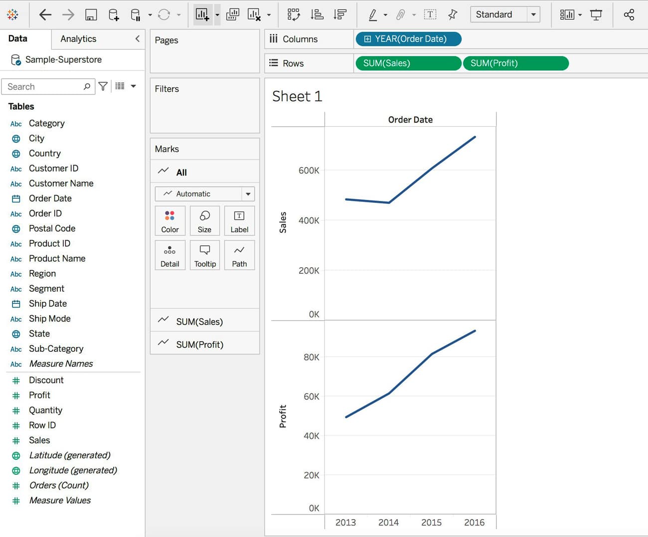
1. Drag Order Date to the Columns shelf, and Sales and Profit to the Rows shelf.
2. Tableau generates a chart that shows the total aggregated sales and profit for each year by order date. When you first create a view that includes time (in this case Order Date), Tableau automatically generates a line chart, as seen in Figure 3.
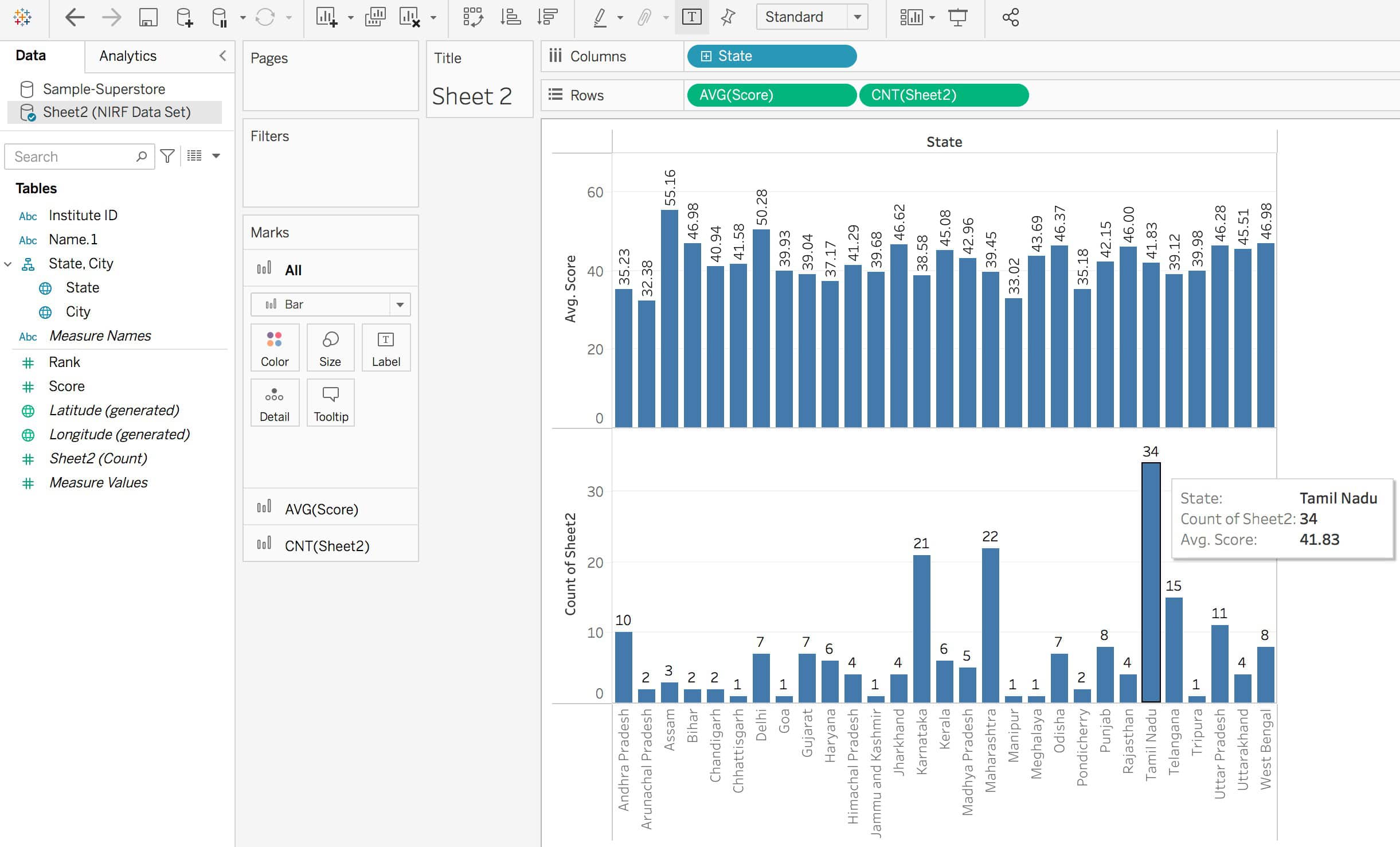
Another representation using the National Institutional Ranking Framework (NIRF) data set is seen in Figure 4.

Now delve a little deeper by getting the average score and count of colleges from each state (NIRF data set). Drag State to Columns. Also drag Sheet2(Count) to Rows and the filter AVG(score).
Drag score to the field ‘Filters’; you will see a pop-up, ‘How do you want to filter on score’ which lists out many options like #Sum, #Average, #Minimum, #Maximum and so on. Select Average, click Next and finally drag AVG(Score) from Filters to Rows.
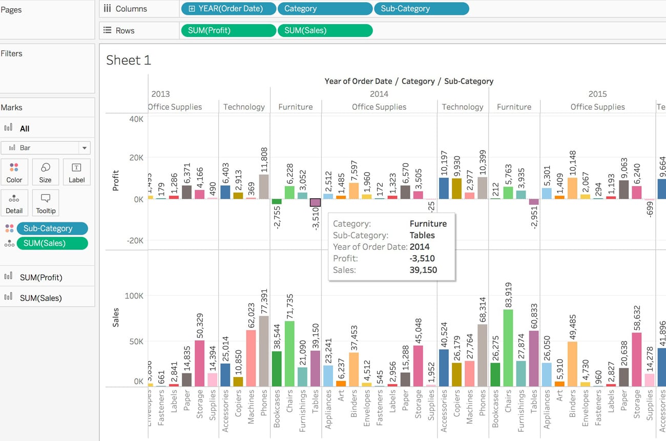
To gain more insight into which products drive overall sales, try adding more data. You can look at products by sub-category to see which items are the big sellers.
From the Data pane, drag Category to the Columns shelf and place it to the right of YEAR(Order Date). Drag Sub-Category to the Columns shelf. Also drag SUM(Sales) and SUM(Profit) to Row shelf. The bar graph depicts Category, Sub-Category, Year of Order Date, Profit & Sales. We can also see Negative Profit for items like Tables under the category Furniture in the year 2014.
| Note: Tableau automatically added a colour legend and assigned a diverging colour palette, because our data includes both negative and positive values. |
Filters
To look at the sales of a particular year or a month for a certain product, or to basically view the distinct aspects of the data, Filters are the way to go.
- Drag the Dimension to the Filters Shelf, select the required attribute from the dialogue box and click next.
- Let us choose Years and click on Next.
- Choose the values that you want to be a part of your Filter.
- Right-click on the newly generated Filter, and then choose Show Filter.
- If you feel that some of your filters can be applied to other sheets as well, then rather than repeating the steps, you can simply Apply the Filter to all other relevant worksheets.
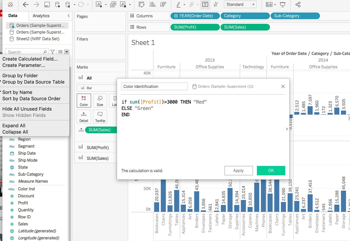
How to create a calculation field
- Click on the rightmost icon near Search – Create Calculated Field.
- Give any name, and type your condition for colour indicator:
if sum(profit)>3000 THEN “Red” ELSE “Green”
- Drag the calculated field ‘Colour Indicator’ to Colour.
- By default, it will show the assigned colour, but we may change the colour. Click on Colour to edit Colours, and choose the appropriate one.
So, we have learned how to apply filters and colour to make it easier to focus on the areas of your data that interest you the most (Figure 5).
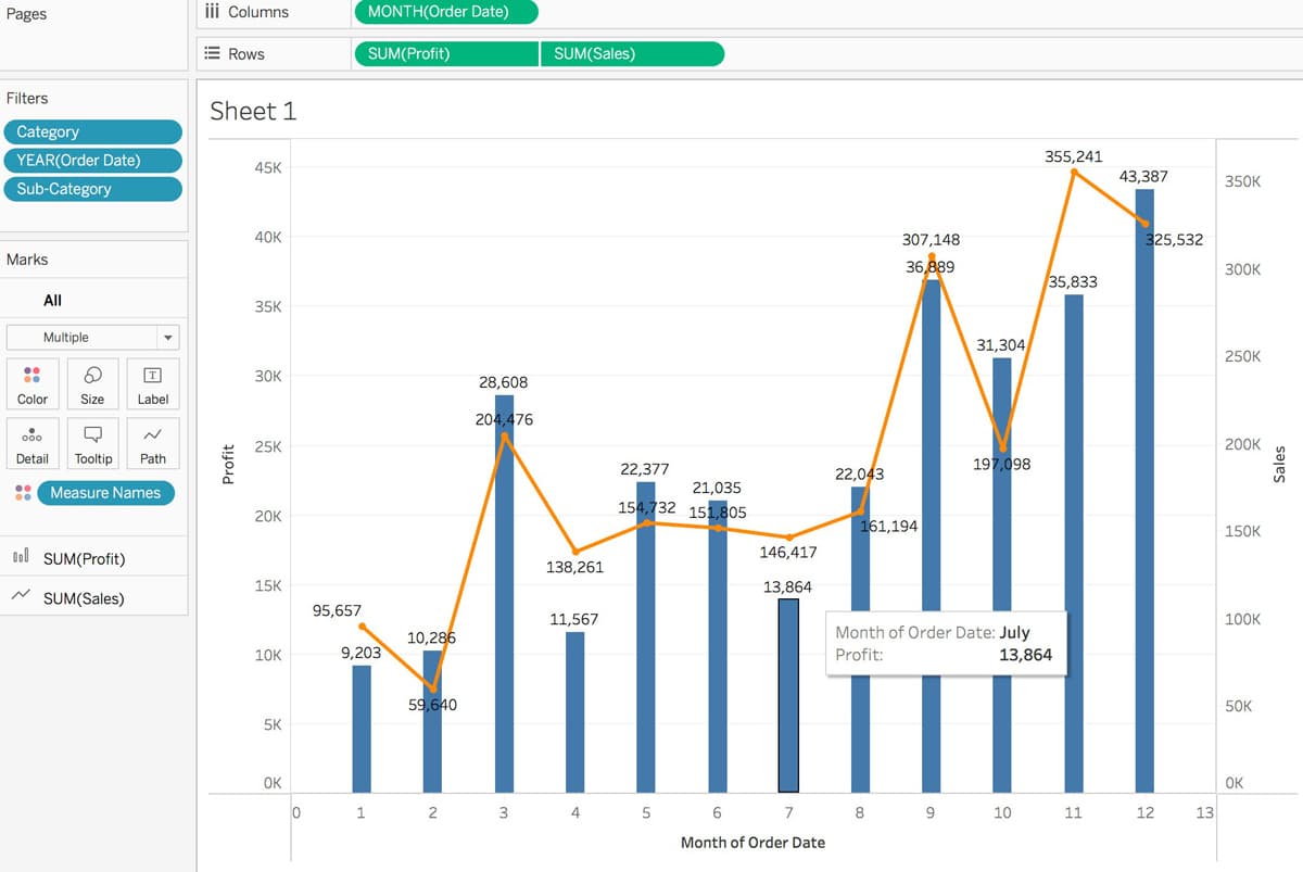
Trend Line
- Go to Show Me and choose the Dual Combination chart to get the chart showing the Trend Line.
- From Analytics, drag and drop Trend Line over the chart. Any type of Trend Line can be selected — linear, exponential, logarithmic, etc.
Dashboard
Dashboards are used to display multiple worksheets at once, enabling one to compare a variety of data simultaneously. Let’s see how to create a dashboard.
- In the Dashboard pane on the left, you’ll see the sheets that you created.
- Click on the window-like icon next to the ‘New Worksheet’ icon in the bottom panel.
- Drag these worksheets from the pane to the empty area ‘Drop sheets here’.
The Dashboard will automatically make space available for the worksheets we have dragged, as shown in Figure 7.
Story: Bringing it all together
- A Story is where you combine all the dashboards, and if need be individual sheets as well.
- Click the New Story tab.
- In the lower-left corner of the screen, choose a size for your story.
To start building your story, double-click a sheet on the left to add it to a story point. In Tableau Desktop, you can also drag sheets into your story point. - Click Add a caption to summarise the story point.
- You can add another story point by Clicking Blank to use a fresh sheet, and start customising a story point.
- You can present your story by clicking the Full Screen button in the upper-right corner of the browser.
So let’s combine all those Dashboards that we had made into what could perhaps make a decent presentation for a beginner. Do ensure to add a caption to all your Dashboards, to convey your message clearly, as seen in Figure 8.
Saving the work
In Tableau Desktop: To save a Tableau workbook locally, select File > Save. Specify the workbook file name in the Save As dialog box. Tableau, by default, saves the file with the .twb extension.
In Tableau Public: With Tableau Public, all the views and data are made public and anybody on the Internet has access to it. Select Server > Tableau Public > Save to Tableau Public and enter the credentials.
In Tableau Server: In case the data is confidential, and the story needs to be shared with the entire team, Tableau Server comes in handy. To publish a story to Tableau Server, select Server > Publish Data Source. But make sure to create an account first.
To sum up, Tableau is the most popular and intelligent data visualisation tool available in the market, as it allows users to design charts, maps, tabular and matrix reports, stories, and dashboards with a simple drag and drop functionality. Tableau is faster than other BI tools and doesn’t require any prerequisite or technical knowledge. Apart from screenshots, the only way to share Tableau Public visualisations is to publish them to the Tableau Public website, for which you will need to create a Tableau account. In addition, when you share a Tableau Public visualisation, any viewer will be able to download the underlying data, unless you purchase a ‘premium’ Tableau Public subscription.
There’s a lot more that can be done with Tableau. This article covers the very basics of this business intelligence tool that allows anyone to visualise and create interactive dashboards.


