


R has a number of packages for plotting graphs and data visualisation, such as graphics, lattice, and ggplot2. In this ninth article in the R series, we shall explore the various functions to plot data in R.
We will be using R version 4.1.2 installed on Parabola GNU/Linux-libre (x86-64) for the code snippets.
$ R --version

R version 4.1.2 (2021-11-01) -- “Bird Hippie”
Copyright (C) 2021 The R Foundation for Statistical Computing
Platform: x86_64-pc-linux-gnu (64-bit)
R is free software and comes with absolutely no warranty. You are welcome to redistribute it under the terms of the GNU General Public License versions 2 or 3. For more information about these matters, see https://www.gnu.org/licenses/.
Plot
Consider the all-India consumer price index (CPI – rural/urban) data set up to November 2021 available at https://data.gov.in/catalog/all-india-consumer-price-index-ruralurban-0 for the different states in India. We can read the data from the downloaded file using the read.csv function, as shown below:
> cpi <- read.csv(file=”CPI.csv”, sep=”,”)

> head(cpi)
Sector Year Name Andhra.Pradesh Arunachal.Pradesh Assam Bihar
1 Rural 2011 January 104 NA 104 NA
2 Urban 2011 January 103 NA 103 NA
3 Rural+Urban 2011 January 103 NA 104 NA
4 Rural 2011 February 107 NA 105 NA
5 Urban 2011 February 106 NA 106 NA
6 Rural+Urban 2011 February 105 NA 105 NA
Chattisgarh Delhi Goa Gujarat Haryana Himachal.Pradesh Jharkhand Karnataka
1 105 NA 103 104 104 104 105 104
2 104 NA 103 104 104 103 104 104
3 104 NA 103 104 104 103 105 104
4 107 NA 105 106 106 105 107 106
5 106 NA 105 107 107 105 107 108
6 105 NA 104 105 106 104 106 106
...
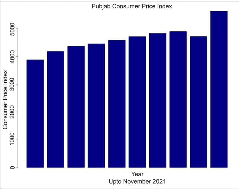
Let us aggregate the CPI values per year for the state of Punjab, and plot a line chart using the plot function, as follows:
> punjab <- aggregate(x=cpi$Punjab, by=list(cpi$Year), FUN=sum)

> head(punjab)
Group.1 x
1 2011 3881.76
2 2012 4183.30
3 2013 4368.40
4 2014 4455.50
5 2015 4584.30
6 2016 4715.80

> plot(punjab$Group.1, punjab$x, type=”l”, main=”Punjab Consumer Price Index upto November 2021”, xlab=”Year”, ylab=”Consumer Price Index”)
The following arguments are supported by the plot function:
| Argument | Description |
| x | A vector for the x-axis |
| y | The vector or list in the y-axis |
| type | ‘p’ for points, ‘l’ for lines, ‘o’ for overplotted plots and lines, ‘s’ for stair steps, ‘h’ for histogram |
| xlim | The x limits of the plot |
| ylim | The y limits of the plot |
| main | The title of the plot |
| sub | The subtitle of the plot |
| xlab | The label for the x-axis |
| ylab | The label for the y-axis |
| axes | Logical value to draw the axes |
The line chart is shown in Figure 1.

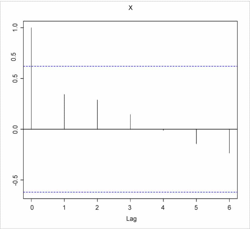
The autocorrelation plot can be used to obtain correlation statistics for time series analysis, and the same can be generated using the acf function in R. You can specify the following autocorrelation types: correlation, covariance, or partial. Figure 2 shows the ACF chart that represents the CPI values (‘x’ in the chart) for the state of Punjab.
The function acf accepts the following arguments:
| Argument | Description |
| x | A univariate or multivariate object or vector or matrix |
| lag.max | The maximum lag to calculate the acf |
| type | Supported values ‘correlation’, ‘covariance’, ‘partial’ |
| plot | The acf is plotted if this value is TRUE |
| i | A set of time difference lags to retain |
| j | A collection of names or numbers to retain |
Bar chart
The barplot function is used to draw a bar chart. The chart for Punjab’s CPI can be generated as follows, and is shown in Figure 3:
> barplot(punjab$x, main=”Punjab Consumer Price Index”, sub=”Upto November 2021”, xlab=”Year”, ylab=”Consumer Price Index”, col=”navy”)
The function is quite flexible and supports the following arguments:
| Argument | Description |
| height | A numeric vector or matrix that contains the values |
| width | A numeric vector that specifies the widths of the bars |
| space | The amount of space between bars |
| beside | A logical value to specify if the bars should be stacked or next to each other |
| density | A numerical value that specifies the density of the shading lines |
| angle | The angle used to shade the lines |
| border | The colour of the border |
| main | The title of the chart |
| sub | The sub-title of the chart |
| xlab | The label for the x-axis |
| ylab | The label for the y-axis |
| xlim | The limits for the x-axis |
| ylim | The limits for the y-axis |
| axes | A value that specifies whether the axes should be drawn |
You can get more details on the barplot function using the help command, as shown below:
> help(barplot)

acf package:stats R Documentation

Auto- and Cross- Covariance and -Correlation Function Estimation

Description:

The function ‘acf’ computes (and by default plots) estimates of
the autocovariance or autocorrelation function. Function ‘pacf’
is the function used for the partial autocorrelations. Function
‘ccf’ computes the cross-correlation or cross-covariance of two
univariate series.

Usage:

acf(x, lag.max = NULL,
type = c(“correlation”, “covariance”, “partial”),
plot = TRUE, na.action = na.fail, demean = TRUE, ...)

pacf(x, lag.max, plot, na.action, ...)

## Default S3 method:
pacf(x, lag.max = NULL, plot = TRUE, na.action = na.fail,
...)

ccf(x, y, lag.max = NULL, type = c(“correlation”, “covariance”),
plot = TRUE, na.action = na.fail, ...)

## S3 method for class ‘acf’
x[i, j]
Pie chart
Pie charts need to be used wisely, as they may not actually show relative differences among the slices. We can generate the Rural, Urban, and Rural+Urban values for the month of January 2021 for Gujarat as follows, using the subset function:
> jan2021 <- subset(cpi, Name==”January” & Year==”2021”)

> jan2021$Gujarat
[1] 153.9 151.2 149.1

> names <- c(‘Rural’, ‘Urban’, ‘Rural+Urban’)
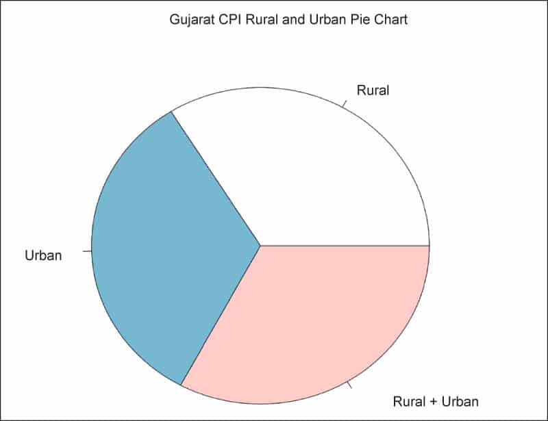
The pie function can be used to generate the actual pie chart for the state of Gujarat, as shown below:
> pie(jan2021$Gujarat, names, main=”Gujarat CPI Rural and Urban Pie Chart”)
The following arguments are supported by the pie function:
| Argument | Description |
| x | Positive numeric values to be plotted |
| label | A vector of character strings for the labels |
| radius | The size of the pie |
| clockwise | A value to indicate if the pie should be drawn clockwise or counter-clockwise |
| density | A value for the density of shading lines per inch |
| angle | The angle that specifies the slope of the shading lines in degrees |
| col | A numeric vector of colours to be used |
| lty | The line type for each slice |
| main | The title of the chart |
Boxplot
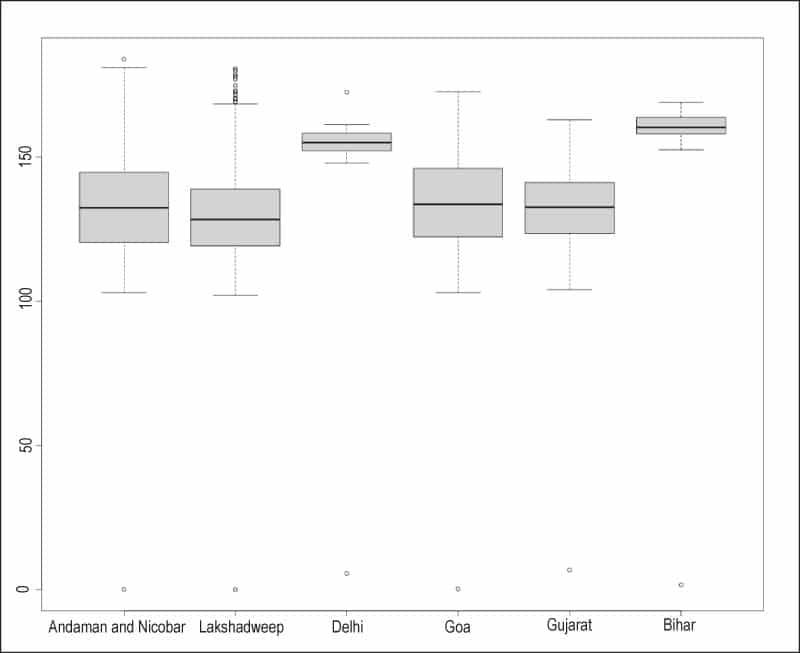
A boxplot shows the interquartile range between the 25th and 75th percentile using two ‘whiskers’ for the distribution of a variable. The values outside the range are plotted separately. The boxplot functions take the following arguments:
| Argument | Description |
| data | A data frame or list that is defined |
| x | A vector that contains the values to plot |
| width | The width of the boxes to be plotted |
| outline | A logical value indicating whether to draw the outliers |
| names | The names of the labels for each box plot |
| border | The colour to use for the outline of each box plot |
| range | A maximum numerical amount the whiskers should extend from the boxes |
| plot | The boxes are plotted if this value is TRUE |
| horizontal | A logical value to indicate if the boxes should be drawn horizontally |
The boxplot for a few states from the CPI data is shown below:
> names <- c (‘Andaman and Nicobar’, ‘Lakshadweep’, ‘Delhi’, ‘Goa’, ‘Gujarat’, ‘Bihar’)
> boxplot(cpi$Andaman.and.Nicobar, cpi$Lakshadweep, cpi$Delhi, cpi$Goa, cpi$Gujarat, cpi$Bihar, names=names)
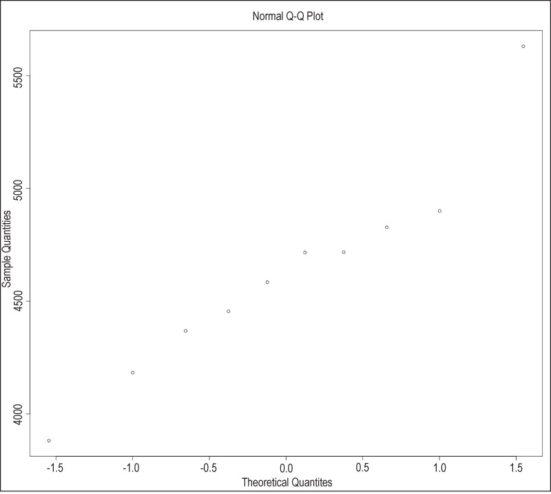
Q-Q plot
The Quantile-Quantile (Q-Q) plot is a way to compare two data sets. You can also compare a data set with a theoretical distribution. The qqnorm function is a generic function, and we can view the Q-Q plot for the Punjab CPI data as shown below:
> qqnorm(punjab$x)
The qqline function adds a theoretical line to a normal, quantile-quantile plot. The following arguments are accepted by these functions:
| Argument | Description |
| x | The first data sample |
| y | The second data sample |
| datax | A logical value indicating if values should be on the x-axis |
| probs | A numerical vector representing probabilities |
| xlab | The label for x-axis |
| ylab | The label for y-axis |
| qtype | The type of quantile computation |
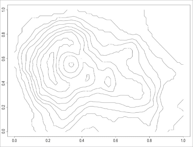
Contour plot
The contour function is useful for plotting three-dimensional data. You can generate a new contour plot, or add contour lines to an existing chart. These are commonly used along with image charts. The volcano data set in R provides information on the Maunga Whau (Mt Eden) volcanic field, and the same can be visualised with the contour function as follows:
> contour(volcano)
The contour function accepts the following arguments:
| Argument | Description |
| x,y | The location of the grid for z |
| z | A numeric vector to be plotted |
| nlevels | The number of contour levels |
| labels | A vector of labels for the contour lines |
| xlim | The x limits for the plot |
| ylim | The y limits for the plot |
| zlim | The z limits for the plot |
| axes | A value to indicate to print the axes |
| col | The colour for the contour lines |
| lty | The line type to draw |
| lwd | Width for the lines |
| vfont | The font for the labels |
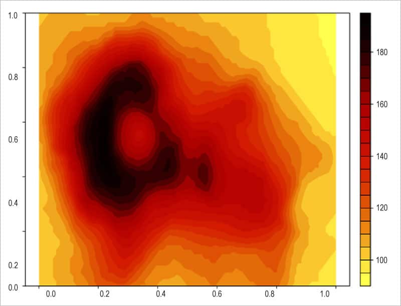
The areas between the contour lines can be filled using a solid colour to indicate the levels, as shown below:
> filled.contour(volcano, asp = 1)
The same volcano data set with the filled.contour colours is illustrated in Figure 8.
You are encouraged to explore the other functions and charts in the graphics package in R.


