


This guide will show you how to use Silex’s visual editor to go from a blank canvas to a ready-to-publish static site, all built on clean HTML and CSS standards.
The modern web requires sites that are fast, flexible, and completely under your control. While many popular platforms offer easy drag-and-drop editors, they come with a high price — constant subscription fees and proprietary code that traps you in their ecosystem. For anyone committed to open source, this loss of control is unacceptable. Developers, designers, and business owners deserve visual tools that truly respect their freedom and data ownership, allowing them to create without the fear of vendor lock-in.
This is where Silex comes in — a powerful, 100% free, and AGPL-licensed visual website builder. Silex lets you design, build, and export professional static websites without ever using proprietary software. If you prioritise freedom, performance, and control, Silex is the open source solution you need to master.
Accessing and starting Silex
The only prerequisite to access Silex is to have a GitLab account. To begin experimenting instantly, simply open the official instance https://v3.silex.me/ in your web browser; you will get a page to sign in using Gitlab.com.
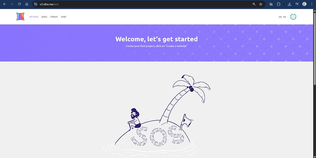
While you can build without an account, saving and managing projects remotely requires connecting a service. Silex uses GitLab for this integration due to its open source nature. To enable saving, you first need an active account on GitLab.com. Click on the Sign In/Sign Up button within the Silex interface, go to Authorize with Gitlab, and then approve the request from the Silex Labs Foundation. Once authorised, you can save your projects directly to your GitLab repositories, ensuring true version control and data ownership. Then the page shown in Figure 1 will appear.
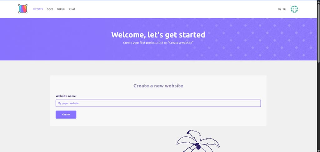
Now scroll down, click on the Create Website button and provide a name for your site. Let us name it Blog page for this article. Next, click on the Create button as shown in Figure 2.
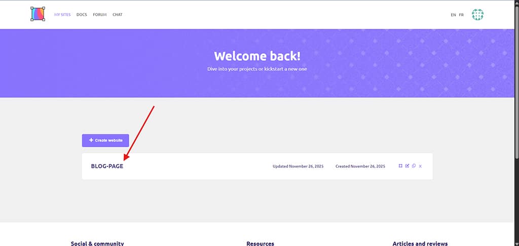
Now, click on the Blog page on the dashboard as shown in Figure 3.
You will be redirected to a blank web page.
Building and styling: The hands-on tutorial
Now, let us start building our blog site. Click on the ‘+’ icon at the top left corner of the page to use the elements to decorate the page. You can see many blocks containing different types of elements under each sub-block, such as Basics, Media, Components, Forms, etc.
Let us first insert a text box for our heading. For that, under Basics (Basics can be accessed by clicking on the ‘+’ icon), drag the Text option and drop it on the page. Click on the textbox and type the title of the blog.
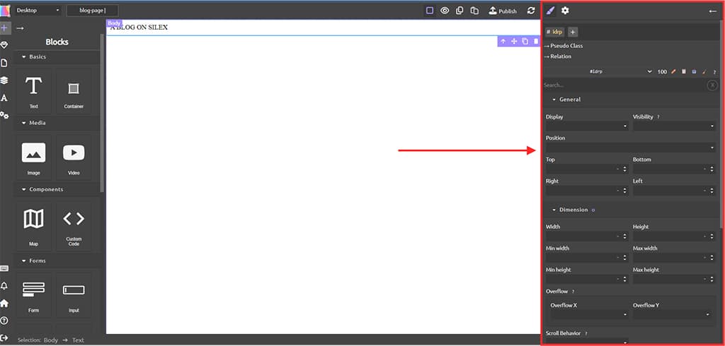
As soon as an element is created, we can modify its properties using the Open style manager available on the right corner of the screen (paint brush icon) as shown in Figure 4.
Now let us scroll through the Open style manager, and modify the margin and padding to 100 and 15 each, respectively. Then, let us insert an image and content for the blog. To insert an image, drag the Image option under the Media sub-block and drop it on the web page. We will get an option to upload the image as shown in Figure 5.
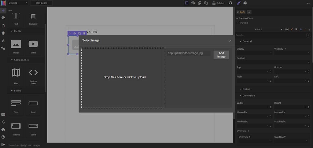
After your selected image gets loaded, click on it to make it appear on the web page.
Now, let us include the content for our blog page. I have included the following sentence:
“Silex is a free and open-source WYSIWYG (What You See Is What You Get) website builder.”
There are many more elements that we can include on our site. Now let us see how to include custom elements in our site. For that, drag the Custom Code option and drop it on the exact position you want. Now, write the code you would like to; I am including the following code to include a simple feature card in our site.
<style>
/* * --------------------------------
* CSS for the Feature Card
* --------------------------------
*/
.osfy-card {
/* Base Styling */
max-width: 300px;
margin: 20px auto; /* Centers the card */
padding: 20px;
text-align: center;

/* Colors and Aesthetics */
background-color: #ffffff; /* White background */
border: 1px solid #e0e0e0; /* Light gray border */
border-radius: 12px;

/* Shadow and Transition for Effect */
box-shadow: 0 4px 12px rgba(0, 0, 0, 0.1);
transition: all 0.3s ease-in-out; /* Smooth transition for hover effects */
}

/* Hover Effect */
.osfy-card:hover {
/* Lifts the card */
box-shadow: 0 10px 25px rgba(0, 0, 0, 0.2);
/* Slightly scales the card */
transform: translateY(-5px) scale(1.02);
}

.osfy-card h3 {
color: #007bff; /* Blue heading color */
margin-top: 0;
}

.osfy-card button {
background-color: #28a745; /* Green button */
color: white;
border: none;
padding: 10px 20px;
border-radius: 5px;
cursor: pointer;
margin-top: 10px;
}
</style>

<div class="osfy-card">
<h3>Static Site Power</h3>
<p>This card demonstrates custom code integration. Notice the clean shadows and the subtle lift when you hover over it!</p>
<button>Read More</button>
</div>
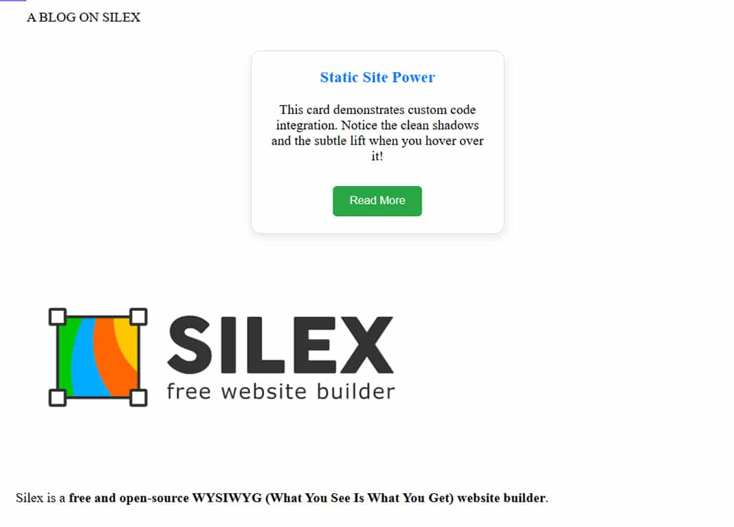
Now, after clicking on Save, our blog looks like the image shown in Figure 6.
Ensuring a responsive design
The ability to look great on any device from a large monitor to a small smartphone is non-negotiable for modern websites. Silex makes this core principle of responsive design accessible visually, without writing complex media queries.
In Silex, always start by inserting containers or sections and placing your content (text, images, media) inside them. These containers are the backbone of your layout and, by default, often behave responsively, automatically scaling their width to the available screen space.
To avoid frustrating horizontal scrolling on your mobile phone, you must minimise fixed pixel sizes. Instead, use relative measurements. Set the width of main content containers and large images using percentages (e.g., 100% or 90%). This ensures the elements shrink and grow proportionally to the viewer’s screen, maintaining an appropriate fit.
The ‘Breakpoint Selector’ is Silex’s most powerful responsive tool. This feature, typically found at the top of the editor, allows you to switch between viewing modes (desktop, tablet, mobile). When you click on the Phone icon, the canvas simulates a narrow screen. Once in the mobile view, you can make highly specific adjustments. If a heading looks too large, select it and reduce its font size in the Property Panel. Silex automatically applies this adjustment only to the mobile breakpoint, leaving the desktop version untouched. You can also easily adjust elements to stack vertically or even hide large, desktop-only graphics entirely from the phone view.
Publishing the final static code
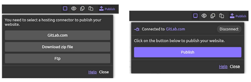
Now, after our site is complete, let us click on the Publish icon on the top navbar, select Gitlab.com, and click on Publish as shown in Figure 7.
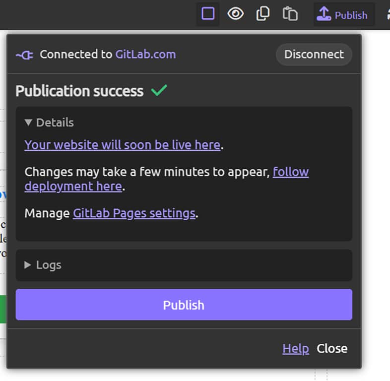
After the process is successful, you will get the live website link as shown in Figure 8.
Now, the process of publishing the website is complete. You can click on the link Your website will soon be live here to access the live website.
Silex is a powerful choice for static web design because it guarantees 100% open source freedom and data ownership, freeing users from vendor lock-in while providing fast, clean HTML/CSS output. While excelling at static sites, Silex’s clean output makes it an ideal front-end for future dynamic expansion; users can easily connect their Silex-designed pages to an open source headless commerce engine like Saleor or Medusa to build a complete e-commerce solution, thus preserving the open source ethos across both design and backend logic.


