


When comparing two (or more) data sets, the statistics about each may not give the entire picture. Often, the data has to be actually plotted or visualised to get the true picture. This article uses two Python libraries — Pandas (for data downloading and manipulation) and Matplotlib — for plotting. The script is in five parts to make it easier to understand.
Unless you have done some formal/informal courses in statistics or data visualisation, the chances are that you must have never heard of Anscombe’s quartet.
This article is about three things:
- Visualisation
- Summary statistics
- Anscombe’s quartet
Let’s begin with Anscombe’s quartet. According to Wikipedia:
“Anscombe’s quartet comprises four data sets that have nearly identical simple descriptive statistics, yet have very different distributions and appear very different when graphed. Each data set consists of eleven (x, y) points.’’
These data sets were constructed in 1973 by the statistician Francis Anscombe to demonstrate both the importance of graphing data before analysing it as well as the effect of outliers and other influential observations on statistical properties.
To summarise:
- Anscombe’s quartet comprises four data sets in the form of x-y pairs. (Because the number of data pairs is four, hence the term quartet.)
- Each data set has eleven points.
- The ‘summary statistics’ of all the four data sets are near equal or identical.
- But when these four data sets are plotted, they represent altogether different graphs.
Before discussing the data sets, let us first understand the term ‘summary statistics’. We won’t get into the semantics of the term. We just need to understand that when we compare two data sets ‘quantitatively’, we compare them on parameters like:
- Mean (which is a measure of central tendency)
- Variance (which is a measure of spread)
- Correlation (which is a measure of dependence)
- Linear regression (which indicates the best fit line)
- Coefficient of determination (which indicates the proportion of variance in the dependent variable that is predicted from the independent variable)
So, without any further delay, let’s have a look at Anscombe’s quartet.
The screenshot of the data set on Wikipedia is shown in Figure 1.
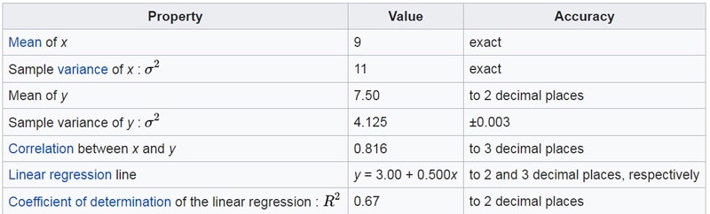
If you see the summary statistics of these four data sets, they are almost identical (to the last two decimal places at least). The summary statistics (for all the four data sets) are shown in Figure 2.
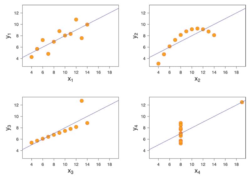
However, when you plot these four data sets, you will realise how different they are from each other.
To plot the data sets, follow the given steps:
Step 1: Download tables from the Wikipedia page on Anscombe’s quartet
Step 2: Clean the data
Step 3: Plot the four data sets
Step 4: Plot the linear regression line for the four sub-plots
Step 5: End note
Step 1: Download tables from the Wikipedia page on Anscombe’s quartets
We will download the data from the Wikipedia page using the read_html() function of a Panda’s DataFrame. This function can download tables from an html page directly. Note the word ‘tables’ here (plural form). So, if a page has more than one table, it will download in the form of a ‘list of DataFrame objects’. This Wiki page (on Anscombe’s quartets) has, in fact, two tables. The first table gives the ‘summary statistics’ of the quartet, and the second table contains the four data sets.
The script to download the tables is as follows:
# Author:- Anurag Gupta ## E-mail 999.anuraggupta@gmail.com
import pandas as pd
# ----- STEP 1:- Read the data set from Wikipedia page
url = r’https://en.wikipedia.org/wiki/Anscombe%27s_quartet’
df = pd.read_html(url)
# This wikipedia page has 2 tables.
# First table (index 0) has summary statistics
# Second table (index 1) has the 4 data sets
print(df[0]) # prints summary statistics of the data set
df2 = df[1] # df2 is simply an alias for df[1]
print(df2) # Prints the 4 data sets in from of a DataFrame
Step 2: Clean the data
We would like to point out an interesting thing about the data set downloaded from the Wikipedia page. Notice that in the screenshot of the four data sets (taken from the Wikipedia page), the column names are I, II, III, and IV, and there is one common column name for two columns. So while there are eight columns, the column names are only I, II, III and IV. But Pandas is smart enough to recognise this and has named the columns as I, I.1, II, II.1, III, III.1, and IV, IV.1. Note that in some of the older versions of Pandas, the column names might show up as NaN. But that should not create a problem.
The cleaning of the data consists of the following three steps:
- Rename the columns as X1, Y1, X2, Y2, X3, Y3, X4, and Y4.
- Remove the row (at index 0) containing x and y. Note that in some older versions of Pandas, the row containing x and y may appear at index 1. This might happen if the Pandas takes the column names as index 0. In that case, you simply need to remove the row at index 1.
- Convert all the items in the table into numerics.The script for implementing Step 2 is as follows:
# ----- STEP 2:- Clean the data
# Step 2(1) -- Change the column names
df2.columns = ['X1', 'Y1', 'X2', 'Y2', 'X3', 'Y3', 'X4', 'Y4']
# print(df2) ## Uncomment to check that column names changed
# Step 2(2) -- Remove row containing x and y at index 0
df2.drop([0], axis = 0, inplace = True)
# print(df2) ## Uncomment to confirm that row with x and y removed
# Step 2(3) -- convert all columns of DataFrame to numeric values
df2 = df2.apply(pd.to_numeric)
# print (df2.dtypes) # Uncomment to see all cells of DataFrame have numerics
Step 3: Plot the four data sets
For plotting the four data sets, we will use the Matplotlib library. As you may be aware, the pyplot module of the matplotlib library has a function called subplots(). The signature is as follows:
matplotlib.pyplot.subplots(nrows=1, ncols=1, sharex=False, sharey=False, squeeze=True, subplot_kw=None, gridspec_kw=None, **fig_kw)
You can see the complete signature of the function along with a description of all the parameters at the link given at the end of the article.
The two important parameters are nrows and ncols. Since we need four sub-plots in a 2×2 grid, we will give values nrows = 2 and ncols = 2. You can ignore the two additional arguments, namely, sharex and sharey. Those who are interested can see the example code in the link given under ‘References’ at the end of the article.
The script for implementing Step 3 is as follows:
# ----- STEP 3:- Plot the 4 data sets
%matplotlib inline
import matplotlib.pyplot as plt

# --- Step 3(1): Create 4 subplots
fig, ax = plt.subplots(nrows=2, ncols=2, figsize = (30, 30),
sharex = ‘col’, sharey = ‘row’)

# --- Step 3(2):- Create 4 Scatter Plots
ax[0][0].scatter(df2.X1, df2.Y1, s = 200)
ax[0][1].scatter(df2.X2, df2.Y2, s = 200)
ax[1][0].scatter(df2.X3, df2.Y3, s = 200)
ax[1][1].scatter(df2.X4, df2.Y4, s = 200)
| Note: The line of code %matplotlib inline is meant only for Jupyter notebook. So, if you are writing this script on some other IED like Spyder or Visual Studio Code, please remove this line. |
Step 4: Plot the linear regression line for the four sub-plots
In this step, we will plot the linear regression line or the ‘best fit’ line for the four sub-plots. If you look back at the summary statistics for the four data sets, you will notice that the Linear regression line is: y = 3.00 + 0.500x.
So, from the high school maths equation for a straight line (y = mx + c), we know that for all these four data sets, the slope is m = 0.500 and the y-intercept is c = 3.00.
Let us now calculate the slope and intercepts for each of these four ‘best fit’ lines for each of the four data sets, and see for ourselves if they match the given summary statistics.
For calculating the ‘best fit’ lines, we will use a Numpy function called polyfit().
The signature to be used is given below:
numpy.polyfit(x, y, deg, rcond=None, full=False, w=None, cov=False)
The complete signature of the numpy.polyfit() method is available at the link given in the ‘References’ at the end of the article.
You need to understand that polyfit() has an attribute deg, which takes the ‘degree’ of the resulting polynomial to be created. For a linear function, we will take deg = 1.
The script for implementing Step 4 is as follows:
# ----- STEP 4:- Plot the linear regression lines for the 4 plots
# Use numpy.polyfit() method. Signature is at link on next line
# https://numpy.org/doc/stable/reference/generated/numpy.polyfit.html
import numpy as np
# Use polyfit() to get slope and intercept
m1, b1 = np.polyfit(df2.X1, df2.Y1, deg = 1)
print(‘First dataset->’, round(m1, 2), round(b1, 2))

# m2 and b2 are same as m1 and b1
m2, b2 = np.polyfit(df2.X2, df2.Y2, deg = 1)
print(‘Second dataset->’, round(m2, 2), round(b2, 2))

# m3 and b3 are same as m1 and b1
m3, b3 = np.polyfit(df2.X3, df2.Y3, deg = 1)
print(‘Third dataset->’, round(m3, 2), round(b3, 2))
# m4 and b4 are same as m1 and b1
m4, b4 = np.polyfit(df2.X4, df2.Y4, deg = 1)
print(‘Fourth dataset->’, round(m4, 2), round(b4, 2))
# Infact the slopes and intercepts of all 4 graphs is same.
# So we can add this best fit line to all 4 graphs as below:-

x = np.array(range(16))
print(x)
ax[0][0].plot(x, m1 * x + b1)
ax[0][1].plot(x, m2 * x + b2)
ax[1][0].plot(x, m3 * x + b3)
ax[1][1].plot(x, m4 * x + b4)
fig
Step 5: End note
Just as an additional exercise, let us further explore the numpy.polyfit() function. Note that, in general, numpy.polyfit() returns the coefficients in descending order of degree, according to the generation equation given below:
P(x) = CnXn + C(n-1)X(n-1) + - - - - - + C0
In case you noticed, the second data set in Anscombe’s quartet showed a definite non-linear trend. Let us try to use the numpy.polyfit() function with degree 2 to see if we can find a ‘curve’ that better fits this data set than a simple straight line.
The following script does it, and the output shows a near-perfect match:
# ----- STEP 5:- Plot the degree 2 polyfit for the second data set
z = np.polyfit(df2.X2, df2.Y2, deg = 2)
print(z)
ax[0][1].plot(x, z[0] * x**2 + z[1] * x + z[2])
fig
So what did we learn? We learnt that ‘summary statistics’ may not always give the true picture of a data set. To fully understand the data we must visualise it, and Anscombe’s data is proof of the fact that diverse data sets may look ‘similar’ statistically but have a completely different visual representation.


