Sales forecasting is very important to determine the inventory any business should keep. This article discusses a popular data set of the sales of video games to help analyse and predict sales efficiently. We will use this data to create visual representations. We won’t dwell on the methodology and science behind statistics and demand forecasting, but will focus on understanding the basic steps needed to use Python and the Google Colab cloud environment to predict sales and arrive at an inventory strategy.
Several traditional tools like MS Excel have been used to derive predictive sales models, but there are lots of complexities, calculations, complicated formulae and cell manipulations that need to be used to do so. Instead, if we adopt an easy front-end application with a rich user experience, it can really help in making a better inference. So let’s venture into the world of Python and its associated large set of statistical and analytical libraries to derive inferences without forcing the beneficiary to use complicated formulae, Excel manipulation, speculation, etc.
To derive this predictive model, we need to take a data set as an example and understand the nature and relationships between its various attributes and forms. Figure 1 shows a heuristic data set capturing the sales data of a company selling online games over the Internet and multiple channels, across several platforms and regions like North America, Europe, Japan, and other demographies for a decade. With the outbreak of the pandemic and different socio-political situations in various countries, the company, after going through various calculations and ledger books, thought of going through the heuristic sales figures to understand the impact (of the pandemic) in order to strategise marketing, capital management, inventory, sales channels, and other areas for the coming financial quarters. The data set as it appears in Figure 1 is continuous in nature.

The following are the different fields of interest that were captured and consolidated by the marketing analysts:
- Rank – Ranking of overall sales
- Name – The game’s name
- Platform – Platform of the game’s release (i.e., PC, PS4, etc)
- Year – Year of the game’s release
- Genre – Genre of the game
- Publisher – Publisher of the game
- NA_Sales – Sales in North America (in million)
- EU_Sales – Sales in Europe (in million)
- JP_Sales – Sales in Japan (in million)
- Other_Sales – Sales in the rest of the world (in million)
- Global_Sales – Total worldwide sales
As the data is of continuous nature, we can take the route of supervised learning and select a regression analysis to predict the sales volume in the next year in different regions. This template pipeline could subsequently be executed on the model identified to achieve the expected accuracy. There could be several statistical models relevant to regression analysis, which might be actually compared to finalise the most desirable model, e.g., decision tree, SVM, Naive Bayes classifiers, etc.
As we go through the data sample and the ways for prediction, it seems we have a continuous data set where the supervised learning technique could be relevant. The following are the most frequently used models that are part of the supervised learning technique. For the sake of brevity, we will use the regression technique to derive the outcome. For the data sample referred here, we will consider linear regression, comparing the various independent variables against a dependent variable to predict a unit of range. The techniques itself, of course, can vary differentially between algorithms based on the continuous or discrete nature of the data sets or categorical data.
- Regression
- Logistic regression
- Classification
- Naïve Bayes classifiers
- Decision trees
- Support vector machine
We will use Google Colab, which is an open source development tool published by Google and widely accepted over the Internet and by the ML fraternity, for the initial analysis. It has built-in GitHub and Google Drive integration. It’s a free Jupyter notebook with GPU support, and has a varied range of features that can integrate with Kaggle.
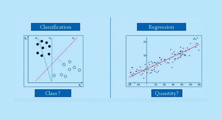
A very apt diagrammatic differentiation between the two types of supervised learning techniques can be seen in Figure 2b.
Regression technique
In case of supervised learning, the major concept is to baseline the prediction on the basis of labelled data and the target variable, which is of continuous nature. Supervised learning is differentiated between classification and regression. In the case of categorical data, we use different classification techniques, while in this example, we will focus on multiple linear regression. This is defined as a statistical technique used to predict the outcome of a response variable through several explanatory variables and model the relationships between them.
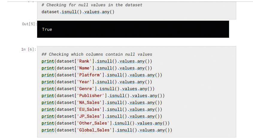
As part of the detailed implementation phase, we will start with data preparation and cleansing to remove biases and errors. We will use Python techniques to remove the null values in the data set. The Python pandas dataframe library has methods to help data cleansing as shown below. This method will remove the null values in the data set:
# Removing the missing value rows in the dataset
dataset = dataset.dropna(axis=0, subset=['Year','Publisher'])
dataset.isnull().values.any()
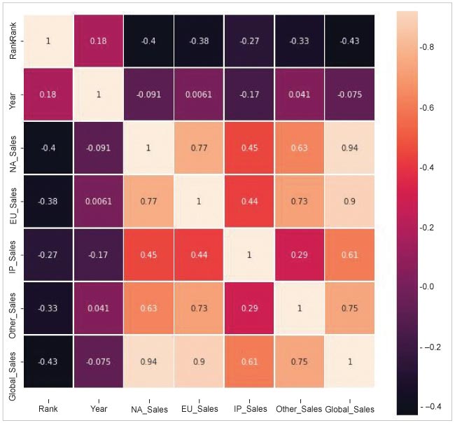
We will now derive the dependent and independent variables out of different attributes in the columns. Our prime goal is to review the relationship between independent and dependent variables, denoted by x and y, respectively. This can be achieved by using the heat map technique to derive the correlation between different features, and evaluate the result to calculate the outcome of the variables. The statistical method heat map is a great technique used to visualise the correlation matrix of data for feature selection to solve business problems. We can see from the heat map in Figure 4 that dependent features like NA_Sales, JP_Sales, EU_Sales and Other_Sales are more contextual and relevant for the analysis.
Now, as the correlated feature set, which impacts the main analysis, is identified, we will focus on the actual algorithm and model selection, which may run in multiple iterations.
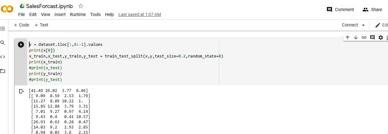
Generally, we split the actual data set into a train, test it in an 80:20 ratio and iteratively run the different regression techniques. The train:test split can be easily executed with the Python library sklearn, as shown below:
#from sklearn.model_selection import train_test_split
x_train,x_test,y_train,y_test = train_test_split(x,y,test_size=0.2,random_state=0)
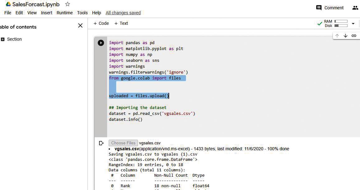
Figure 5 shows the Google Colab screenshot, where we have uploaded the data set csv file from the local drive and executed it. We can see on the top right corner the allocated disk and RAM for executing the Python codebase below, while the highlighted section provides a method to choose the file through a browser pop-up to upload the data file vgsales.csv from Kaggle.
We are now in the ultimate phase of executing the algorithm, which is readily available from the Python sklearn library to train the model with the training data set for multiple linear regression. You can see the standard package for it, imported from the sklearn library:
from sklearn.linear_model import LinearRegression
regressor_MultiLinear = LinearRegression()
regressor_MultiLinear.fit(x_train,y_train)
Once the model is trained, we will predict the actual test results and r2 coefficient, which is an effective way to find and compare the accuracy while applying various techniques of regression. The best possible score is 1.0, and it can be negative if the model selected is arbitrarily worse. The standard definition of the r2 score in statistics is the proportion of the variance in the dependent variable that is predictable from the independent variable(s).
## Predicting test results
y_pred = regressor_MultiLinear.predict(x_test)
# Calculating r2 score
from sklearn.metrics import r2_score
r2_MultiLinear = r2_score(y_test,y_pred)
print(r2_MultiLinear)
There are several standard models associated with the regression technique like polynomial regression, XGBoost, decision tree, K-Nearest neighbour regression, random forest regression, linear support vector regression, non-linear support vector, etc.
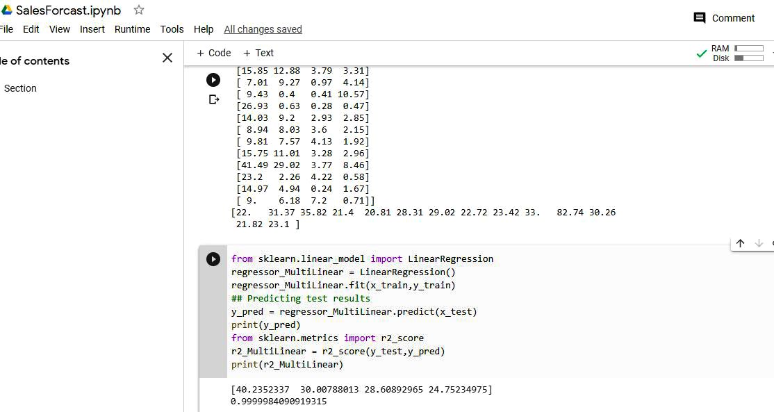
The real scenario should capture the r2 score of many of these different regression techniques for the final model selection for prediction.
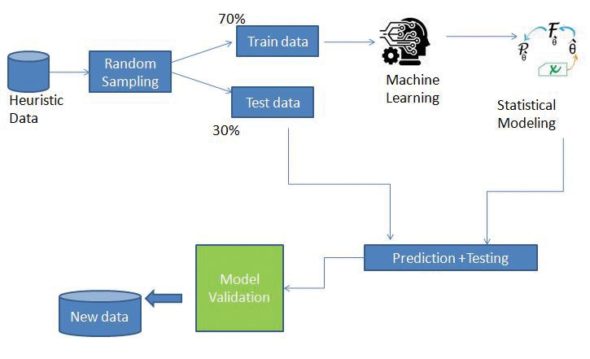
The above technique falls in the category of supervised learning based on a continuous data set, and is a widely accepted process for recommendation, ranking, prediction, etc, for large heuristic data sets. In fact, you could go through the same in Google Colab with the given data set to apply various models and compare the r2 score, in order to gauge the accuracy of the model to be selected for the test data. Figure 7 gives the flowchart for the execution of a typical ML pipeline 70/30 distribution in a training test split.


