
Android developers and DIY enthusiasts can use fancy text in their apps and games. In Android, text is not a matter of just typing it in and applying styles to it. It is an involved procedure that uses TextView, which contains Spans as classes. Read on to discover the magic of creating attractive text in Android.
Text is probably the most common thing in any app. There could hardly be an app without any text in it, and the easiest way to display text in Android is to use TextView from the Android framework. Most people might think that TextView is a pretty easy and lightweight widget, because it only draws text. And that it is probably just canvas.drawText() with some customisation for text like underline and bold. But it is a lot more complex than that. When we looked at the code of TextView, we found that it consists of more than 10,000 lines of code.
The packages that TextView primarily depends on to get things done contain the package android.text.style. Now, if you look at the classes or interfaces contained in this package, these are mostly Spans, which are used to attach mark-up or styling information to a piece of text. There are two main direct implementations of Span—Spanned and Spannable. Spanned is immutable and Spannable is mutable; otherwise, they mostly provide the same functionalities. The Spanned interface implements CharSequence, so you can set it to TextView with the setText method. During our regular development flow, we don’t really deal with CharSequences but mostly work with Strings and StringBuilders. To help with that, the framework provides SpannableString and SpannableStringBuilder, both of which behave similar to String and StringBuilder, respectively, and also know how to handle Spans inside a String.
Now before going into building our own Spans and applying them for our custom styles, let’s look at the Spans that the framework provides. These are AbsoluteSizeSpan, BackgroundcolourSpan, ClickableSpan and LocaleSpan, just to name a few. The framework provides us with a huge variety of Spans to style text. Let’s talk about some of the most common ones which can help deal with text in day-to-day development workflows.
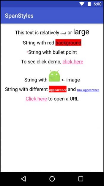
Figure 1 shows how the demo will look after we have done all the work. We will explain all the Spans according to the order shown in Figure 1. You can find the link to the source code of the demo application in the References section of the article.
RelativeSizeSpan
First, we’re going to talk about one of the easiest Spans, which is RelativeSizeSpan. It is used to resize the text size relative to its current size. We will make a SpannableString with the text and then apply Spans to the specific range of characters in the string. This will be our regular pattern for applying Spans to our text in this article.
SpannableString relative = new SpannableString(“This text is relatively small or large”);
relative.setSpan(new RelativeSizeSpan(1.5f), relative.length() - 5, relative.length(), 0);
relative.setSpan(new RelativeSizeSpan(0.5f), relative.length() - 14, relative.length() - 9,
0);
textView.setText(relative);
First, we create a SpannableString with the content. We then apply Spans with the method SpannableString.setSpan(). The first parameter in the method is the object of the type of Span that we want to apply; so we create a RelativeSizeSpan there. The parameter in the constructor of RelativeSizeSpan is the proportion or the multiplier.
For instance, passing 0.5 there would make the text half the size and passing 2 would make the text twice as big. The next two parameters in the setSpan method are the start and end of Span in the string. The last parameter is flag, which does not concern us now, so we will pass 0. This is how we can make text relatively small or big in a single TextView. If you want to apply some absolute size to your text, you can use AbsoluteSizeSpan, which applies the size to the text as absolute values.
BackgroundcolourSpan
This Span is used to apply a background colour to a piece of text. You ought to notice that we have used the term ‘background colour’, which means it only accepts a colour and not any other form of background such as Drawables. Now to apply this type of Span, use the following code:
SpannableString colour = new SpannableString("String with red background");
colour.setSpan(new BackgroundcolourSpan(colour.RED), colour.length() - "background".length(),
       colour.length(), 0);
textView.setText(colour);
The parameter in the constructor of BackgroundcolourSpan is the colour you want as the background; the other parameters behave the same as explained earlier.
BulletSpan
BulletSpan can be used to apply bullet points to your strings. The usage is the same as in other Spans with one caveat. Let’s look at the usage first.
SpannableString bullet = new SpannableString(“String with bullet point”);
bullet.setSpan(new BulletSpan(5, colour.RED), 0, bullet.length(), 0);
textView.setText(bullet);
The first parameter in the constructor of BulletSpan is the gap between the content and the bullet, and the other is the colour of the bullet. The caveat here is that in order to make BulletSpan draw a bullet point, it must be applied to the start of our string; otherwise, it won’t draw the bullet.
Let’s move on to some more interactive Spans.
ClickableSpan
ClickableSpan lets us make a certain part of the text clickable. It gives us the click event in an abstract method, onClick, that we need to implement. Let’s see how we can apply it.
SpannableString clickable = new SpannableString(“To see click demo, click here”);
clickable.setSpan(new ClickableSpan() {
   @Override
   public void onClick(View widget) {
       Toast.makeText(widget.getContext(), “You just clicked there”, Toast.LENGTH_LONG)
               .show();
   }
}, clickable.length() - “click here”.length(), clickable.length(), 0);
textView.setText(clickable);
Here, we can see that we pass in an object of the abstract class ClickableSpan and implement the onClick method, which just makes a Toast to notify the click event. This might seem OK, but if you run the application and try to click on the link you just created, it will do nothing. This is because we explicitly need to tell TextView that the text may contain links. We do that by setting an object of the LinkMovementMethod in TextView.
textView.setMovementMethod(new LinkMovementMethod());
Now when you click on the link, it will show you a Toast.
ImageSpan
This Span is an interesting one, because we may end up in a situation where we need to show some kind of image in between our text. Now, what a novice Android developer would probably do is take an ImageView between two TextViews, as anyone who doesn’t know anything about Spans would do. ImageSpan solves this problem by allowing us to put any Drawable or Bitmap in between the text.
SpannableString image = new SpannableString(“String with <- image”);
int start = image.length() - “ <- image”.length();
image.setSpan(new ImageSpan(this, R.mipmap.ic_launcher), start, start+1, 0);
textView.setText(image);
Although it is quite easy to set the Span, we need to be careful here, because the image could just be drawn over all the text we have in that Span. We need to be sure that we are not applying the Span over any text, unless it is intentional.
TextAppearanceSpan
The example we have shown you in Figure 1 is a bit complex because it uses more than one span to achieve that effect. But we will talk about TextAppearanceSpan only. You can see the other code and follow it on your own as an exercise to know what it does.
TextAppearanceSpan can be created in two ways. One is to construct the object from a style in your project, and the other is to manually provide values in the constructor. The code is as follows:
SpannableString appearance = new SpannableString(“String with different appearance and link appearance”);
appearance.setSpan(new TextAppearanceSpan(“serif”, 0, 30,
       colourStateList.valueOf(colour.WHITE), colourStateList.valueOf(colour.BLUE)), 22,
       32, 0);
appearance.setSpan(new BackgroundcolourSpan(colour.RED), 22, 32, 0);
appearance.setSpan(new TextAppearanceSpan(“serif”, 0, 30,
               colourStateList.valueOf(colour.WHITE), colourStateList.valueOf(colour.BLUE)),
       37, appearance.length(), 0);
appearance.setSpan(new ClickableSpan() {
   @Override
   public void onClick(View widget) {
       Toast.makeText(widget.getContext(), “That is a link”, Toast.LENGTH_SHORT).show();
   }
}, appearance.length() - “link appearance”.length(), appearance.length(), 0);
textView.setMovementMethod(new LinkMovementMethod());
textView.setText(appearance);
We have manually provided values to the TextAppearanceSpan here. The first parameter in the constructor is the font-family—it must be one of sans-serif, serif or monospace. Next is the style of font—we have passed 0 here, but you can pass any style constant from the Typeface class such as Typeface.BOLD or Typeface.BOLD_ITALIC. Next is the size of the font. Keep in mind that this is the absolute size. The next parameter is the colorStateList for the colour of the text. For those who do not know about colorStateList, it is a StateList which changes colour according to the state of the widget such as whether it is pressed or focused. We want the same colour for all the states, so we use the convenient static method in the class to construct a colorStateList with only one colour. The fourth and last parameter is the same as the third parameter—it is a colorStateList. But it is applied only on the links inside the text.
URLSpan
URLSpan is an implementation of ClickableSpan, which opens the provided link upon clicking in the Span.
SpannableString url = new SpannableString(“Click here to open a URL”);
url.setSpan(new URLSpan(“http://www.samvidinfotech.in”), 0, “click here”.length(), 0);
textView.setMovementMethod(new LinkMovementMethod());
textView.setText(url);
The only parameter URLSpan requires is the link to open when clicked. And you should not forget to set the movement method for LinkMovementMethod; otherwise, it won’t work.
Creating your own Spans
You may have noticed that the first parameter in the setSpan method takes in an object. Anything can be provided as a Span there and it will work. Spans in the framework are generally divided into two categories—the ones extending CharacterStyle and those implementing ParagraphStyle. CharacterStyle Spans affect the text of the Span at the character level, such as changing the text colour, whereas ParagraphStyle Spans affect the text more at the block level. These affect the paragraph, such as providing a leading margin on the first line of a paragraph.
You aren’t supposed to extend or implement these basic Spans, but you can extend or implement one of the Spans that provide you more control over how the text is drawn, such as ReplacementSpan when you need absolute control over the drawing of text. We are not going to get into details but here is a simple class which draws a border around the text on which it is applied. Use this as a reference and dig a bit deeper into the topic to get the exact custom style you or your designer wants.
public class TextBorderSpan implements LineBackgroundSpan {
   private Path mPath;

   @Override
   public void drawBackground(Canvas canvas, Paint paint, int left, int right, int top, int baseline, int bottom, CharSequence charSequence, int start, int end, int lnum) {
       if(mPath == null) {
           mPath = new Path();
           mPath.setLastPoint(left, top);
           mPath.lineTo(right, top);
           mPath.lineTo(right, bottom);
           mPath.lineTo(left, bottom);
           mPath.lineTo(left, top);
       }

       Paint.Style oldStyle = paint.getStyle();
       float oldStroke = paint.getStrokeWidth();
       paint.setStrokeWidth(3);
       paint.setStyle(Paint.Style.STROKE);
       canvas.drawPath(mPath, paint);
       paint.setStrokeWidth(oldStroke);
       paint.setStyle(oldStyle);
   }
}
You may take the above class as a reference on achieving more control over how text or any of its properties are drawn on screen. We have covered many of the most common text Spans here but there are many other useful Spans that can help you implement your custom effects such as SubscriptSpan, UnderlineSpan and TypefaceSpan. You are advised to explore the android.text.style package for more information on these Spans. We would like to point out that many of the classes and interfaces in the package do not provide good documentation and some do not provide any documentation at all; so you may need to learn some effects by trial and error.


