 Moving on down the invention lane, let’s create a simple Android application that calculates the tip we should give at a restaurant. Do have fun trying it out.
I hope that all of you are busy in developing creative Android apps, and doing the job well too. If you have uploaded any of your applications on to the Google Play Store, please share your links with me. On our journey so far, we have explored the various components and features of a smartphone. We can proudly say that we have mastered certain aspects like the components available for use in the palette, and found out that playing between the designer and block editor is so much fun.
In our Android app development journey, we have covered all those basic to complex applications that are essential for daily use. Now, let’s develop a simple yet useful Android application. Leaving a tip is a tradition followed when we visit restaurants. With this app, we will calculate the amount of the tip.
Theme of the application
The theme is pretty simple—we will calculate the total bill at the restaurant by adding a percentage of the bill as the tip. We will have input boxes for the bill amount and tip percentage; then at the click of a button, we will get the total bill again, including the tip amount.
GUI requirements
For every application, we have a graphical user interface or GUI, which helps the user to interact with the on-screen components. How each component responds to user actions is defined in the block editor section.
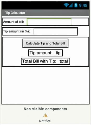
GUI requirements for Screen1
1. Label: Labels are static text components that are used to display some headings or markings on the screen.
2. Button: A button will let you trigger the event and is a very essential component.
3. Horizontal arrangement: This is a special component, which keeps all child components horizontally aligned within it.
4. Notifier: A notifier is used to display some instructions or give users control over their existing components. You will see its functionality in more detail when we implement it in the app.
5. Text box: Text boxes are interactive components and are used to take user inputs. In our case, we need to input the bill amount and tip percentage to calculate the final sum.
 The components that we require for this application are given in Table 1. We will drag them on to the designer from the left hand side palette.
1. Drag and drop the components mentioned in Table 1 to the viewer.
2. Visible components can be seen by you while the non-visible components will be located beneath the viewer under the tag ‘Non-visible’.
3. Change the title of Screen1 to the name of the application.
4. Label and text boxes will be aligned using horizontal arrangements.
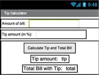
5. If you have dragged and placed everything, the layout will look something like what’s shown in Figure 1.
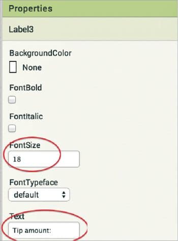
6. Make the necessary property changes like we did when changing the text property for the label and button components (Figure 2).
7. Renaming the components helps to identify them in the block editor.
8. Your graphical user interface is ready. Figure 3 shows exactly what the application will look like after the installation.
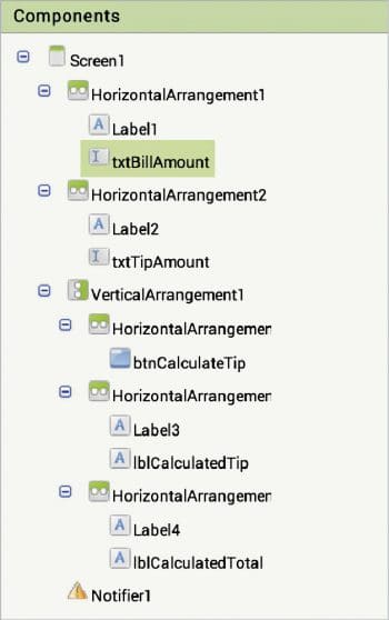
9. The hierarchy of the components that we have dragged to the designer is shown in Figure 4.
If you are confused by the designer and the components viewer, let me explain things a bit more. Here is the hierarchy that we have placed for our application.
- At the top, we have the title for the application. It can be set by changing the text property of the screen.
- Next, we have the horizontal arrangement, which holds a label and text box as child elements. This text box will be used to get the bill amount from the user.
- In the next series, we have another label and text box components — this second text box will be used to get the percentage (%) value of the tip.
- Below these we have a button which, upon clicking, will calculate the tip value and add it to the bill, to give the final bill amount.
- The labels placed next will display the tip and total bill amount separately.
Now, let’s head towards the block editor to define the behaviour. Let’s discuss the actual functionality that we are expecting from the application.
- First, the user will enter the bill amount.
- Using the second text box, the user will input the percentage (%) of the tip applicable for the service.
- Upon clicking the button, the user should get the tip and total bill amount.
- We will check for any invalid inputs in the text fields.
So let’s move on and add these features using the block editor. I hope you remember how to switch from the designer to the block editor. There is a button available right above the Properties pane to do so.
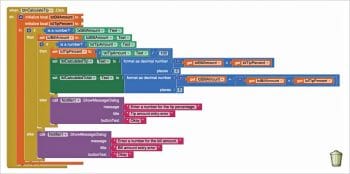
Block editor blocks: I have already prepared the blocks for you. All you need to do is drag the relevant ones from the left side palette and drop them on the viewer. Arrange the blocks in the same way as shown in Figure 5. I will explain what each one does and how it is called.
- We have initialised two variables, namely, IclBillAmount and IclTipPercent; when the button is
clicked, the click block of the button will be called. - First, we will check whether the entries made are only numerical as we can’t make calculations on text values.
- If the inputs entered are invalid, we will display a suitable error message using the notifier so that users can correct it accordingly.
- Next, we will calculate the tip amount mathematically.
- Adding the tip amount to the initial bill will give you the total amount payable.
Now, you are done with the block editor too. Next, we will move to download and install the app on your phone to check how it is working.
Packaging and testing
To test the app, you need to get it on your phone. First, you have to download the application to your computer and then move it to your phone via Bluetooth or USB cable. I’ll tell you how to download it.
1. On the top row, click on the ‘Build’ button. It will show you the option to download the apk to your computer.
2. Downloading will show the progress and, after a successful download, the application will be placed to the download folder of your directory or the location you selected for it.
3. Now you need to get this apk file to your mobile phone either via Bluetooth or USB cable. Once you have placed the apk file to your SD card, you need to install it. Follow the on-screen instructions to install it. You might get some notification or warning saying Install from un-trusted source. Allow this from the settings and after successful installation, you will see the icon of your application in the menu of your mobile. Here, you will see the default icon, which can be changed
and we will tell you how to do this as we move ahead.
I hope your application is working exactly according to the requirements you have given. Now, depending upon your usability and customisation, you can change various things like the image, sound and behaviour.
Debugging the application
We have just created the prototype of the application with very basic functionality, but what else would the user expect of it? Let’s look at various use cases that your app should be able to operate under—this will require serious thought so as not to annoy the user. Consider the following cases:
- Can we make a record of the calculations using the database component?
- Can we share the calculations we have made using the sharing component?
These are some of the scenarios that might occur, and users of your app will be pretty happy to see them implemented.
Think through all these scenarios and explore ways in which you can integrate them into the application. Do ask me if your app fails to operate well in any of the above cases.


