


The COVID-19 pandemic has taken the world by storm. Every nation on earth has joined the fight against this vicious virus, and every little contribution matters. The Internet has also provided the means to effectively use statistical and analytic tools to study the disease and its spread, thereby helping us to understand the implications of the pandemic. Data analysis is an effective tool to study the spread of the virus. This article outlines how to analyse COVID-19 data using R.
Data analysis helps us to understand complex data, identify the trends of data growth, and predict values for some distant points. Exploration of data provides the means to identify the pattern of its distribution and to discover its statistical model. As COVID-19 data is available on many reliable websites, it is possible to explore it for different statistical data analyses and modelling.
The objective of this article is to give readers an idea of data analysis on use cases. Interested readers can initiate exploratory analysis on this data for further understanding and thereby contribute to the welfare of human beings during this pandemic.
Data acquisition
There are many well documented and organised COVID-19 data repositories. For instance, the GitHub repository of Johns Hopkins University Centre for Systems Science and Engineering (JHUCSSE) is highly reliable and easily accessible. From the URL, one can collect the latest data on the worldwide spread of COVID-19. Readers can download or read the data directly from the URL.
library(data.table) df <- fread("https://raw.githubusercontent.com/CSSEGISandData/COVID-19/master/csse_covid_19_data/csse_covid_19_time_series/time_series_covid19_confirmed_global.csv")
df <- data.frame(df,header=TRUE,stringsAsFactors=FALSE)
Preprocessing
Preprocessing of the acquired data is an essential step of data analysis. Proper processing helps us to organise data efficiently and reduces the chances of errors in the final exercise. Preprocessing also makes the data complete by filling in the missing data and removing odd values.
Here we shall check the data for NA and fill in the blank Province.State fields with Country.Region values. As it is a huge data set, we shall demonstrate the analysis on some selective countries, namely, China, India, Pakistan and Iran.
library(dplyr)
df$Province.State <- sub("^$", NA, df$Province.State)
df <- transform(df, Province.State = ifelse(Province.State=="" | is.na(Province.State), Country.Region, Province.State))
#Replace all fields with 0 if the value is NA
df <- df %>% replace(.=="NA", 0) # replace with 0
df <- df[with(df, Country.Region %in% c("China","India","Pakistan","Iran")),]
Analysis
Country-wise infection count: The data set contains the state-wise infection count of some countries. To have a country-wise count of infection on each date, it is necessary to make a group of all the states of a country. This can be done in different ways.
Here I have used the aggregate() function to perform this group-wise summation, as shown below:
dfCountryGroupSum <- aggregate(df[,c(5:ncol(df))],by=list(Category=df$Country.Region),FUN=sum)
>head(dfCountryGroupSum[dfCountryGroupSum$Category=="China" ,c(1:5)])
# Category X1.22.2020 X1.23.2020 X1.24.2020 X1.25.2020
#28 China 548 643 920 1406
>dfCountryGroupSum[dfCountryGroupSum$Category=="China" | dfCountryGroupSum$Category=="India",c(1:10)]
Category X1.22.20 X1.23.20 X1.24.20 X1.25.20 X1.26.20 X1.27.20 X1.28.20 X1.29.20 X1.30.20
37 China 548 643 920 1406 2075 2877 5509 6087 8141
80 India 0 0 0 0 0 0 0 0 1
> head(dfCountryGroupSum[dfCountryGroupSum$Category %in% c("China","India"),c(1:5)])
#28 China 548 643 920 1406
#63 India 0 0 0 0
The aggregated result is stored in a dataframe variable dfCountryGroupSum, and displayed with dataframe indexing with the corresponding variables and logical filtering.
Aggregate of total infection of each country: To get the aggregate of infection in each country, it is necessary to add all the date-wise infection counts. This is implemented here with apply(). The sum() function is mapped to each row from the second column to the last column of dataframe dfCountryGroupSum.
>dfCountryGroupSum$Total <- apply(dfCountryGroupSum[,c(2:ncol(dfCountryGroupSum))],1,sum,na.omit=T)
> head(dfCountryGroupSum[with(dfCountryGroupSum, Category %in% c("China","India")),c(1,ncol(dfCountryGroupSum))])
Category Total
1 China 15452689
2 India 69692867
>View(dfCountryGroupSum)
Graphical representation
To have a better view of the analysis, it is always desirable to depict the analytical outcomes in graphical forms.
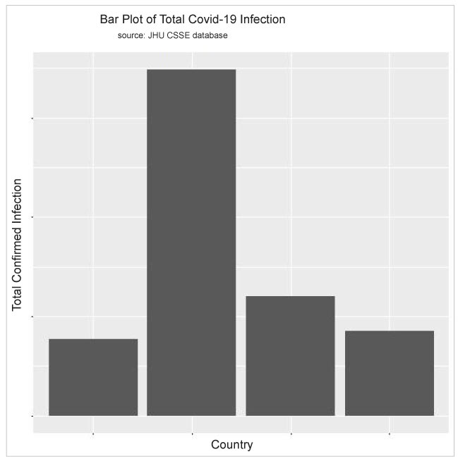
Using the code below, I can display the exploratory data analysis results in histograms so that a visual comparative study can be done for the data.
>names(dfCountryGroupSum)[1]<-c("Country")
>TotConfirmedCase <- dfCountryGroupSum[,c(1,ncol(dfCountryGroupSum))]
>View(TotConfirmedCase)
>p<-ggplot(TotConfirmedCase, aes(x=Country,y=log(TotCase))) +
geom_bar(stat="identity")
> p
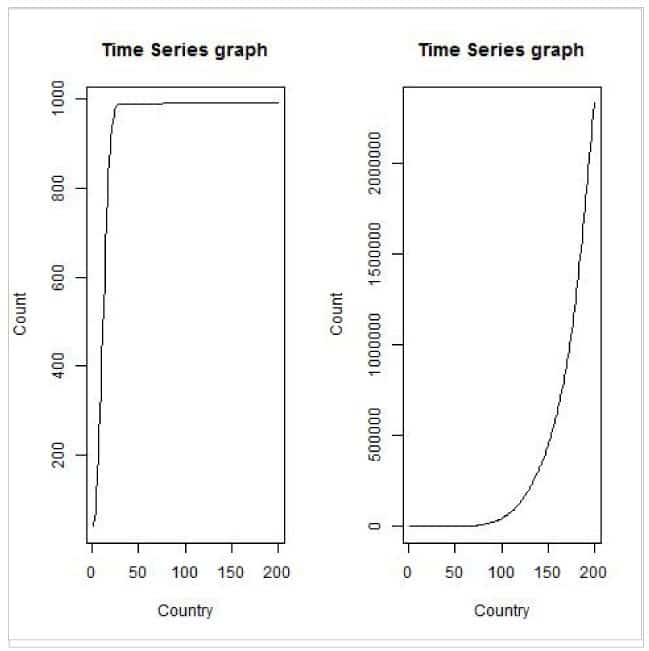
Trend analysis
Trend analysis is important for future projections. As the acquired data contains sufficient reliable day-wise information of confirmed infection cases, we can perform trend analysis using a time series.
For simplicity, I shall demonstrate the time series analysis on some selected records only.
>daterange <- colnames(df[,c(5:ncol(df))])
>countrynames <- df$Country.Region
>tdf <- data.frame(t(df),stringsAsFactors=FALSE)
Eliminate Province.State
>tdf <- tdf[c(-1),]
>rownames(tdf) <- daterange
>colnames(tdf) <- countrynames
>tdf$cdate <- as.Date(seq(as.Date("2020/1/22"), by = "day",length.out=nrow(tdf)),format = "%d/%b/%Y-%u")
>class(tdf$cdate)
>tstdf <- ts(tdf$China,frequency=365, start=as.POSIXct(as.Date("2020/1/22")))
>plot.ts(tstdf, xlab="Country", ylab="Count", main="Time Series graph")
>tstdf <- ts(tdf$India,frequency=365, start=as.POSIXct(as.Date("2020/1/22")))
>plot.ts(tstdf, xlab="Country", ylab="Count", main="Time Series graph")
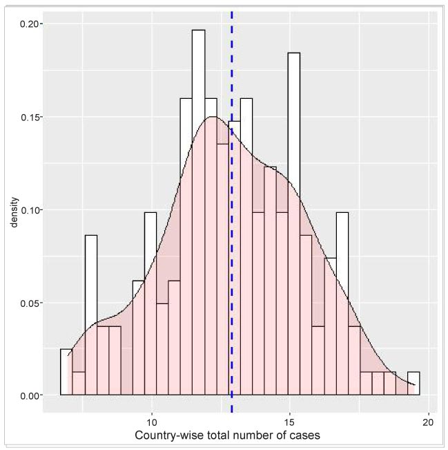
Density distribution plot
Visualization of a variable depends on its type and corresponding graphical tools. For the variable ‘country’ I have already used a bar plot, so as to show the total infection of each category. To visualise the distribution of the total infections of each country, I can use a histogram and density plot using the ggplot() function.
Unlike the bar and trend analysis, here I have considered all the countries to have a better depiction of the density distribution. As mentioned above, the data is initially collected and filtered. The country-wise infection count is then done on country-wise group data. Finally, the geom_histogram() and genom_density() functions of ggplot are used for the histogram and density plot.
The density plot is overlaid on the histogram for a better understanding of the distribution. Moreover, a vertical line indicating the mean value is also shown.
#Preprocessing
>library(data.table)
> df <- fread("https://raw.githubusercontent.com/CSSEGISandData/COVID-19/master/csse_covid_19_data/csse_covid_19_time_series/time_series_covid19_confirmed_global.csv")
>df <- data.frame(df, stringsAsFactors=FALSE)
>library(dplyr)
>df$Province.State <- sub("^$", NA, df$Province.State)
>df <- transform(df, Province.State = ifelse(Province.State=="" | is.na(Province.State), Country.Region, Province.State))
#Replace all fields with 0 if the value is NA
df <- df %>% replace(.=="NA", 0) # replace with 0
>dfCountryGroupSum <- aggregate(df[,c(5:ncol(df))],by=list(Category=df$Country.Region),FUN=sum)
>dfCountryGroupSum$Total <-
>apply(dfCountryGroupSum[,c(2:ncol(dfCountryGroupSum))],1,sum,na.omit=T)
>names(dfCountryGroupSum)[1]<-c("Country")
>TotConfirmedCase <- dfCountryGroupSum[,c(1,ncol(dfCountryGroupSum))]
>names(TotConfirmedCase)[2] <- c("TotCase")
>p<-ggplot(TotConfirmedCase, aes(x=log(TotCase))) +
geom_histogram(aes(y=..density..), colour="black", fill="white")+
geom_density(alpha=.2, fill="#FF6666") +
geom_vline(aes(xintercept=mean(log(TotCase))),
color="blue", linetype="dashed", size=1)+
xlab("Country wise total Number of Case")
>p
The coronavirus pandemic has opened up many options for different types of activities. Highly reliable structured data pertaining to the COVID-19 virus, data on treatment and spread of the pandemic, and so on are readily available on the Internet. Different communities are using this data to study and contribute to the worldwide effort to conquer the virus infection.
Here, I have shown the process of data acquisition and an outline of data analysis with R. I hope readers can explore various methods and use the knowledge in their own field of interest to contribute to the present war against the pandemic.


