


In the last article in this series on AI and machine learning, we learned to use Anaconda. We also tried to strengthen our knowledge of probability, a task we will continue in this article. We will discuss seaborn and Keras, and further explore Pandas and TensorFlow in this sixth article in the AI series.
Let us begin by increasing our theoretical knowledge of AI and machine learning. We all know that AI, machine learning, data science, deep learning, etc, are the trending topics in computer science today. However, there are other topics trending in this domain too such as blockchain, IoT (Internet of Things), quantum computing, etc. So do the advances in the field of AI affect any of these technologies in a positive way?
First, let us discuss blockchain. According to Wikipedia, “A blockchain is a type of distributed ledger technology that consists of a growing list of records, called blocks, that are securely linked together using cryptography.” At a casual glance it looks as if AI and blockchain are two independent technologies advancing at a very high pace at the same time in history. But surprisingly, this is not the case. The buzzword associated with blockchain is integrity and the buzzword associated with AI is data. We give massive amounts of data to AI based applications to process. Though the results produced by many of these applications are stunning, how do we trust them? This raises the need for explainable AI, which can give certain guarantees so that end users can trust the results provided by AI based applications. Many experts believe that blockchain technologies can be used to increase the trustworthiness of decisions made by AI based software. On the other hand, smart contracts (which are part of blockchain technology) can benefit from AI based verification. Notice that, in essence, smart contracts and AI often lead to decision making. Thus, we can safely conclude that the advances in AI will positively affect blockchain technology and vice versa.
Now, let us discuss how AI and IoT impact each other. In the earlier days, IoT devices often did not have large processing power or battery backup. This made the deployment of machine learning based software, which requires large processing power, infeasible in many IoT devices. At that point in time, only rule-based AI software was being deployed in most IoT devices. The advantage with rule-based AI is that it is simple and requires relatively less processing power. However, nowadays, IoT devices are equipped with more processing power and can run powerful machine learning software. The advanced driver-assistance system developed by Tesla, called Tesla Autopilot, is an excellent example for the blending of IoT and AI. Thus, here again, AI and IoT are positively affecting each other’s development.
Finally, let us try to understand how AI and quantum computing are impacting each other. Even though quantum computing is still in its infancy, quantum machine learning (QML) is taken very seriously. Quantum machine learning is based on two concepts: quantum data and hybrid quantum-classical models. Quantum data is the data generated by a quantum computer. Quantum neural networks (QNNs) are used to model quantum computational models. A powerful tool for developing quantum computational models is TensorFlow Quantum, a library for hybrid quantum-classical machine learning. The presence of this and many other tools indicates that more and more quantum computing based AI solutions will be available in the near future.
Introduction to seaborn
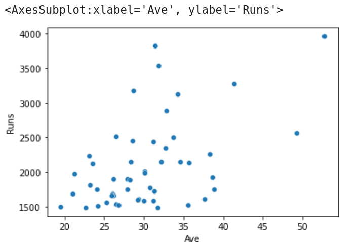
Now let us learn to use seaborn. Seaborn is a Python data visualisation library based on Matplotlib. It provides functions for drawing visually appealing statistical images. Seaborn can be installed easily by using Anaconda Navigator, as explained in the previous article in this series. I have used the batting records in T20 international cricket from the website ESPNcricinfo to create a CSV (comma-separated values) file called T20.csv, which contains the following 15 columns: Player name, Career span, Matches, Innings, Not out, Total runs, Highest score, Average, Balls faced, Strike rate, Centuries, Fifties, Ducks, Number of 4s scored, and Number of 6s scored. We will use the library called Pandas to read this CSV file. Remember that we have already familiarised ourselves with Pandas. Now, consider the program shown in Figure 1.

Let us try to understand the working of the program. Lines 1 and 2 import the packages Pandas and seaborn. Line 3 reads the CSV file called T20.csv from the working directory of JupyterLab. Line 4 prints the metadata and the first line of data. Figure 1 shows this line, which displays the batting record of Virat Kohli, the highest run scorer in T20 international cricket matches. Line 5 stores the metadata and the first five rows of data in the CSV file T20.csv to another CSV file called Best5.csv. On execution of the code, you will see this file created in the working directory of JupyterLab. Line 6 sorts the CSV file in ascending order based on the column ‘100’ (which contains the number of centuries scored by each batsman) and stores the details of the top 10 century scorers into a CSV file called Highest100.csv. This file will also be stored in the working directory of JupyterLab. Finally, Line 7 extracts details of columns 5 and 7 (total runs scored and average, respectively) and generates a scatter plot. Figure 2 shows this scatter plot generated by the program on execution.
Now add the following line of code at the end of the program and run it again.
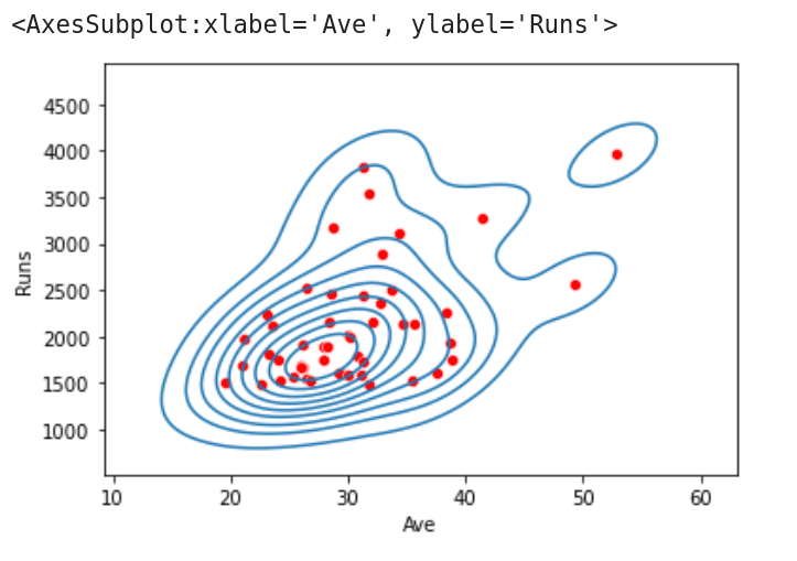
sns.kdeplot(data=df.iloc[:, [5, 7]].head(50), x=’Ave’, y=’Runs’)
This draws a KDE plot, in addition to the scatter plot, of the data obtained from columns 5 and 7. The function kdeplot( ) gives a Kernel Distribution Estimation Plot, which depicts the probability density function of the continuous or non-parametric data variables. This definition may not give you any idea about the actual operation that will be performed by the function kdeplot( ). Figure 3 shows the KDE plot and scatter plot being drawn on a single image. From this figure, we can observe that data points drawn by the scatter plot are grouped into clusters by the KDE plot. Notice that there are a lot of other plotting functions also provided by seaborn. In the program we have discussed now, replace Line 7 with the lines of code (one line at a time) shown below, and execute the program again. You will see plots with varying styles. Explore the other plotting functions offered by seaborn and choose the one that suits your need the most.
sns.histplot(data=df.iloc[:, [5, 7]].head(50), x=’Ave’, y=’Runs’)

sns.rugplot(data=df.iloc[:, [5, 7]].head(50), x=’Ave’, y=’Runs’)
More on probability
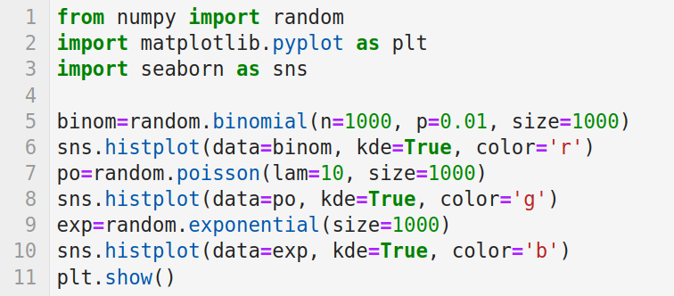
Now, let us learn some more topics in probability. In one of the previous articles in this series, we saw how a normal distribution can be used to model real world scenarios. But normal distribution is just one among the many important probability distributions. Consider the program shown in Figure 4, which plots three probability distributions.
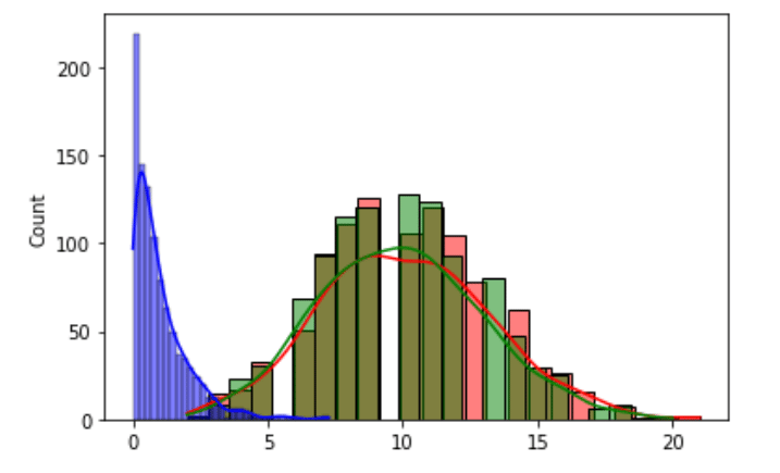
Now, let us try to understand the program. Line 1 imports the random module of NumPy. Lines 2 and 3 import libraries Matplotlib and seaborn for plotting. Line 5 generates a binomial distribution with parameters n (number of trials) and p (probability of success).
Binomial distribution is a discrete probability distribution, which gives the number of successes in a sequence of n independent experiments. The third parameter called size decides the shape of the output. Line 6 plots the histogram of the data generated. Notice that a KDE plot is also plotted because the parameter kde is set as true. The third parameter colour decides the colour of the plot, which in this case is red (‘r’). Line 7 generates a Poisson distribution (named after the French mathematician Siméon Denis Poisson). The Poisson distribution is a discrete probability distribution which gives the limit of the binomial distribution. The parameter lam sets the expected number of events occurring in a fixed-time interval. Here also the parameter size decides the shape of the output. Line 8 plots the data generated as a histogram in green. Line 9 generates an exponential distribution with a size of 1000. Line 10 plots the data generated as a histogram in blue. Finally, Line 11 displays all the plots generated. Figure 5 shows the three probability distributions plotted on execution of the program. The random module of NumPy offers a large number of other probability distributions like Dirichlet distribution, Gamma distribution, geometric distribution, Laplace distribution, etc. It would be really rewarding if you could work and get familiarised with more of them.
Now, let us learn about linear regression. Linear regression analysis can be used to predict the value of a variable based on the value of another variable. One of the important applications of linear regression is data fitting. Linear regression is very important because of its simplicity. The supervised learning paradigm of machine learning is actually another name for regression modelling. Thus, linear regression can be considered as an important machine learning strategy. This learning paradigm is often called statistical learning by statisticians. Both NumPy and SciPy offer functions for performing linear regression. Since linear regression is an important operation in machine learning, we will see examples involving both NumPy and SciPy. Now, consider the program shown in Figure 6.
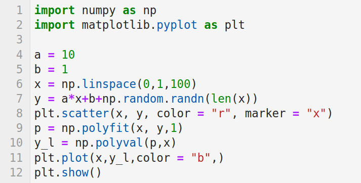
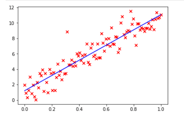
The program uses NumPy to perform linear regression. First, let us try to understand the working of this program. Lines 1 and 2 import NumPy and Matplotlib. Lines 4 and 5 initialise the variables a and b for data generation. Line 6 uses the function linspace( ) to generate evenly spaced numbers over the specified interval of 0 and 1. In this case 100 such numbers are generated. Line 7 generates values in the array y by using the values in the array x. The function randn( ) returns samples from the standard normal distribution. These values, together with the values provided by the variables a, b, and array x, are used to generate the values in the array y. Line 8 generates a scatter plot by using the values in the arrays x and y. Figure 7 shows this scatter plot. The hundred data points are marked in red. Line 9 uses the function polyfit( ) to perform a least squares polynomial fit. It is one of the techniques used to perform linear regression. The function polyfit( ) takes for processing the arrays x and y, and a third parameter (in this case 1), which denotes the degree of the fitting polynomial. The function then returns the polynomial coefficients and they are stored in the array p. Line 10 uses the function polyval( ), which evaluates a polynomial at specific values. These values are stored in the array y_l. Line 11 plots the regression line in blue (Figure 7). Finally, Line 12 displays all the plots. This regression line can be used for making predictions about the possible (x, y) data pairs.
Now, let us see how SciPy can be used to perform the same task. Consider the program shown in Figure 8.
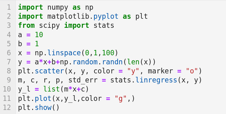
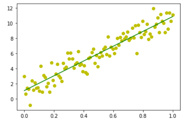
Let us try to understand the working of the program. Lines 1 and 2 import the libraries NumPy and Matplotlib. Line 3 imports the stats module from the library SciPy. Lines 4 to 8 are the same as the previous program and perform similar tasks. Line 9 uses the function linregress( ) offered by the stats module of SciPy, which can calculate a linear least-squares regression for two sets of measurements — in this case, the values in the arrays x and y. The function returns, in addition to other data, the slope and intercept of the regression line that is stored in the variables m and c, respectively. Line 10 uses the values of slope and intercept to generate the regression line. Line 11 plots the regression line in green. Finally, Line 12 displays all the plots. Figure 9 shows the image generated on execution of the program. The data points are displayed in yellow and the regression line is shown in green.
In the last three articles in this series, we have tried to learn more and more concepts from probability and statistics. Though the treatment of the subject is in no way comprehensive, I think we have arrived at a good starting point and it is time to shift our focus to other matters of equal importance.
Introduction to Keras
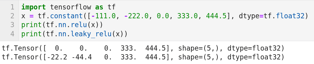
Now, let us learn to use Keras. Keras is used along with TensorFlow. Hence, let us begin by exploring TensorFlow a bit more. Consider the program shown in Figure 10. Though this program contains just four lines of code, this is our first encounter with neural networks in this series. Now, let us try to understand the working of the program. Line 1 imports the library TensorFlow. Line 2 creates a tensor called x. Lines 3 and 4 apply two activation functions called ReLU (Rectified Linear Unit) and Leaky ReLU, respectively, on the tensor x. In neural networks, the activation function of a node defines the output of that node given an input or set of inputs. ReLU activation function is an activation function defined as the positive part of its argument. The output of the code in Line 3 is shown in Figure 10. It can be observed that the negative values in the tensor x are replaced with zeros after applying the ReLU activation function. Leaky ReLU activation function is a modified version of the ReLU activation function. From the output of the code in Line 4 shown in Figure 10, it can be verified that positive values are retained as such, and 20 per cent of the negative values are retained on applying the Leaky ReLU activation function. Though we are moving on to discuss Keras, we will revisit this topic in the future to learn more about neural networks and activation functions.
Now, let us start using Keras. The installation of Keras can also be done very easily with Anaconda Navigator. Consider the program shown in Figure 11. We will use our first data set in this program. For the time being, we will only import and display sample data from the data set. But in the next article, we will use the same data set for training and testing our model, thus beginning the next phase in our journey to develop AI and machine learning based applications.
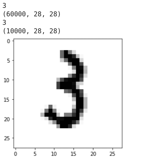
Now, let us try to understand the working of the program. Line 1 imports Keras. Line 2 imports the MNIST database of handwritten digits. It has a training data set of 60,000 samples and a test data set of 10,000 samples. Line 3 imports Matplotlib. Line 5 loads the data set. Lines 6 to 9 print the dimension and shape of the training data and the test data. Figure 12 shows the output of these lines of code. It can be seen that both the training data and the test data are three-dimensional. It can also be verified that there are 60,000 training images of 28 x 28 pixel quality and 10,000 test images of 28 x 28 pixel quality. Line 10 loads the 1234th training image. Lines 11 and 12 display this image. Figure 12 shows this handwritten image of the digit 3.
Now, it is time to wind-up our discussion. We are at the halfway mark of our journey through AI and machine learning. We have started discussing neural networks, a discussion we will continue in the next article. We have also come across our first data set with Keras. In the next article, we will continue discussing the use of Keras by training with this data set. We will also have our first interaction with scikit-learn, another powerful Python library for machine learning.


