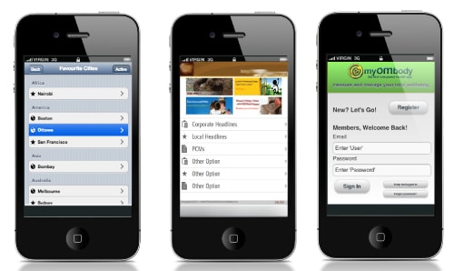
jQuery Mobile is a cross-platform, open source UI framework that enables developers to build websites and applications by integrating HTML5, CSS3 and layout foundation with very little scripting. The framework is compatible with every mobile device and tablet (more platform support can be found at http://jquerymobile.com/gbs/) including browsers such as Firefox, Chrome, Internet Explorer, Android, BlackBerry and Symbian.
What it is and what it is not
jQuery Mobile is built on top of jQuery, which means that it uses jQuerys core framework but doesnt replace it. Being lightweight makes it fast, robust and easily themeable – it allows us to build customised themes easily, and offers Ajax navigation with touch events, page transition, widgets and mouse navigation. jQuery Mobile is neither a SDK for packaging native Web apps, nor a framework for JavaScript, nor an alternative for Web browsers.
To get started, we need:
- A Web browser
- A text editor
How to use jQuery Mobile
There are basically two ways we can make use of jQuery Mobile:
1. Simply download the latest stable version of the download builder from http://jquerymobile.com/download-builder/ , extract the folder to your working directory and provide the path for use in your code.
2. Using CDN (Content Delivery Network) distributes often-used files across the Web and, most importantly, it doesnt require any download.
It is assumed that the reader is familiar with HTML5 markup language and the basics of CSS.
jQuery Mobiles page structure
Create index.html and include jQuery Mobile library files in the header.
A page developed on jQuery Mobile must follow a series of rules for proper functioning. Every bit of content visible must be inside a container with the data-role attribute defined as page usually div.
First, declare the HTML5 doctype, viewpoint and width of the page inside the header. Viewpoint will ensure that your app appears correctly on all devices. Next, add the jQuery framework or library files either by downloading to the local folder or by loading files from CDN as shown in Figure 1.

Create a page using a data attribute
Define a page using the HTML5 data-role attribute with three important sections, namely, the header, content and footer, as shown below:
<div data-role=page> <div data-role=header> </div> <div data-role=content> </div> <div data-role=footer > </div> </div>
Notice that in the above code snippet we used something called data-role. It specifies which div/block should be used for the page, header, content and footer. Data-role assigns roles to regular HTML elements.
Now lets add some content to our page, header, content and footer to make a mobile Web app. First, add some theme to our page using the data-theme:
<div data-role=page data-theme=b> or <div data-role=page class=ui-bar ui-bar-e>
jQuery Mobile supports some powerful themes. jQuery provides its own themes or, if needed, you can create your own theme. More information about themes can be found at http://themeroller.jquerymobile.com/ .
Making our list of items searchable
Listview can be an ordered or unordered list on a page with at least one item in it. jQuery Mobile renders lists for touch devices and it automatically occupies the whole width of the page. Listview may also contain item separators, multiple lists and, most importantly, it must be made searchable.
Inside the <ul> tag, add data-role listview with data-insert= true to specify whether the element should be within content margins or outside of them. Once Listview is added, look at the search box above the list. This can be used to search any of the listed items. Try searching some countrys name in the search bar after adding Listview.
<ul data-role=listview data-insert=true data-filter=true>
Format the footer
Now that our header, content and search bar is looking good, lets add a footer to our page using data-role=footer, data-position= fixed (this attribute is used to keep the footer position fixed) inside the <div> tag.
<div data-role=footer data-position=fixed data-theme=e>
Last of all, add data-role=navbar. jQuery mobile provides a number of icons that can be used with the data-icon attribute or class named ui-icon-. jQuery provides both PNG and SVG images of icons. For example, the following will display the home icon at the footer (for more information on icons, refer to http://api.jquerymobile.com/icons/) and upon clicking the Home button, it will navigate to the first page using href=#MainPage.
<nav data-role=navbar> <ul> <li><a href=#MainPage data-icon=home>Home</a></li> <li><a href=settings data-icon=gear>Settings</a></li> </ul></nav>
Building a simple Web app
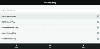
Now that we have some basic understanding of jQuery Mobiles page structure, lets create a simple app (Figure 2).
The complete code for our app follows. (Add the <script> code given below after defining jQuery Mobile library files.)
<head><script> <!-- JQuery script for our HTML5 code -->
$(document).ready(function(){
var loc = window.location.href;
$(li).click(function(){
var country = $(this).attr(id);
$(#FlagImage).attr (src, function (i,origValue){
return images\\ + country + -flag.jpg;});
$(#FlagDescription).text (This is + country.toUpperCase () + Flag);
$(#FlagHeader).text (country.toUpperCase () + + Flag);
newURL = loc +#FlagPage;
$(location).attr(href,newURL); });}); </script></head>
<body>
<div data-role=page data-theme=a id=MainPage>
<header data-role=header data-theme=b>
<h1>National Flag</h1>
</header><!-- /header -->
<div data-role=content data-theme=d>
<ul data-role=listview data-insert=true data-filter=true>
<li id=india><a> <h1>Indian National Flag</h1></a></li>
<li id=usa><a> <h1>USA National Flag</h1></a></li>
<li id=england><a> <h1>England National Flag</h1></a></li>
<li id=japan><a> <h1>Japan National Flag</h1></a></li>
<li id=china><a> <h1>China National Flag</h1></a></li>
</ul>
</div><!-- /content -->
<div data-role=footer data-position=fixed data-theme=b>
<nav data-role=navbar>
<ul>
<li><a href=#MainPage data-icon=home>Home</a></li>
<li><a href=Info data-icon=info>Info</a></li>
<li><a href=plus data-icon=plus>Share</a></li>
</ul>
</nav>
</div><!-- /footer -->
</div><!-- /page -->
<div data-role=page id=FlagPage data-theme=b>
<div data-role=header>
<h1 id=FlagHeader> Header </h1>
<a href=#MainPage data-icon=arrow-l>Back</a>
</div>
<div class=img>
<img id=FlagImage/>
<p id=FlagDescription></p>
</div>
<div data-role=footer data-position=fixed data-theme=b>
<nav data-role=navbar>
<ul>
<li><a href=#MainPage data-icon=home>Home</a></li>
<li><a href=Info data-icon=info>Info</a></li>
<li><a href=plus data-icon=plus>Share</a></li>
<li><a href=settings data-icon=gear>Settings</a></li>
</ul>
</nav>
</div><!-- /footer -->
</div>
</body>
</html>


