


Data visualisation tools provide an effective way to understand complex data. They help us identify the data growth trends, and visualise the outliers and patterns in data. Visualisation of data is done by using graphical elements like charts, graphs and maps. This article will help the reader to learn the visualisation techniques of R.
R supports a wide variety of graphical tools implemented with different packages. Though conventional graphical tools like line, plot, bar-plot and histogram are available within basic packages, high-end tools like ggplot, ggmap and tidyverse require packages to be loaded with all of their dependencies.
Maps
The ggmap package is one of the important data visualisation tools. However, it requires several other essential data and attributes also. The data requires proper processing and arrangement to mould it into proper shape before mapping it on to the map object. Preprocessing performs filtering and data manipulation to make data compatible with map data.
Mapping also requires latitude and longitude information for each mapping object. Proper care is required to map the location information. Here, we shall try to learn the technique in steps.
ggplot
The ggplot2 package, created by Hadley Wickham, is a useful graphics language for creating stylish and complex plots. Often the qplot() function is used to draw ggplot graphics to hide the complexity of the ggplot graphics syntax. It is a declarative system to create graphics and the implementation is based on ‘The Grammar of Graphics’ by Leland Wilkinson. This function maps variables to aesthetics, followed by which graphical primitives use them and take care of the details.
This package can be installed by installing the ggplot2 package or simply from the whole tidyverse package. An alternative option is to install it from the development version of GitHub.
1. Install ggplot by installing the whole tidyverse package:
install.packages("tidyverse")
2. Alternatively, install only ggplot2:
install.packages("ggplot2")
3. Or from the development version of GitHub:
devtools::install_github("tidyverse/ggplot2")
Usage
As it is a complex graphical tool based on a deep-rooted theoretical platform, a detailed discussion of the functioning of ggplot2 is not possible here. Here it will be illustrated with only two examples.
In most of the cases ggplot() starts with a data set and an aesthetic mapping with aes(). Then layers of different functionalities incorporate different graphical features and shapes into the graph. Graphical shapes are added with geom.point(), geom.histogram(), etc, and features are added with scale_colour_brewer(), facet_wrap(), coord_flip(), etc. Here are two examples of ggplot graphs on mtcars data.
Example 1:
library(ggplot2)
ggplot(mtcars, aes(mpg,hp, colour = cyl)) + geom_point()
Example 2:
ggplot(mtcars, aes(mpg, colour = cyl)) + geom_histogram()
Similarly, geom_line(), geom_boxplot(), geom_bar() will plot line, boxplot and bar graphs.
Load data
On December 31, 2019, WHO was informed of several cases of pneumonia in Wuhan City, Hubei Province of China, originating from a new type of coronavirus. As the virus was unknown, the infection caused by it raised concerns because no one knew how it affected people.
To know the infection pathology and prognosis, daily level information on the affected people is essential. This can give some interesting insights when made available to medical professionals and researchers. A prolonged exploratory data analysis of this data can play an important role in drug discovery also.
For instance, the Johns Hopkins University has created an admirable portal using data on the affected cases extracted from the associated Google sheets. This data is available as .csv files in the Johns Hopkins University Center for Systems Science and Engineering (JHU CSSE) GitHub repository. From the URL, one can gather the most recent data on the worldwide spread of COVID-19. The file can be downloaded or read directly from https://github.com/CSSEGISandData/COVID-19/tree/master/csse_covid_19_data/csse_covid_19_time_series
#Data Acquisition
library(data.table)
df <- fread("https://raw.githubusercontent.com/CSSEGISandData/COVID-19/master/csse_covid_19_data/csse_covid_19_time_series/time_series_covid19_confirmed_global.csv")
df <- data.frame(df, stringsAsFactors=FALSE)
Preprocessing
Preprocessing steps include filtering and data organisation. Filtering handles null value, missing and inappropriate value imputation, and data manipulation for the alignment of data with world map data.
Here I shall discuss dplyr, ggplot2 and ggmap packages-based implementation of COVID-19 global mapping. The COVID-19 confirmed records are loaded into the data frame df. As the function data.frame() with option stringsAsFactors=FALSE is used, all the variables are either characters or numeric, and conversion of factors to numeric and character is not required. However, it is required to replace all blank fields with appropriate character and numeric values. Since na.omit() removes the entire record containing NA, here this function is not used to manage null fields and instead, the individual fields are examined and replaced with appropriate Gauss values.
1. library(dplyr)
2. df <- transform(df, Province.State = ifelse(Province.State==””, Country.Region, Province.State))

#Replace all numeric fields with 0 if the value is NA
3. df <- df %>% replace(.=="NA", 0) # replace with 0

4. countries <- df[,2:ncol(df)]
5. print(countries)
Global map marking
Getting a map of the world is very easy. In R, it is available within the ggmap package and can be called by the map_data() function. First load ggmap and then assign the world map to a local variable with:
library(ggmap)
map.world <- map_data("world")

head(map.world)
long lat group order region subregion
1 -69.89912 12.45200 1 1 Aruba <NA>
2 -69.89571 12.42300 1 2 Aruba <NA>
3 -69.94219 12.43853 1 3 Aruba <NA>
4 -70.00415 12.50049 1 4 Aruba <NA>
5 -70.06612 12.54697 1 5 Aruba <NA>
6 -70.05088 12.59707 1 6 Aruba <NA>

> class(map.world)
[1] "data.frame"
To make the visualisation simple and decent, here we shall mark countries and localities (provinces) selectively. Within our dataframe df, the second column is the country (and region) variable and columns 5 onwards are date-wise infection counts. Therefore, columns two to ncol(df) are the required columns to mark the spread of COVID-19 within the world map.
countries <- df[,2:ncol(df)]
Since world-map marking requires the longitude and latitude, the third and fourth variables Lat and Long are two essential fields for this activity. One can inspect the values as shown below:
## INSPECT
as.factor(countries$Lat) %>% levels()
as.factor(countries$Long) %>% levels()
To map values, it is also essential to update country names to the matching country names of the world map. This can be done with the recode() function as shown in the following instruction:
# Recode names
countries$Country.Region <- recode(countries$Country.Region
,'United States' = 'US'
,'United Kingdom' = 'UK'
))
head(countries[,c(1:3)])
Country.Region Lat Long
1 Thailand 15.0000 101.0000
2 Japan 36.0000 138.0000
3 Singapore 1.2833 103.8333
4 Nepal 28.1667 84.2500
5 Malaysia 2.5000 112.5000
6 Canada 49.2827 -123.1207

class(countries)
[1] "data.frame"
For further processing, it is essential to convert country variables from factor data type to character type before permanently converting the country data set into data frame.
#Convert from Factor to character
countries$Country.Region <- as.character(countries$Country.Region)

#Convert to data frame
countries <- as.data.frame(countries)
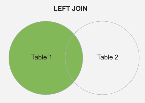
Now, to combine countries and map.world data frames on the basis of region (map.world) and Country.region (countries) attributes, the dplyr::left_join() function is used.
# LEFT JOIN
map.world_joined <- left_join(map.world, countries, by = c('region' = 'Country.Region'))
Figure 1 is a schematic diagram of the left_join, where Table 1 and Table 2 are the map.world and countries, respectively.
To reduce the mapping complexity here we shall mark only six countries, namely India, Nepal, Nigeria, Norway, US, Iran and regions of USA. This is done here with the filter dplyr::semi_join(). Figure 2 is a schematic diagram of the semi join between the attributes countries (X) and df.country_points (Y).
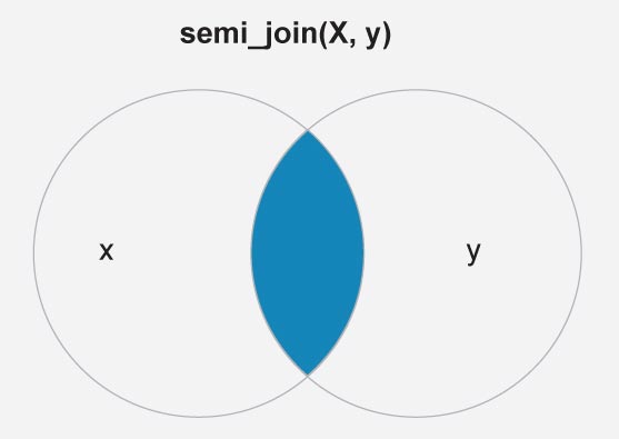
df.country_points <- data.frame(country = c("India","Nepal","Nigeria","Norway","US","Iran"), stringsAsFactors = F)

df.country_points <- semi_join(countries, df.country_points, by = c('Country.Region'='country' ))

glimpse(df.country_points)
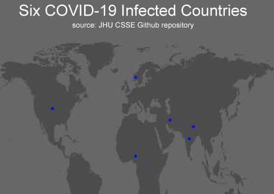
So now we have two dataframes — map.world_joined and df.country_points. Both are synchronised for the global map and six countries with latitudes and longitudes. The depiction of the world map and marking the map with COVID-19 infected data is shown here with ggplot(). With a little patience, the reader can explore the following ggplot() command sequence:
p <-ggplot() +
geom_polygon(data = map.world_joined, aes(x = long, y = lat, group = group)) +
geom_point(data = df.country_points, aes(x = Long, y = Lat), color = "blue") +
scale_fill_manual(values = c("#CCCCCC","#e60000")) +
labs(title = ' Six COVID-19 Infected Countries'
,subtitle = ' source: JHU CSSE Github repository') +
theme(text = element_text(family = "Verdana", color = "#FFFFFF")
,panel.background = element_rect(fill = "#444444")
,plot.background = element_rect(fill = "#444444")
,panel.grid = element_blank()
,plot.title = element_text(size = 20)
,plot.subtitle = element_text(size = 10)
,axis.text = element_blank()
,axis.title = element_blank()
,axis.ticks = element_blank()
,legend.position = "none"
)

library(gridExtra)
grid.arrange(p, ncol = 1)

closeAllConnections()
Due to the easy availability of different map packages, this feature of R has become a useful tool for practising data visualisation. There is lots of data available in many places that data analytics professionals can map.
Creating maps typically requires several essential skills in combination. These include the ability to retrieve the data, reshape it into the proper format, filtering and merging with other data and visualising it. We hope this article will help the reader to learn the visualisation techniques of R. COVID-19 data is available in different repositories, so the readers interested in it can download the data and explore it for further studies.


