

In this tenth article in the R series, we will continue to explore data visualisation in R with the lattice and ggplot2 packages.
We will be using the R version 4.1.2 installed on Parabola GNU/Linux-libre (x86-64) for the example code snippets in this article.
$ R --version
R version 4.1.2 (2021-11-01) -- “Bird Hippie”
Copyright (C) 2021 The R Foundation for Statistical Computing
Platform: x86_64-pc-linux-gnu (64-bit)
R is free software and comes with absolutely no warranty. You are welcome to redistribute it under the terms of the GNU General Public License versions 2 or 3. For more information about these matters, see https://www.gnu.org/licenses/.
Lattice
Line chart
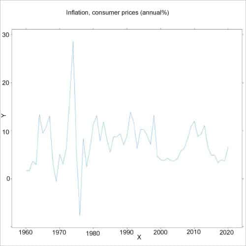
Consider the consumer prices (annual per cent) inflation data for India between 1960 and 2022 available from the World Bank. You can use the years in the x-axis, and the inflation on the y-axis to produce a line chart using the xyplot function, as shown below:
> x<-c(1960:2020)

> y<-c(1.77,1.69,3.63,2.94,13.35,9.47,10.80,13.06,3.23,-0.58,5.09,3.07,6.44,16.94,28.59,5.74,

-7.63,8.30,2.52,6.27,11.34,13.11,7.89,11.86,8.31,5.55,8.72,8.80,9.38,7.07,8.97,13.87,11.78,6.32,10.24,10.22,8.97,7.16,13.23,4.66,4.00,3.77,4.29,3.80,3.76,4.24,5.79,6.37,8.34,10.88,11.98,8.85,9.31,11.06,6.64,4.90,4.94,3.32,3.94,3.72,6.62)

> d <- data.frame(x,y)

> xyplot(y~x, data=d, type=”l”, main=”Inflation, consumer prices (annual %)”)
The line chart is shown in Figure 1.
The xyplot accepts the following arguments:
| Argument | Description |
| data | A data frame containing values |
| groups | A grouping variable in the data |
| main | The title of the chart |
| strip |
A logical condition on whether to draw strips |
| x |
The primary numeric variable |
| xlab |
The label for x-axis |
| xlim | A numeric vector that specifies left and right limits for x-axis |
| ylab | The label for y-axis |
| ylim | A numeric vector of length two that mentions lower and upper limits for y-axis |
The barchart function
The bar chart function produces a bar chart for the given data. In the following example, we specify a function to the axis argument to use the year on the x-axis.
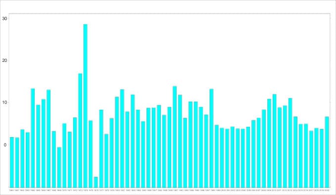
> barchart(y~x|x, data=d, horizontal=FALSE, axis=function(side, ...) { if (side==”bottom”) panel.axis(at=seq_along(d$x), label=d$x, outside=TRUE, rot=0, tck=0) else axis.default(side, ...)}, main=”Inflation, consumer prices (annual %)”)
The additional set of arguments available to the xyplot and barchart are listed below:
| Argument | Description |
| box.ratio | Specifies the ratio of the width of rectangles in barchart |
| panel | Plots x and y variables in each panel |
| default.prepanel | A default function as a fallback to the prepanel function |
| auto.key | Used to produce a suitable legend |
| aspect | The physical aspect ratio of the panels |
| axis | A function responsible for drawing the axis annotation |
| horizontal | The orientation of the bar chart |
| subscripts | A logical flag to pass a ‘subscripts’ vector to the panel function |
| subset | A set of rows from the data is used in the plot |
Scatter plot
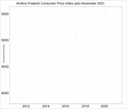
You can also display individual charts on a panel grid. For example, the all India consumer price index (rural/urban) data set up to November 2021 is available from https://data.gov.in/catalog/all-india-consumer-price-index-ruralurban-0 for the different states in India. We can read the data from the downloaded file using the read.csv function, as shown below:
> cpi <- read.csv(file=”CPI.csv”, sep=”,”)
> head(cpi)
Sector Year Name Andhra.Pradesh Arunachal.Pradesh Assam Bihar
1 Rural 2011 January 104 NA 104 NA
2 Urban 2011 January 103 NA 103 NA
3 Rural+Urban 2011 January 103 NA 104 NA
4 Rural 2011 February 107 NA 105 NA
5 Urban 2011 February 106 NA 106 NA
6 Rural+Urban 2011 February 105 NA 105 NA
Chattisgarh Delhi Goa Gujarat Haryana Himachal.Pradesh Jharkhand Karnataka
1 105 NA 103 104 104 104 105 104
2 104 NA 103 104 104 103 104 104
3 104 NA 103 104 104 103 105 104
4 107 NA 105 106 106 05 107 106
5 106 NA 105 107 107 105 107 108
6 105 NA 104 105 106 104 106 106
The aggregate function can be used to obtain the values for the state of Andhra Pradesh as follows:
ap <- aggregate(x=cpi$Andhra.Pradesh, by=list(cpi$Year), FUN=sum)

> head(ap)
Group.1 x
1 2011 3911.28
2 2012 4255.40
3 2013 4516.60
4 2014 4673.60
5 2015 4822.20
6 2016 4921.50
A simple scatter plot can be displayed for the consumer price indexes using the following arguments to the xyplot function:
> xyplot(x~Group.1, ap, main=”Andhra Pradesh Consumer Price Index upto November 2021”, xlab=”Year”, ylab=”Consumer Price Index”)
The corresponding scatter plot illustration is shown in Figure 3.
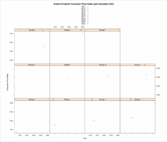
Panel grid
You can also visualise the values per year (Group.1) using the xyplot:
> xyplot(x~Group.1|Group.1, ap, groups=Group.1, main=”Andhra Pradesh Consumer Price Index upto November 2021”, xlab=”Year”, ylab=”Consumer Price Index”, auto.key=TRUE)
The output chart produced by R is as shown in Figure 4.
In addition to the above listed plotting functions, lattice provides the bwplot function for box-and-whisker plots, and the stripplot function for one-dimensional scatter plots.
ggplot2
The ggplot2 R package implements a grammar of graphics that specifies how to plot data. You can install the package using the following command:
> install.packages(“ggplot2”)

*** installing help indices
*** copying figures
** building package indices
** installing vignettes
** testing if installed package can be loaded from temporary location
** testing if installed package can be loaded from final location
** testing if installed package keeps a record of temporary installation path
* DONE (ggplot2)
The library needs to be loaded into the R session before you can use its functions:
library(ggplot2)
Scatter plot
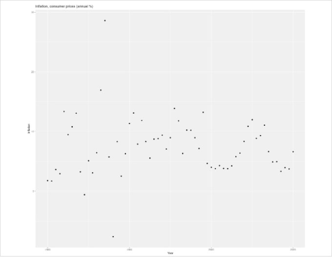
The same consumer prices (annual per cent) inflation data for India can be plotted using the quick plot or qplot function from the ggplot2 package in R. For example:
> x<-c(1960:2020)
> y<-c(1.77,1.69,3.63,2.94,13.35,9.47,10.80,13.06,3.23,-0.58,5.09,3.07,6.44,16.94,28.59,5.74,-7.63,8.30,2.52,6.27,11.34,13.11,7.89,11.86,8.31,5.55,8.72,8.80,9.38,7.07,8.97,13.87,11.78,6.32,10.24,10.22,8.97,7.16,13.23,4.66,4.00,3.77,4.29,3.80,3.76,4.24,5.79,6.37,8.34,10.88,11.98,8.85,9.31,11.06,6.64,4.90,4.94,3.32,3.94,3.72,6.62)
> d <- data.frame(x,y)
> qplot(x=x, y=y, data=d, xlab=”Year”, ylab=”Inflation”, main=”Inflation, consumer prices (annual %)”)
The simple scatter plot is shown in Figure 5.
We can also store the results of the plot to a variable and ask R to provide a summary of the same, as shown below:
> ex1 <- qplot(x=x, y=y, data=d)
> summary(ex1)
data: x, y [61x2]
mapping: x = ~x, y = ~y
faceting: <ggproto object: Class FacetNull, Facet, gg>
compute_layout: function
draw_back: function
draw_front: function
draw_labels: function
draw_panels: function
finish_data: function
init_scales: function
map_data: function
params: list
setup_data: function
setup_params: function
shrink: TRUE
train_scales: function
vars: function
super: <ggproto object: Class FacetNull, Facet, gg>
-----------------------------------
geom_point: na.rm = FALSE
stat_identity: na.rm = FALSE
position_identity
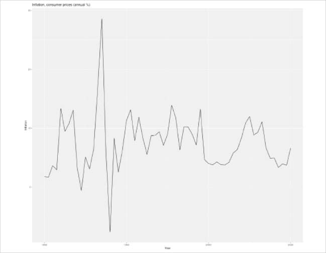
Line chart
We can generate a line chart by specifying the geom attribute as ‘line’, as shown below:
> qplot(x=x, y=y, data=d, xlab=”Year”, ylab=”Inflation”, main=”Inflation, consumer prices (annual %)”, geom=”line”)
The corresponding line graph is shown in Figure 6.
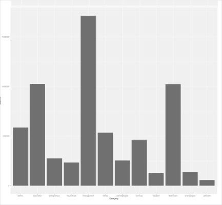
The ‘Bank Marketing Data Set’ for a Portuguese banking institution is available from the UCI machine learning repository available at https://archive.ics.uci.edu/ml/datasets/Bank+Marketing. The data can be used for public research use. There are four data sets available, and we will use the read.csv() function to import the data from a ‘bank.csv’ file into a data frame.
bank <- read.csv(file=”bank.csv”, sep=”;”)

> bank[1:3,]
age job marital education default balance housing loan contact day
1 30 unemployed married primary no 1787 no no cellular 19
2 33 services married secondary no 4789 yes yes cellular 11
3 35 management single tertiary no 1350 yes no cellular 16
month duration campaign pdays previous poutcome y
1 oct 79 1 -1 0 unknown no
2 may 220 1 339 4 failure no
3 apr 185 1 330 1 failure no
Bar chart
The geometry argument can be specified as ‘bar’ to produce a bar chart, as indicated below:
> qplot(x=job, data=bank, geom=”bar”, weight=balance, ylab=”Balance”, xlab=”Category”)
The produced bar chart is shown in Figure 7.
We can also list a summary of the chart by storing the results of the plot to a variable, and invoking the summary function on the same. For example:
> barchart <- qplot(x=job, data=bank, geom=”bar”, weight=balance, ylab=”Balance”, xlab=”Category”)

> summary (barchart)
data: age, job, marital, education, default, balance, housing, loan,
contact, day, month, duration, campaign, pdays, previous, poutcome, y
[4521x17]
mapping: x = ~job, weight = ~balance
faceting: <ggproto object: Class FacetNull, Facet, gg>
compute_layout: function
draw_back: function
draw_front: function
draw_labels: function
draw_panels: function
finish_data: function
init_scales: function
map_data: function
params: list
setup_data: function
setup_params: function
shrink: TRUE
train_scales: function
vars: function
super: <ggproto object: Class FacetNull, Facet, gg>
-----------------------------------
geom_bar: width = NULL, na.rm = FALSE, orientation = NA
stat_count: width = NULL, na.rm = FALSE, orientation = NA
position_stack
The qplot function accepts the following arguments:
| Argument | Description |
| asp | The y/x aspect ratio |
| data | Optional data frame that contains x and y |
| geom | The geometry to use |
| main | The title of the chart |
| margin | Display margins |
| position | The adjustments to specify the position |
| x | X values |
| xlab | The x-axis label |
| xlim | The limits for the x-axis |
| y | Y values |
| ylab | The y-axis label |
| ylim | The limits for the y-axis |
ggplot
The ggplot function can be used to create a new ggplot object for input data, and also specify aesthetic mappings for the same.
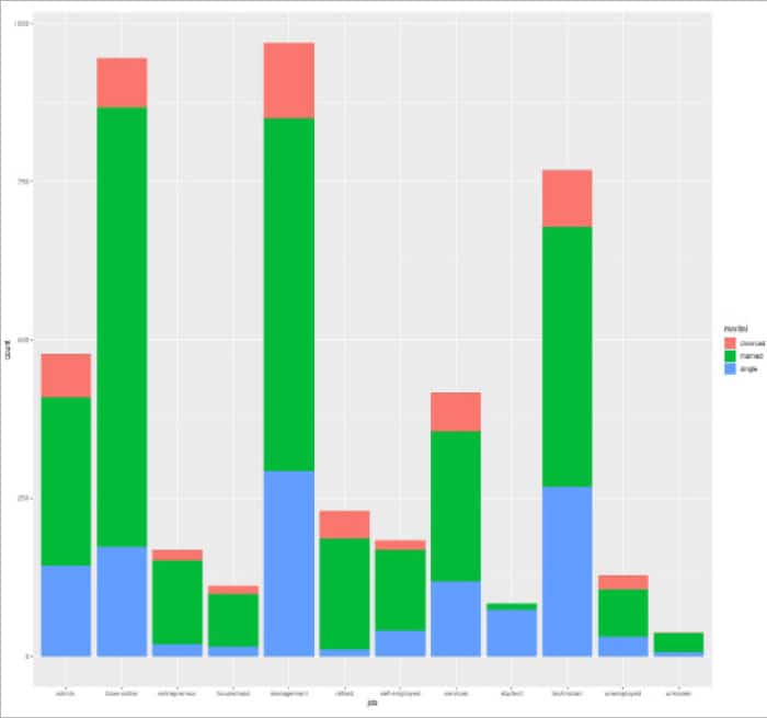
For the bank.csv data, we can tabulate the job and marital status together using the with function as follows:
> with(bank, table(job, marital))
marital

job divorced married single
admin. 69 266 143
blue-collar 79 693 174
entrepreneur 16 132 20
housemaid 13 84 15
management 119 557 293
retired 43 176 11
self-employed 15 127 41
services 62 236 119
student 0 10 74
technician 89 411 268
unemployed 22 75 31
unknown 1 30 7
You can now plot the above categorical data using ggplot, as follows:
> ggplot(bank, aes(x = job, fill = marital)) + geom_bar()
The resultant graph is shown in Figure 8.
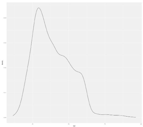
The age distribution can be plotted as a density using the geom_density function as follows:
> ggplot(bank, aes(x = age)) + geom_density()
The corresponding graph is shown in Figure 9.
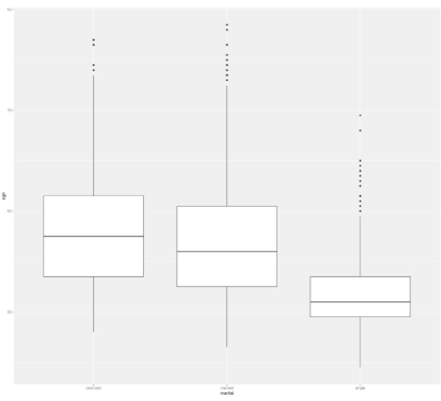
A box plot for the age and marital status can be visualised using the following arguments to ggplot:
> ggplot(bank, aes(x = age, y = marital)) + geom_boxplot() + coord_flip()
The output graph is as shown in Figure 10.
The ggplot function accepts the following arguments:
| Argument | Description |
| data | The data frame for the plot |
| mapping | The aesthetic mappings to be used in the plot |
| environment | The globalenv() environment for the aesthetics |
Do try and explore more functions and charts in the graphics packages available in R.


