KNIME (Konstanz Information Miner) is free, open source software being used in data science. It makes understanding data, and designing data science workflows and reusable components, easy for everyone. This article implements a clustering algorithm through KNIME for the Covid 19 data set to assess the rate of recovery from the virus in the country.
With KNIME, one can create visual workflows for data analytics with an intuitive, drag and drop style graphical interface, without the need for coding. KNIME also makes blending data from any source easy. In this article, we will be using the Covid 19 data set. Three clusters have been created based on the confirmed Covid-positive tests, number of people cured (recovered), and deaths as of date. The k-means node is used to perform k-means clustering on the data set. The colour manager and shape manager nodes are used to assign colours and shapes to the clusters. The scatter plot node is used to view the clusters as scatter plots.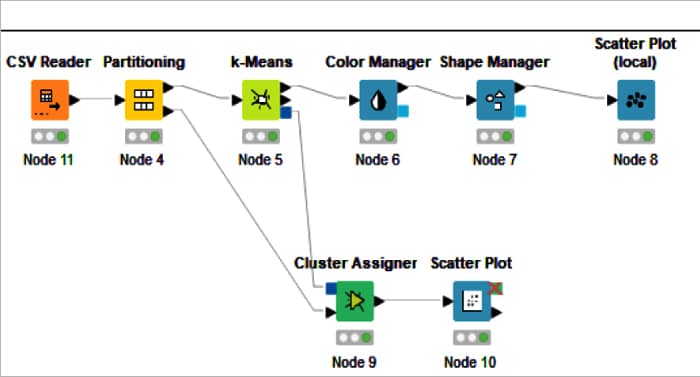
Figure 1: Covid 19 k-means clustering KNIME workflowTo install KNIME:
- Download the KNIME Desktop Application from https://www.knime.com/.
- Install the KNIME Desktop Application and provide the necessary permissions during the setup process.
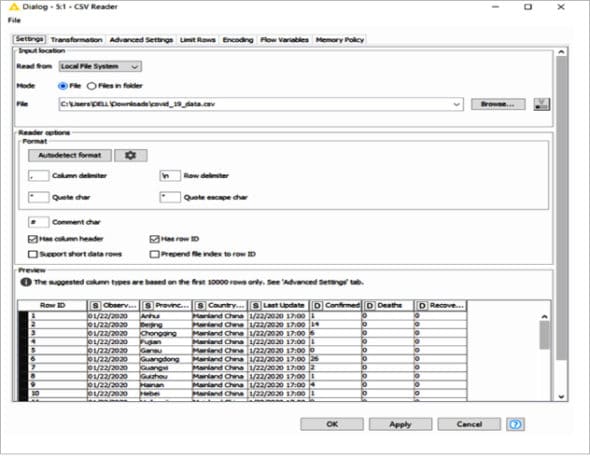
Figure 2: Configuration of CSV reader node
Node status
There are four node statuses — not configured, configured, executed, and error.
The ‘not configured’ status is represented by the colour ‘red’. It shows that the node that was dragged and dropped in the workspace is not configured, and the user needs to configure it to perform the desired function. |
The ‘configured’ status is represented by the colour ‘yellow’. It indicates that the node is configured and ready to be executed. We need to click the ‘execute’ option after right clicking on the node to change the status of the node to ‘executed’. |
| Executed: The ‘executed’ status is represented by the colour ‘green’. It indicates that the node is successfully executed. If the execution fails, the user will see an ‘error’ status. |
| Error: The ‘error’ status is represented with a cross inside a red circle. It indicates that the node has not executed properly or there is an error while configuring it. |
Clustering
K-means clustering is an unsupervised machine learning iterative algorithm, which uses centroid-based selection. This algorithm places ‘k’ cluster centres and centroids randomly for each data point attached to it as the nearest cluster centre. This turns the centroids into cluster centres.
List of nodes
The nodes that we are going to use are listed below: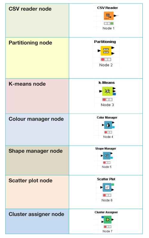
How to design the Corona virus cluster
- In the KNIME Analytics Platform, create a new workflow.
- Drag and drop the following nodes and connect, configure and execute them into the KNIME Workbench Editor:
- CSV file which will automatically create a CSV reader node and connect the CSV reader to the partitioning node.
- Connect the first partition of the partitioning node to the k-means node, and then connect its output lead to the colour manager, shape manager, and scatter plot node.
- Connect the second partition of the partitioning node to the cluster assigner node and scatter plot node successively.
In Figure 1 we can see the Covid19 k-means clustering KNIME workflow.
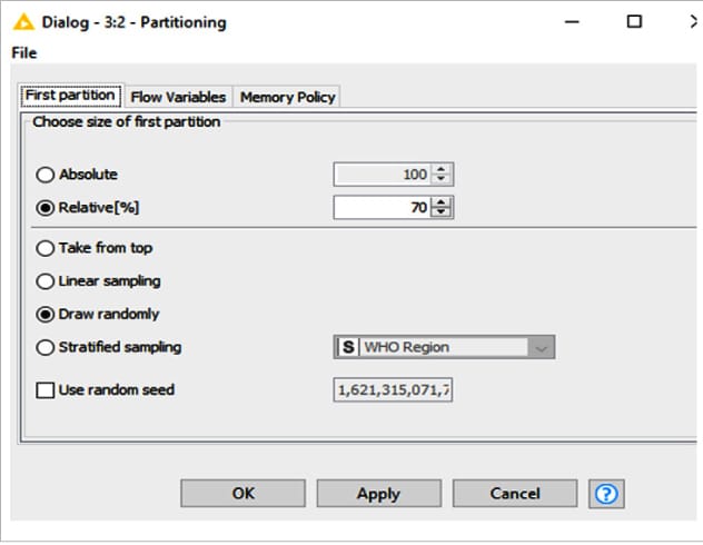
Partitioning node
Using the partitioning node, the given input table is divided into two different partitions row-wise. The first partition is termed train data and the second is test data. The outcomes of these two partitions are made available at the two output ports of the partitioning node. The data set has been partitioned in a 70:30 ratio, with 70 per cent of the data forming the training set and the remaining 30 per cent forming the testing data set.
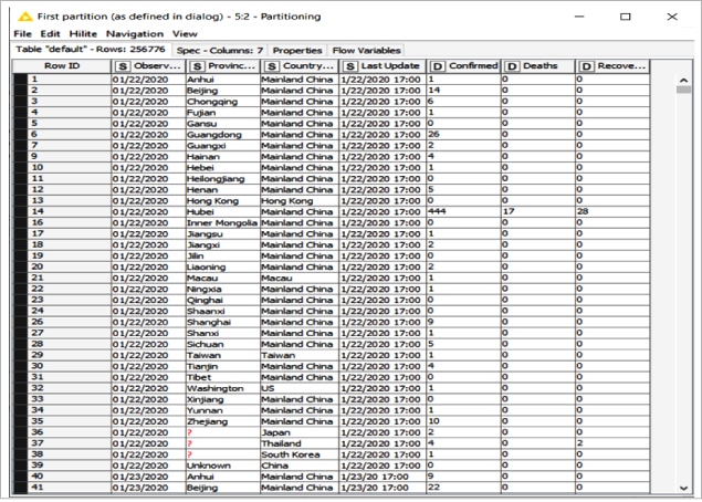
The output of the first partition of the Covid 19 data set, also referred to as the training data set, is captured in Figure 4.
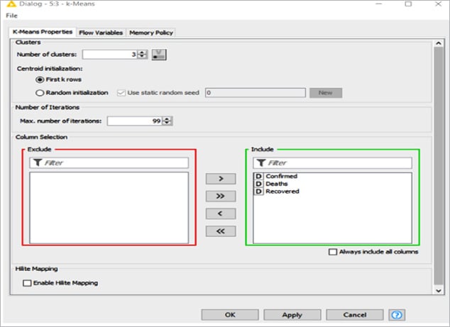
K-means node
Based on the number of clusters (k) configured, the k-means node groups the input data set into the required cluster constructed on the distance criterion. This node outputs the cluster centres for a predefined number of clusters (no dynamic number of clusters).
K-means performs a crisp clustering that assigns a data vector to exactly one cluster. The algorithm terminates when the cluster assignments do not change any more. The clustering algorithm uses the Euclidean distance on the selected attributes. The data is not normalised by the node.
As the number of the cluster has been configured with the value ‘3’, three clusters (cluster_0, cluster_1, cluster_2) have been created for the given Corona virus data set, as shown in Figure 6.
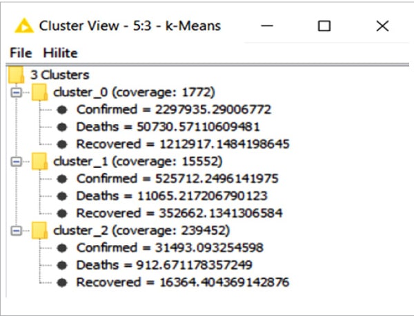
Clustering is based on three attributes — confirmed cases, cured (recovered) cases, and deaths. The number in the figure denotes cluster number labels like:
- CLUSTER 0 – Cases of COVID-19 deaths
- CLUSTER 1 – Cases of COVID-19 cured cases
- CLUSTER 2 – Cases of COVID-19 confirmed cases
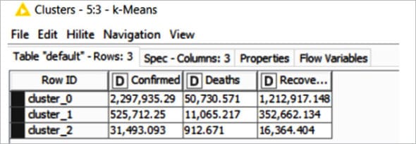
Figure 7: Cluster table of k-means node
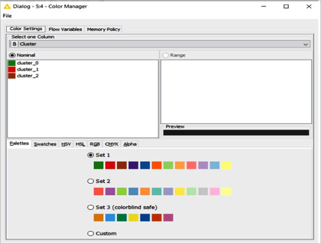
Colour manager
Colourful and graphically creative clusters can be created using the colour manager node. Colours can be assigned for either nominal (possible values have to be available) or numeric columns (with lower and upper bounds).
Shape manager
This node assigns (different) shapes for each attribute value of one nominal column, i.e., for each possible value. It supports views, and then renders data points with the shape associated with the corresponding attribute value.
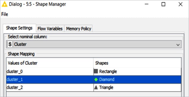
Using the shape manager node, three different shapes have been assigned to the clusters.
Cluster assigner
This node assigns new data to an existing set of prototypes, which are obtained by k-means clustering. Each data point is assigned to its nearest prototype.
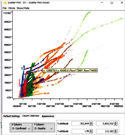
Scatter plot
An interactive output view is created using a scatter plot node. It creates a scatter plot of two selectable attributes. Then each data point is displayed as a dot at its corresponding place, depending on the values of the selected attributes. The dots are displayed in the colour defined by the colour manager. The size is defined by the size manager, and the shape is defined by the shape manager.
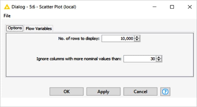
Figure 12 depicts the visualisation output of the scatter plot obtained by performing k-means clustering and unsupervised machine learning on KNIME software for the Covid 19 data set. This gives us an idea of the country’s recovery rate during the pandemic.