


Android Jetpack Compose is a new way of creating an Android layout; it eases the difficulties faced in traditional layout creation and maintenance. This article is a simple demonstration of how to use Jetpack Compose to build a sample app along with code based on Kotlin.
Jetpack Compose is a UI kit made for declarative programming in Android. With Jetpack Compose, you can avoid complicated xml layout files, but programmatically design the screens. The UI is built using composable functions in Jetpack Compose. In this tutorial, we will use it to make a simple application that will help users make a bio for themselves.
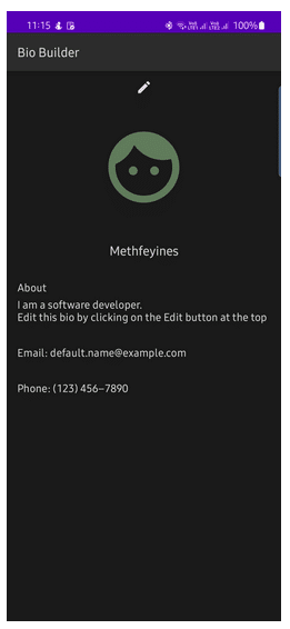
Figure 1 shows what our app looks like when it is opened. It should show an Edit button at the top. The profile picture should be displayed below the Edit button. Below this picture, the name, about, email, and the phone number are displayed. The app provides options to edit all the details by clicking the Edit button.
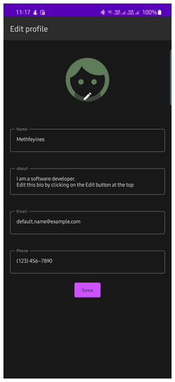
In editing mode (Figure 2), the app will display an Edit button on the profile picture; all other fields become editable, and a Save button is displayed.
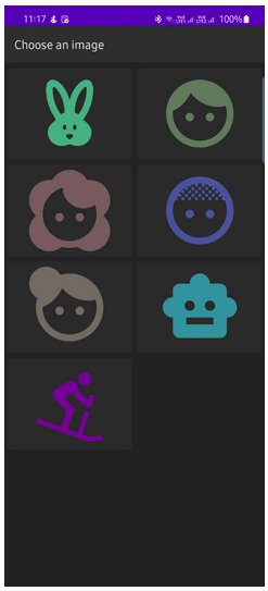
On clicking the Edit button on the profile picture, the app will display an option to pick a profile picture from the list, as shown in Figure 3.
Creating the app
Open the Android Studio (Android Studio Dolphin or later). Go to it, then click File -> New -> New Project -> Empty Compose Activity. Give application name, package name, save location and minimum SDK. API 21 is given as the minimum SDK.
String resources
Create a string.xml file with all of the required strings in our code. As per the UI, we require the following strings in our app:
 <string name=”app_name”>Bio Builder</string>
    <string name=”profile_pic”>Profile Picture</string>
    <string name=”edit_profile”>Edit profile</string>
    <string name=”update_profile_picture”>Update picture</string>
    <string name=”text_template”>%1$s: %2$s</string>
    <string name=”name_label”>Name</string>
    <string name=”about_label”>About</string>
    <string name=”phone_label”>Phone</string>
    <string name=”email_label”>Email</string>
    <string name=”dob_label”>Date of Birth</string>
    <string name=”save_label”>Save</string>
    <string name=”default_name”>Default name</string>
    <string name=”default_about”>I am a software developer.\nEdit this bio by clicking on the Edit button at the top</string>
    <string name=”default_phone”>(123) 456–7890</string>
    <string name=”default_email”>default.name@example.com</string>
    <string name=”editable_app_title”>Edit Bio</string>
    <string name=”choose_image”>Choose an image</string>
Bio-page: EditButton
Create a composable function called EditButton. Composable functions can be created by adding the @Composable prefix.
@Composable
fun EditButton(
modifier: Modifier = Modifier,
onEdit: () -> Unit
) {
IconButton( modifier = modifier, onClick = onEdit) {
Icon(
imageVector = Icons.Default.Edit,
contentDescription = stringResource(id = R.string.edit_profile)
)
}
}
Inside the EditButton composable, we can add an IconButton. We use the Modifier object to apply parameters like padding, size, etc. onEdit lambda is called when the button is clicked. We call an Icon composable with Icons.Default.Edit as the imageVector inside the content lambda.
Now create a state variable for storing the value of editable inside the setContent composable:
var editable by rememberSaveable {
    mutableStateOf(false)
}
Create a lambda for enabling the editing:
val onClickEdit = {
    editable = true
}
Create another lambda for cancelling the editing:
val cancelEdit = {
    editable = false
}
Now, we can preview our EditButton using the @Preview annotation. Create another composable function named PreviewEditButton. Inside the PreviewEditButton, call EditButton composable. Pass an empty lambda as onEdit parameter. If we build the application now, you can see our Edit button.
@Preview
@Composable
fun PreviewEditButon() {
    EditButton {
   }
}
Profile picture
We can now create a composable for our profile picture. Create a composable function called ProfileImage. This function will show an Edit button in edit mode. On clicking the Edit button, it will show an option to pick a profile picture. This function will have three other parameters along with a modifier parameter — a Boolean value to determine the mode, an ID of the profile picture, and a lambda for changing the image upon clicking the Edit button.
@Composable
fun ProfileImage(
    modifier: Modifier = Modifier,
    editable: Boolean,
    picId: Int,
    onChangePic: () -> Unit
) {
    Box(
        modifier = modifier,
        contentAlignment = Alignment.BottomCenter
    ) {
        Image(
            modifier = Modifier.size(128.dp),
            painter = painterResource(id = picId),
            contentDescription = stringResource(id = R.string.profile_pic)
        )
        AnimatedVisibility(visible = editable) {
            ChangePicButton(onChangePic)
        }
    }
}
For the profile image, we are calling an Image composable inside a Box composable. We will create a composable named ChangePicButton for showing the Edit button on top of the profile pic. We call it inside the AnimatedVisibility composable function.
AnimatedVisibility composable will animate and make the ChangePicButton visible when the value of the editable parameter is true.
Button to change the picture
Now, let’s implement the ChangePicButton composable.
@Composable
private fun ChangePicButton(onChangePic: () -> Unit) {
IconButton(
onClick = onChangePic
) {
Icon(
modifier = Modifier
.background(
color = MaterialTheme.colors.surface.copy(alpha = 0.5f),
shape = CircleShape
)
.padding(horizontal = 20.dp, vertical = 8.dp),
imageVector = Icons.Default.Edit,
contentDescription = stringResource(id = R.string.update_profile_picture),
tint = MaterialTheme.colors.onSurface
)
}
}
Here we added the background and padding modifiers to the Icon composable. We applied the surface colour with 0.5 alpha as the background colour. We also applied the onSurface colour as the icon tint.
ViewModel class for the biodata
Before creating the next composables, create a ViewModel class called BioModel for temporarily storing the biodata. Create a BioModel.kt file with the following contents:
class ProfileModel: ViewModel() {

    private val _profilePicId: MutableLiveData<Int> = MutableLiveData()
    val profilePicId: LiveData<Int> = _profilePicId

    private val _name: MutableLiveData<String> = MutableLiveData()
    val name: LiveData<String> = _name

    private val _dob: MutableLiveData<Time> = MutableLiveData()
    val dob: LiveData<Time> = _dob

    private val _about: MutableLiveData<String> = MutableLiveData()
    val about: LiveData<String> = _about

    private val _email: MutableLiveData<String> = MutableLiveData()
    val email: LiveData<String> = _email

    private val _phone: MutableLiveData<String> = MutableLiveData()
    val phone: LiveData<String> = _phone

    fun updateName(name: String) {
        _name.value = name
    }

    fun updateDob(time: Time) {
        _dob.value = time
    }

    fun updateAbout(about: String) {
        _about.value = about
    }

    fun updateEmail(email: String) {
        _email.value = email
    }

    fun updatePhone(phone: String) {
        _phone.value = phone
    }

    fun updatePicId(id: Int) {
        _profilePicId.value = id
    }

    fun updateProfile(name: String, about: String, email: String, phone: String) {
        updateName(name)
        updateAbout(about)
        updateEmail(email)
        updatePhone(phone)
    }
}
Now declare an object of the ProfileModel inside the setContent lambda.
val bioModel: ProfileModel = viewModel()
Name field
Next, let’s create a composable for the Name field. It should display a text in the centre in normal mode. But it should display a TextField in the editing mode.
@Composable
fun EditableName(
    modifier: Modifier = Modifier,
    editable: Boolean,
    label: String,
    text: String,
    textStyle: TextStyle = MaterialTheme.typography.h5,
    onTextChanged: (String) -> Unit
) {
    AnimatedVisibility(visible = !editable) {
        Text(
            modifier = modifier,
            text =  text,
            style = textStyle,
            textAlign = TextAlign.Center
        )
    }
    AnimatedVisibility(visible = editable) {
        OutlinedTextField(
            modifier = modifier,
            value = text,
            onValueChange = onTextChanged,
            label = {
                Text(text = label)
            },
            keyboardOptions = KeyboardOptions(keyboardType = KeyboardType.Text),
        )
    }
}
Here, too, we use AnimatedVisibility to animate the visibility changes. The text value will store a default value, and the onTextChanged lambda will be executed when the text in the TextField is changed in the editing mode.
Now create a state variable for storing the name and a lambda for updating the name.
var name by rememberSaveable() {
mutableStateOf(bioModel.name.value)
}

val onNameChanged = {changedName: String ->
name = changedName
}
About Field
Similarly, we can create composable, state variables and lambda for the about field:
@Composable
fun EditableAbout(
    modifier: Modifier = Modifier,
    editable: Boolean,
    label: String,
    text: String,
    onTextChanged: (String) -> Unit,
) {
    AnimatedVisibility(visible = !editable) {
        Column(modifier = modifier) {
            Text(
                text = label,
                style = MaterialTheme.typography.h6
            )
            Spacer(modifier = Modifier.height(4.dp))
            Text(
                text = text,
                style = MaterialTheme.typography.h6
            )
        }
    }
    AnimatedVisibility(visible = editable) {
        OutlinedTextField(
            modifier = modifier,
            value = text,
            onValueChange = onTextChanged,
            label = {
                Text(text = label)
            },
            keyboardOptions = KeyboardOptions(keyboardType = KeyboardType.Text)
        )
    }
}

var about by rememberSaveable() {
    mutableStateOf(bioModel.about.value)
}

val onAboutChanged = { changedAbout: String ->
    about = changedAbout
}
Email and phone
We can create a common composable for displaying the email and the phone number:
@Composable
fun EditableText(
    modifier: Modifier = Modifier,
    editable: Boolean,
    label: String,
    text: String,
    textStyle: TextStyle = MaterialTheme.typography.h6,
    onTextChanged: (String) -> Unit,
    keyboardType: KeyboardType = KeyboardType.Text
) {
    AnimatedVisibility(visible = !editable) {
        Text(
            modifier = modifier,
            text = stringResource(id = R.string.text_template, label, text),
            style = textStyle
        )
    }
    AnimatedVisibility(visible = editable) {
        OutlinedTextField(
            modifier = modifier,
            value = text,
            onValueChange = onTextChanged,
            label = {
                Text(text = label)
            },
            keyboardOptions = KeyboardOptions(keyboardType = keyboardType)
        )
    }
}
The keyboardType will be KeyboardType.Email and KeyboardType.Phone for the email and the phone composables, respectively.
Now create the state variables and lambdas for email and phone:
var email by rememberSaveable() {
    mutableStateOf(bioModel.email.value)
}
val onEmailChanged = { changedEmail: String ->
    email = changedEmail
}
var phone by rememberSaveable() {
    mutableStateOf(bioModel.phone.value)
}
val onPhoneChanged = { changedPhone: String ->
    phone = changedPhone
}
Save button
Next, create a composable function for the Save button, as shown below:
@Composable
fun SaveButton(modifier: Modifier = Modifier, onSave: () -> Unit) {
    Button(onClick = onSave) {
        Text(text = stringResource(id = R.string.save_label))
    }
}
Create a lambda for calling on clicking the Save button:
val onSave = {
    // Saving the details to the viewModel
    bioModel.updateProfile(
        name?: “”,
	about?: “”,
	email?:””,
	phone?:””
    )
    editable = false
}
App title
Let’s now create a title composable function for displaying the app title.
@Composable
fun Title(modifier: Modifier = Modifier, title: String) {
    Surface(
        modifier = modifier,
        elevation = 4.dp
    ) {
        Text(
            modifier = Modifier
                .fillMaxWidth(1f)
                .padding(horizontal = 16.dp, vertical = 16.dp),
            text = title,
            style = MaterialTheme.typography.h5
        )
    }
}
Bio-page title
Next, create a title composable for displaying the title of the bio page. It will have different titles in Edit mode and in normal mode.
@Composable
fun BioTitle(editable: Boolean) {
    if (editable) {
        Title( title = stringResource(id = R.string.edit_profile))
    } else {
        Title(title = stringResource(id = R.string.app_name))
    }
}
Bio page
Create a composable function called BioPage, as shown below:
@Composable
fun BioPage(
    modifier: Modifier = Modifier,
    onEdit: () -> Unit,
    editable: Boolean,
    profilePicId: Int,
    onChangePic: () -> Unit,
    name: String,
    onNameChanged: (String) -> Unit,
    about: String,
    onAboutChanged: (String) -> Unit,
    email: String,
    onEmailChanged: (String) -> Unit,
    phone: String,
    onPhoneChanged: (String) -> Unit,
    onSave: () -> Unit,
    onEditCancel: () -> Unit
) {
    Column(
        modifier = modifier,
        horizontalAlignment = Alignment.CenterHorizontally
    ) {
        BioTitle(editable = editable)
        AnimatedVisibility(visible = !editable) {
            EditButton(
                modifier = Modifier
                    .fillMaxWidth()
                    .wrapContentWidth(align = Alignment.End)
                    .padding(horizontal = 8.dp, vertical = 8.dp),
                onEdit = onEdit
            )
        }
        ProfileImage(
            modifier = modifier
                .padding(32.dp)
                .clip(CircleShape),
            editable = editable,
            picId = profilePicId,
            onChangePic = onChangePic
        )
        val textModifier = Modifier
            .fillMaxWidth(1f)
            .padding(vertical = 16.dp, horizontal = 16.dp)

        EditableName(
            modifier = textModifier,
            editable = editable,
            label = stringResource(id = R.string.name_label),
            text = name,
            onTextChanged = onNameChanged
        )

        EditableAbout(
            modifier = textModifier,
            editable = editable,
            label = stringResource(id = R.string.about_label),
            text = about,
            onTextChanged = onAboutChanged
        )

        EditableText(
            modifier = textModifier,
            editable = editable,
            label = stringResource(id = R.string.email_label),
            text = email,
            onTextChanged = onEmailChanged,
            keyboardType = KeyboardType.Email
        )

        EditableText(
            modifier = textModifier,
            editable = editable,
            label = stringResource(id = R.string.phone_label),
            text = phone,
            onTextChanged = onPhoneChanged,
            keyboardType = KeyboardType.Phone
        )
        AnimatedVisibility(visible = editable) {
            BackHandler {
                onEditCancel()
            }
            SaveButton(onSave = onSave)
        }
    }
}
Clicking the Back button while the app is in editing mode will cancel the editing mode handled by the BackHandler in the above code segment.
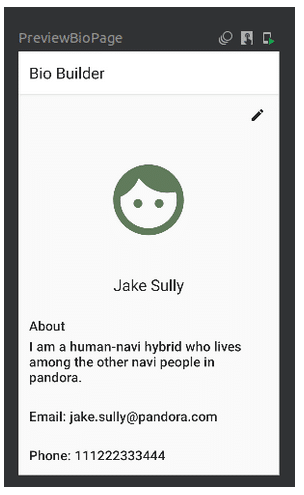
Preview the BioPage
You can now preview the BioPage by creating a preview function. You can pass empty lambdas for functions that require a lambda.
@Preview(showBackground = true)
@Composable
fun PreviewBioPage() {
    BioBuilderTheme {
        BioPage(
            onEdit = { /*TODO*/ },
            editable = false,
            profilePicId = R.drawable.head,
            name = “Jake Sully”,
            onNameChanged ={} ,
            about = “I am a human-navi hybrid who lives among the other navi people in pandora.”,
            onAboutChanged = {},
            email = “jake.sully@pandora.com”,
            onEmailChanged = {},
            phone = “111222333444”,
            onPhoneChanged = {},
            onChangePic = {},
            onSave = {},
            onEditCancel = {}
        )
    }
}
At a time, you can view multiple previews in compose.
Choose picture screen
Create a state variable for storing the value of ChangePicture mode and a lambda for enabling this mode.
var changePicture by rememberSaveable() {
    mutableStateOf(false)
}

val onChangePicture = {
    changePicture = true
}
Create lambdas for updating the profile picture with new ID, and cancel the Change Picture mode.
val onPictureChanged = { pictureId: Int ->
    bioModel.updatePicId(pictureId)
    changePicture = false
}

val cancelChooseImage = {
    changePicture = false
}
Create a composable function named ChoosePictureTitle for the title of ChoosePicture screen.
@Composable
fun ChoosePicTitle() {
    Title(title = stringResource(id = R.string.choose_image))
}
Create a new Kotlin file named Constants.kt with the IDs of some drawable resources you have.
val PICTURE_LIST = listOf(
    R.drawable.rabbit,
    R.drawable.head,
    R.drawable.flower_head,
    R.drawable.baldhead,
    R.drawable.bumpy_head,
    R.drawable.boy,
    R.drawable.downhill
)
Create a composable function named ChoosePicture with the following contents:
/*A function for selecting an image from the list*/
@Composable
fun ChoosePicture(
    modifier: Modifier = Modifier,
    onChoose: (Int) -> Unit,
    onCancel: () -> Unit
) {
    BackHandler() {
        onCancel()
    }
    Surface(
        modifier = modifier,
        shape = RoundedCornerShape(4.dp),
        elevation = 1.dp
    ) {
        Column() {
            ChoosePicTitle()
            LazyVerticalGrid(
                columns = GridCells.Adaptive(180.dp),
   horizontalArrangement = Arrangement.spacedBy(8.dp), contentPadding = PaddingValues(horizontal = 4.dp, vertical = 4.dp)
            ){
                items(PICTURE_LIST) {picture ->
                    Button(
                        modifier = Modifier.padding(vertical = 4.dp),
                        onClick = {
                            onChoose(picture)
                        },
                        colors = ButtonDefaults.buttonColors(
                            backgroundColor = MaterialTheme.colors.background
                        )
                    ) {
                        Image(
                            modifier = Modifier.size(128.dp),
                            painter = painterResource(id = picture),
                            contentDescription = null
                        )
                    }
                }
            }
        }
    }
}
The above function uses the LazyVerticalGrid composable to show the images in a grid. An Image composable placed inside a Button composable will show the images in our list in a button. On clicking the button, the particular image is updated as the profile picture. For each item in the list, a button with an image is generated as provided inside the itemContent lambda of the items function. The column count is changed based on the screen size by setting it using GridCells.Adaptive (180dp). Each column will have a width of 128dp. Each content has a space of 8dp in-between. Horizontal and vertical content padding is added to the LazyVerticalGrid.
Preview choose image screen
Create a Preview function for previewing the ChoosePicture screen, as follows:
@Preview
@Composable
fun PreviewChooseImage() {
    BioBuilderTheme() {
        ChoosePicture(onChoose = {}, onCancel = {})
    }
}
Putting it all together
Add the following code inside the BioBuilderTheme composable inside the onCreate function:
Surface(
modifier = Modifier.fillMaxSize(),
color = MaterialTheme.colors.background
) {
AnimatedVisibility(visible = !changePicture) {
BioPage(
modifier = Modifier.fillMaxWidth(1f),
onEdit = onClickEdit,
editable = editable,
profilePicId = profilePicId.value ?: R.drawable.head,
onChangePic = onChangePicture,
name = name ?: stringResource(id = R.string.default_name),
onNameChanged = onNameChanged,
about = about ?: stringResource(id = R.string.default_about),
onAboutChanged = onAboutChanged,
email = email ?: stringResource(id = R.string.default_email),
onEmailChanged = onEmailChanged,
phone = phone ?: stringResource(id = R.string.default_phone),
onPhoneChanged = onPhoneChanged,
onSave = onSave,
onEditCancel = cancelEdit
)
}
AnimatedVisibility(visible = changePicture) {
ChoosePicture(
modifier = Modifier
.fillMaxWidth(1f),
onChoose = onPictureChanged,
onCancel = cancelChooseImage
)
}
}
Now you can run the app and interact with it. You will be able to update the bio and change the profile picture. You can also try out different things using the concepts learned above.
| Note: The complete code can be downloaded from https://github.com/dicortech/bio_builder. |


