


We need specific and effective tools to make sense of the vast amounts of data being generated today. This article looks at an interesting open source data visualisation tool called RAWGraphs, which helps build professional quality visualisation without requiring any code. Let’s see how.
The volume and variety of data being generated each day is increasing exponentially. The success or failure of a software application depends on the efficiency with which it handles data. A major challenge this massive, heterogeneous data poses is the difficulty in inferring patterns. Data visualisation renders the data in a visual form, which is easier for us to understand. As the human brain is better at processing visual information in comparison to textual and numeric data, with data visualisation it becomes easier to understand the data.
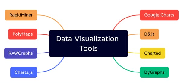
Data visualisation today has applications across various domains such as healthcare, finance, tourism, banking, cybersecurity and e-commerce. In fact, it is difficult to think of a domain that is not benefited by data visualisation. There are many tools that help to carry out data visualisation. Some of them are listed below:
- RAWGraphs
- D3.js
- RapidMiner
- Chart.js
- Google Charts
Each of these tools has a specific purpose and features. This article focuses on an interesting data visualisation tool called RAWGraphs. This free and open source tool has been developed jointly by Density Design, Calibro and Inmagik. The project is led and maintained by the Density Design Research Lab at Politecnico di Milano. Released to the public in 2013, it has evolved into an important tool in the domain of data visualisation. Calibro and Inmagik joined the team in 2019.
That this is a proven data visualisation tool is evident from the fact that it was presented as a research paper in one of the leading conferences in this domain (https://doi.org/10.1145/3125571.3125585). RAWGraphs is supported by both academia and industry.
The primary objective of RAWGraphs is to make the complex data visualisation process easy for everyone. This is achieved by enabling visualisation without requiring any code. RAWGraphs is designed to bridge the gap between spreadsheet applications and vector graphics editors. Anyone with a basic knowledge of computing can use it easily.
Key features
Open source: RAWGraphs is free and open source. The source code repository can be accessed at https://github.com/rawgraphs/rawgraphs-core.
Visualisation options: Depending on the nature of the data and the domain, one can choose from different visualisation options, making RAWGraphs a very useful tool.
Data safety: The official documentation states that the data processing happens only at the client browser and that data is secure.
Ability to export in various formats: RAWGraphs provides the option to export the visualisation either as a vector or raster image.
No code; no installation: RAWGraphs is available as a web app, which can be accessed directly from your web browser. It doesn’t require users to configure anything in their system. This is a major benefit of this tool.
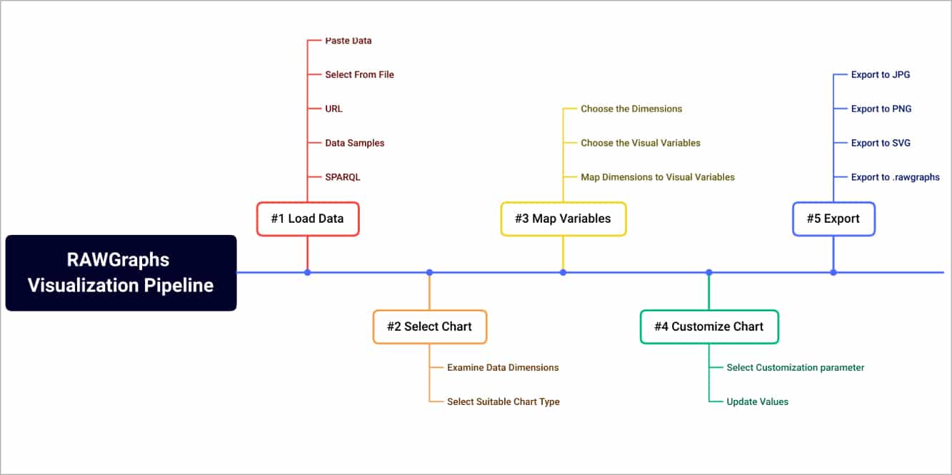
RAWGraphs visualisation pipeline
RAWGraphs has clearly defined the visualisation pipeline. Users have to go through each stage and select the options as per their needs to build effective visualisation. The five different stages in the data visualisation pipeline (Figure 2) of RAWGraphs are:
- Data loading
- Chart selection
- Data dimension mapping to the visual variables of the chart
- Customisation
- Exporting
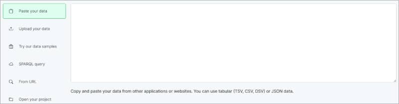
Data loading
The RAWGraphs web app can be accessed at https://app.rawgraphs.io/. The first step in the visualisation pipeline is to load the data. The following options are provided in this step:
- Paste your data
- Upload your data
- Try data samples
- SPARQL query
- From URL
- Open your project
When you select the option ‘Upload your data’, RAWGraphs allows you to choose from the following file formats:
- .tsv (Tab separated values)
- .csv (Comma separated values)
- .dsv (Delimiter separated values)
- .json (JavaScript object notation)
In the case of .json files, the level of the nested structure can be selected to transform the data into a table.
Figure 4 shows sample data loaded from the repository ‘Letter frequency by language’. This repository has 390 rows (1170 cells).
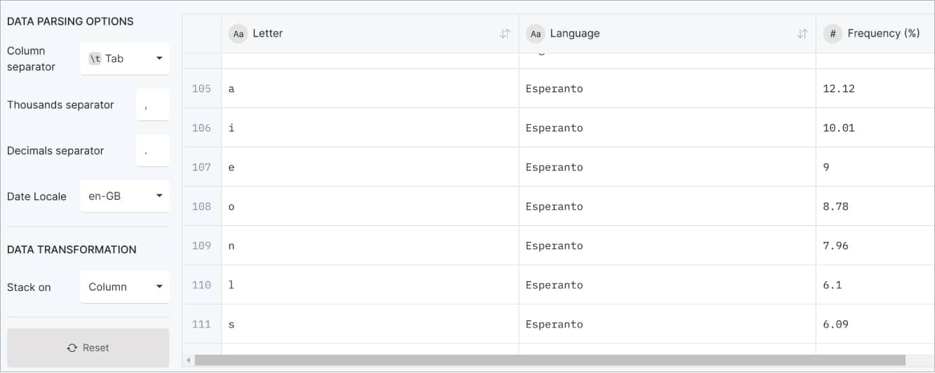
Chart selection
The second step is to select the chart type. The power of RAWGraphs lies in the variety and specific types of charts it provides. Figure 5 illustrates a set of charts this tool can render.
The best part is that, for each chart type, a clear description along with a demo video is provided, helping users make an informed choice.
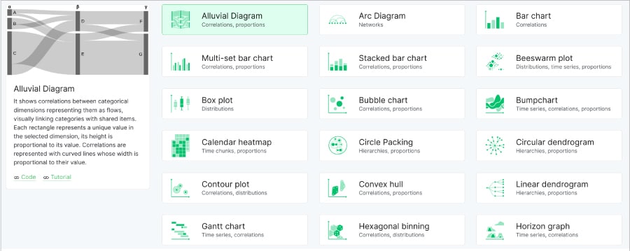
The most important task in the data visualisation process is the selection of suitable types of visualisation. Incorrect selection will lead to suboptimal visualisation, which may not satisfy the goal of comprehending the data. For the data set that we selected (Letter frequency by language), it would be best to select the ‘Matrix Plot’ for proper visualisation.
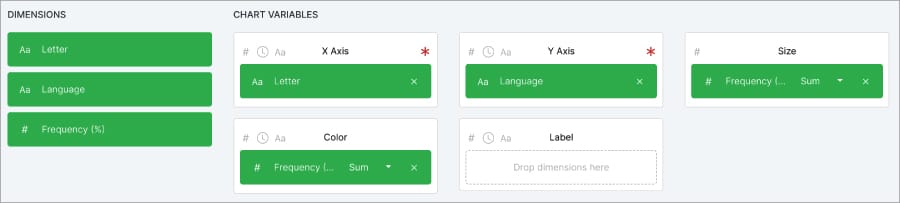
Data dimension mapping
The third step is to map the data dimension to the visual variables of the chart. Based on the visualisation that you have selected, RAWGraphs prompts for different dimensions. For the Matrix Plot that we have selected in the previous step, the following are to be mapped:
- X-Axis (Letter)
- Y-Axis (Language)
- Size (Frequency %)
- Colour (Frequency %)
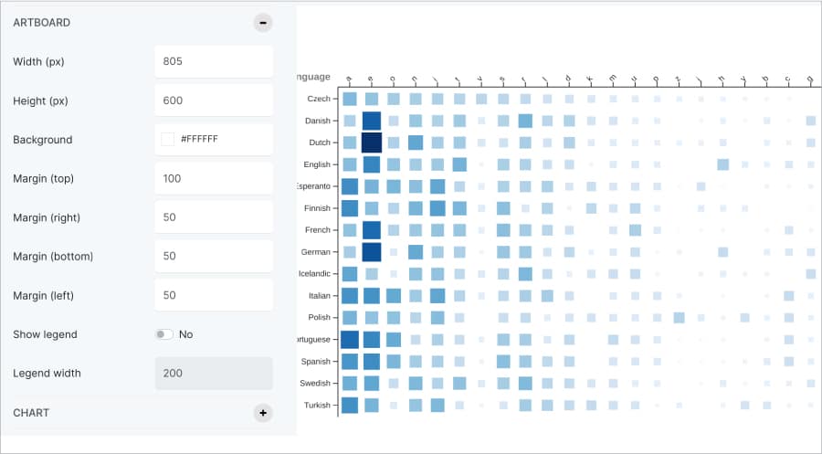
Customisation
This step allows us to change the look and feel of the visualisation. Based on the chart selected, the customisation options are floated automatically, which can be altered. A sample customisation screenshot is shown in Figure 7.
Export
The final step in the visualisation pipeline is to export the file in the needed format. The options provided by RAWGraphs are shown in Figure 8.
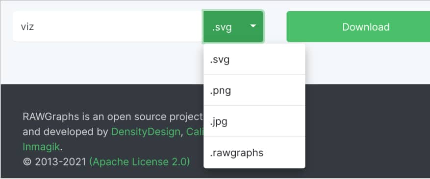
One of the interesting options here is to save the visualisation in ‘.rawgraphs’ format. If you do so, this project can be opened and edited later. This format will preserve all the choices made in the earlier steps. You can share your visualisation project with others in the team so that they need not start from scratch again.
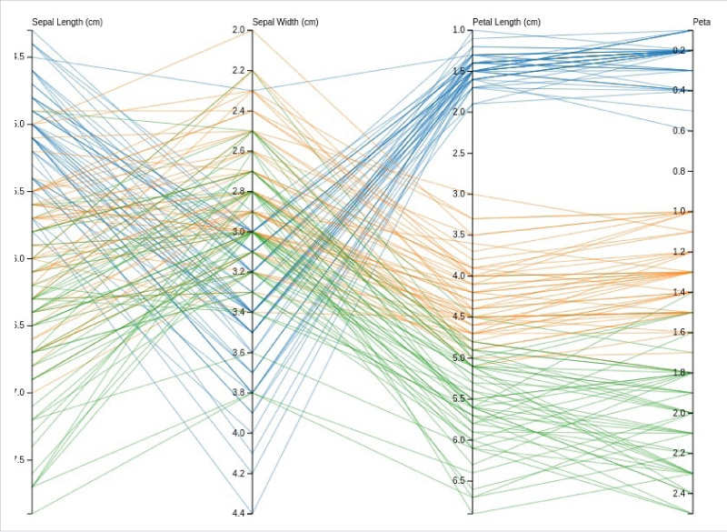
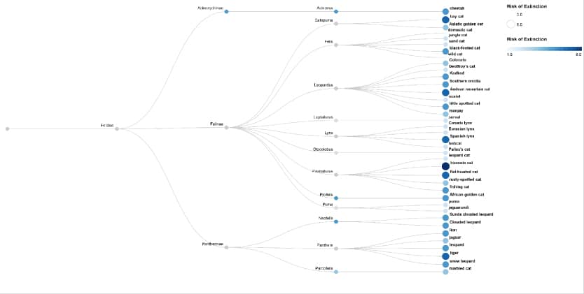
With the aforementioned data visualisation pipeline, RAWGraphs can be used to build various types of visualisation. Two more samples are provided in Figure 9 and Figure 10. Figure 9 illustrates a ‘Parallel Coordinates’ chart created with the ‘Iris Flowers’ data set. A dendrogram is shown in Figure 10. The sample data for the illustrated dendrogram can be fetched from https://www.rawgraphs.io/learning/how-to-make-a-linear-dendrogram. The ‘Galleries’ section showcases various types of illustrations built with RAWGraphs
(https://www.rawgraphs.io/gallery)
The official documentation of RAWGraphs is organised very well and serves as an important resource (https://www.rawgraphs.io/learning) to experiment with data visualisation. In addition to the excellent documentation, there are specific courses to acquire expertise (https://www.rawgraphs.io/courses) in using this tool.
To summarise, RAWGraphs makes the visualisation process seamless. If you are a data science enthusiast, you should give it a try.


