


According to a report by the World Health Organisation (WHO), the number of visually impaired people in the world is 285 million! The report also states that 90 per cent of these people live in low-income settings. Android, being an open source platform, has been adopted by various handset manufacturers. Owing to the open source nature of Android, and the availability of many low-cost Android powered smartphones in the market, the operating system has become extremely popular in developing countries. Hence, it is of utmost importance that Android applications are easy to use for people with and without impairments. Users should not feel that the application is not meant to be used by them because of their impairment, i.e., they should not feel disabled. Hence, stakeholders, designers and developers need to take into account the opinions of users with impairments and the problems they face while using an application, in order to make it accessible to everyone.


Principles of accessibility
The World Wide Web Consortium (W3C) has defined the following four principles of accessibility, based on which the Web Content Accessibility Guidelines (WCAG) were developed. These should be followed by those developing web applications, and can be applied to the development of mobile applications as well.
1. Perceivable: The information being displayed should be perceivable, i.e., text alternatives should be provided for images; audio and video content should be accompanied by captions, while colours should not confuse the user.
2. Operable: It must be easy for users to navigate across multiple screens, whether they are using a touchscreen device or a keyboard. The components on the screen should be easy to operate.
3. Understandable: The content presented to the user should be easy to read and understand.
4. Robust: The application should be compatible with maximum number of assistive technologies, web browsers, etc.
Accessibility options for Android users
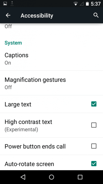
Through Lollipop, Google offers a set of accessibility options that the user can control from a single screen. This article explains the options available in Android 5.0, which can be used by people with visual, motor or auditory impairment (Figure 1).
1. TalkBack: Talkback is an accessibility service that consists of many features, such as Explore by Touch and Screen Reader. It is meant to be used by people who have visual impairment or blindness. Screen Reader allow users to identify the option that they have touched, and decide whether they want to activate the option that was touched. Similarly, there are other components such as sound feedback, haptic feedback, etc. If the app is perceivable, operable and understandable, TalkBack makes it easy for people to use it, thus making the app robust (Figure 2).
2. Switch Access: This is used to associate certain buttons (such as the power button) with specific operations that help the user navigate across multiple screens, such as to the home screen. Switch Access reduces the effort required to navigate across various screens, i.e., it makes the device more operable (Figure 3).
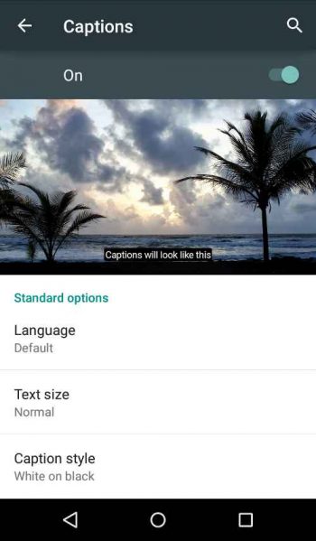
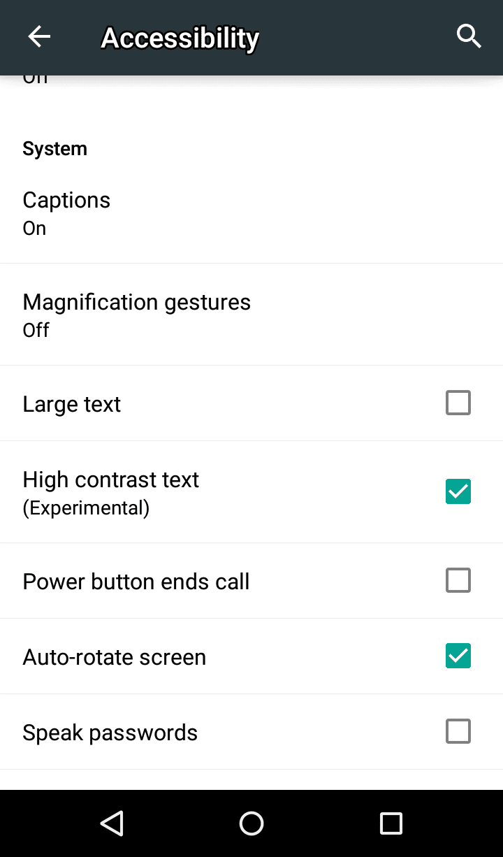
3. Captions: Captions for videos are displayed when this option is enabled. The user may decide how the caption should be displayedwhether it should be displayed in yellow on a black background, whether the text size should be large or not, etc. This option makes the app more perceivable to the user (Figure 4).
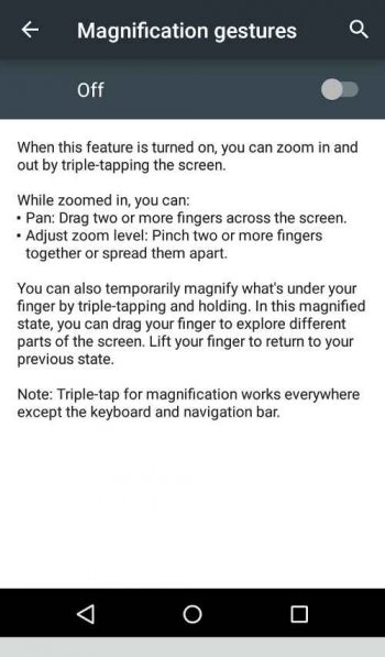
4. Magnification gestures: If this option is enabled, users can not only zoom in and out using the usual pinch gesture, but while the page is zoomed in, they can also pan across the screen with the help of two or more fingers. If the screen is tapped thrice, the area under the users finger will be magnified and the screen will return to the previous state when the finger is lifted. This makes an app not only perceivable, but also operable (Figure 5).
5. Large text: If this option is selected, the size of the text on the phone across all the screens will be increased. This improves the perceivable aspect of the app (Figure 6).
6. High contrast text: This option highlights the text so that it becomes easy for people with visual impairment to read it on the screen. Here, light text colours are converted to their darker shades as can be seen in Figures 6 and 7. The text (Experimental) that was grey in Figure 6 is black in Figure 7 after selecting the High contrast text option. Combined with the Large text option, the app makes it easier to perceive text (Figure 7).
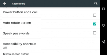
7. Power button ends call: As the name indicates, the user can press the power button to end the call, instead of determining the position of the end call button on the touch screen, making the device more operable.
8. Auto-rotate screen: This option automatically changes the orientation of the app depending on the orientation of the device. However, if an app has been developed in such a way that it runs only in one mode (landscape or portrait), this option cannot change its orientation. Auto-rotate makes the contents on the screen more perceivable (Figure 8).
9. Speak passwords: This option reads aloud the password entered by the user, making the app more operable.
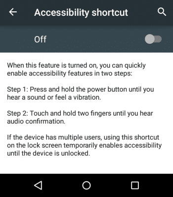
10. Accessibility short cut: If this option is selected, the user can enable accessibility features using short cuts such as pressing the power button for a few seconds and after hearing a sound, touching the screen with two fingers and holding it till an audio feedback is received. This improves the operability of the device (Figure 9).
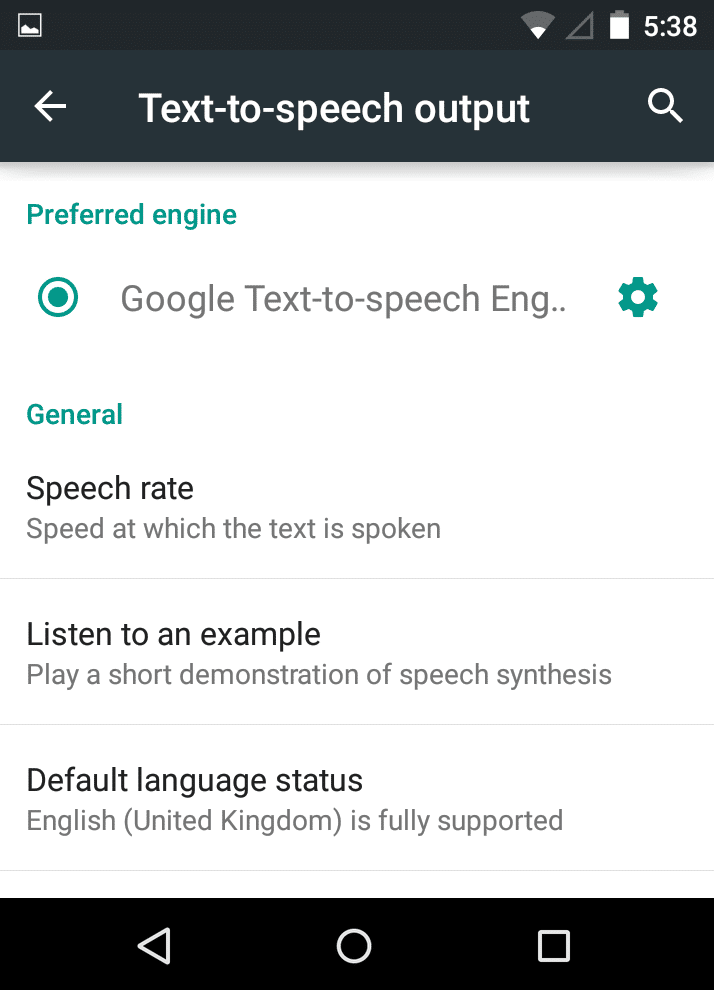
11. Text-to-speech output: This option enables users to select the text-to-speech engine of their choice. Google is the default engine. The user can select the language and the pace at which the text should be read out. This helps improve the perceivability and understandable aspects of the screens contents (Figure 10).
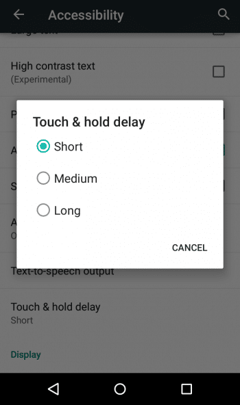
12. Touch and hold delay: This enables the user to select the duration for which an option should be touched and held in order to activate it. This can be used by people with motor impairment, and helps improve the operability of the apps installed on the device (Figure 11).
13. Colour inversion: As the name indicates, the colours on the screen are converted to their respective inverse colours, thus leading to a more perceivable app. This option is also available in the notification bar.
14. Colour correction: This option allows users to change the mode of colours on the screen according to their visual capabilities, making the app more perceivable. The three modes are – Deuteranomaly (red-green), Protanomaly (red-green) and Tritanomaly (blue-yellow).
Colour inversion and colour correction changes are not reflected in screenshots. Hence, a picture of the phones screen was taken in order to show the changes. Figure 12 shows the effect of colour inversion; Figures 13 and 14 show the effect of colour correction. Figure 13 shows the screen before selecting the option, and Figure 14 shows the screen after selecting Tritanomaly.
Tips for developers
Google has its own checklist for developers to help them make their applications accessible, some of which are listed below:
1. Provide content descriptions (the android: contentDescription attribute should be used in the layout file) for elements such as images. These behave like alternate text descriptions for images.
2. Ensure correct navigation. Users may navigate through the app using other hardware such as an external keyboard. It is the responsibility of the developer that the focus is shifted properly when the user presses the tab key, or the arrow keys.
3. Audio feedback should be supported by captions or vibration.
4. Test the accessibility of the app using TalkBack and other assistive technologies, such as an external keyboard connected to the device.
In addition, developers should take care of the following aspects too:
1. The user should be provided with options to change the text size, text colour, background colour, etc, within the app.
2. The size of the elements on the screen should be appropriate. There should be proper spacing between two elements so that users feel free to move around with the help of their fingers when using a touchscreen device.
3. Test your app on various versions of Android.
4. Interact with people with impairments and understand the problems they face while they use mobile apps. Also, let them test the app that you have developed. This will help identify the flaws in the design as well as gauge how well the app functions.
References
[1] http://www.w3.oorg/TR/UNDERSTANDING-WCAG20/intro.html
[2] http://www.w3.org/WAI/intro/people-use-web/principles
[3] http://developer.android.com/guide/topics/ui/accessibility/checklist.html
Interested readers may also read the authors paper on the accessibility of popular applications on Google Play at
http://www.indjst.org/index.php/indjst/article/view/61436.


