


 If you haven’t joined the Android app developer bandwagon yet, then welcome to App Inventor 2. If you are a first timer, we suggest you read our previous articles (which have been featured here for around a year now). If you’ve already got a few apps in your armoury, then good luck and carry on.
For the past year, we have embarked on a journey of developing apps using App Inventor. During this period, we developed multiple applications and I hope you have also experimented with things on your own. If your applications have been published in the Google Play store, I would like to check out your work; so please share your app download links via email.
In App Inventor, we have mastered the components available for use in the palette. Playing around with the designer and block editor is so much fun.
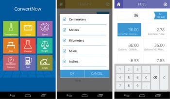
A unit conversion app or software is quite a necessity in our daily lives. There are multiple instances when we need to convert some unit to another and vice versa. The application comes handy for faster calculations. So let’s develop a simple, yet fun filled Android utility application. You have probably practised unit conversion in mathematical problems in school. In this article, we will revise your knowledge of units.
The theme of the application
The theme is pretty simple — we need to design and program the application so that it can convert one unit to another. Rather than doing single unit conversions, let’s give users options to pick from a range of alternatives.
GUI requirements
For every application, we have a graphical user interface or GUI, which helps users to interact with the on-screen components. How each component responds to user actions is defined in the block editor section.
 GUI requirements for Screen1
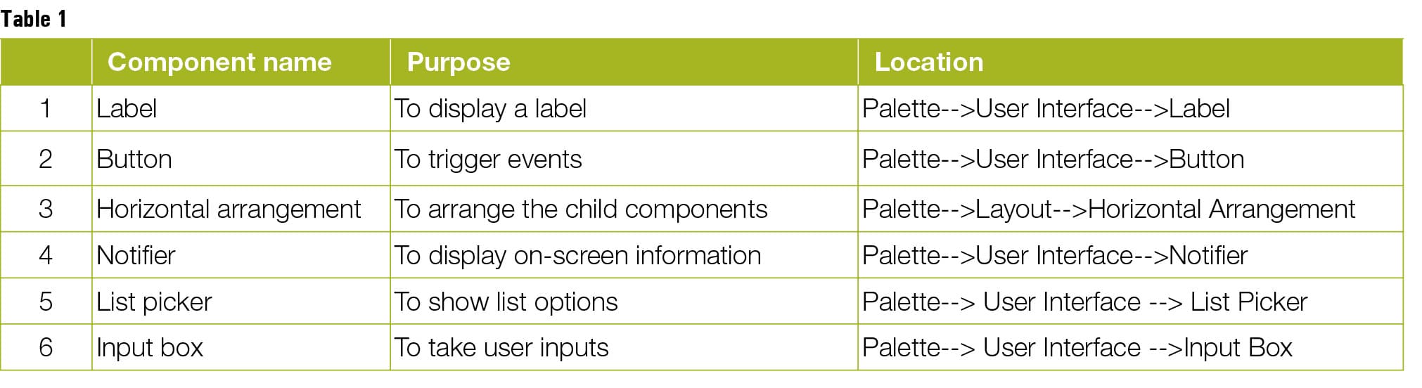
1. Labels: The labels are the static text components used to display some headings or markings on the screen.
2. Button: A button will let you trigger the event and is a very essential component.
3. Horizontal arrangement: These are special components which keep all child components aligned. Horizontal components keep all the child components horizontally aligned.
4. Notifier: This is used to display some instructions or control your existing components. You will see its functionality in more detail as we implement it in our app.
5. List picker: This is the GUI component which presents a list to users, who have to choose from the displayed options.
6. Input box: These dedicated user input boxes allow the user to type the input. During the designing stage, you can set the type of accepted input, e.g., numerical only, multi-line, etc.
Table 1 lists the components that we will need for this application. Let us drag them to the designer from the left hand side palette.
1. Drag and drop the components mentioned in the table above the viewer.
2. Visible components can be seen by you, while the non-visible components will be located beneath the viewer under the tag ‘Non-visible’.
3. We have placed a label so as to name the application.
4. All buttons need to be put within the Horizontal arrangement so as to keep them aligned horizontally.
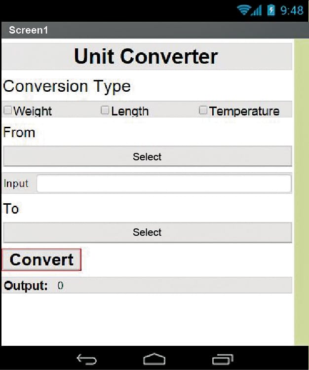
5. If you have dragged and placed everything, the layout will look something like what’s shown in Figure 1.
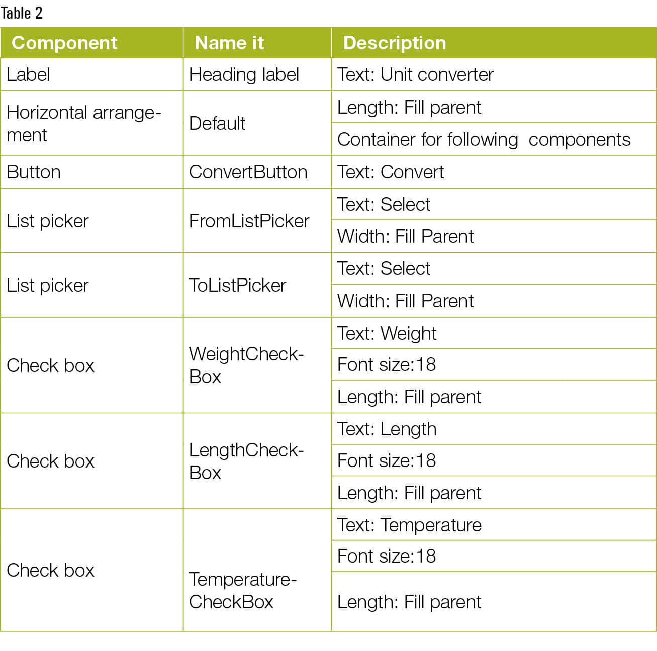
6. Make the necessary property changes, like we did in changing the text property for the label and button components. Table 2 depicts this more clearly.
7. Renaming the components helps to identify them in the block editor.
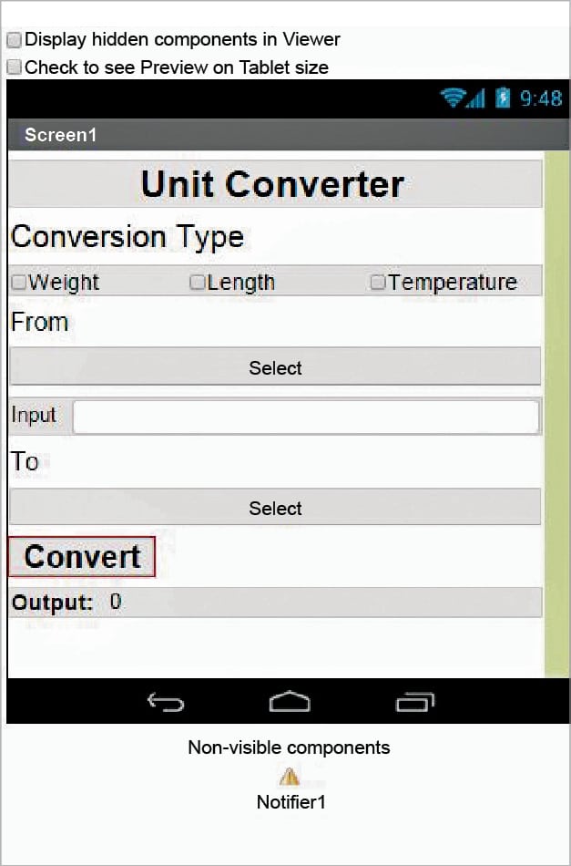
8. So now your graphical user interface is ready. The application will look like what’s shown in Figure 2 after the installation.
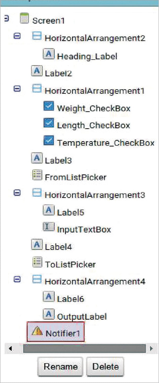
9. Figure 3 gives the hierarchy of the components that we have dragged to the designer.
If you are confused after looking at the designer and the components viewer, let me explain things a bit more. Here is the hierarchy that we have placed for our application.
1. At the top, we have the title for our application. It’s always a good practice to name your application and display it on the screen as well. We have put a label for that and have set its text property to the name of the application.
2. Below that we have another label, which will work as a prompt for the user to select a conversion type from the available options.
3. Next, we have placed three check boxes in a row, putting them all within a horizontal arrangement. We will code them to work as the HTML radio button so that once a check box is selected, the other one is deselected automatically.
4. Then we have a list picker to select the input unit.
5. Within the user types, the input will be only numeric, as we have set the property of the text box to take only numeric inputs.
6. Another list picker will decide the output unit.
7. The Convert button will initiate the convert calculation and, depending upon the user inputs, it will display the conversion output to the dedicated label.
The block editor
Now let’s head towards the block editor to define its behaviours. So, what is the exact functionality that we expect from our application?
1. First, the user will select the type of conversion, i.e., whether it is weight conversion, length conversion or temperature conversion.
2. Depending upon the user selection for the check boxes, the list picker options should be populated.
3. Next, the user will provide the numeric input in the text box provided.
4. The user has to select the output conversion unit.
5. Upon clicking the Convert button, the output digit should be populated.
So let’s move on and add these behaviours using the block editor. I hope you remember how to switch from the designer to the block editor. There is a button available right above the Properties pane to do so.
Block editor blocks
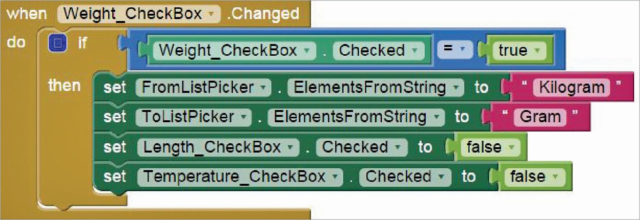
I have already prepared the blocks for you. All you need to do is drag the relevant ones from the left side palette and drop them on to the viewer. Arrange the blocks in the same way as shown in Figure 4. I will explain what each one does and how it is called.
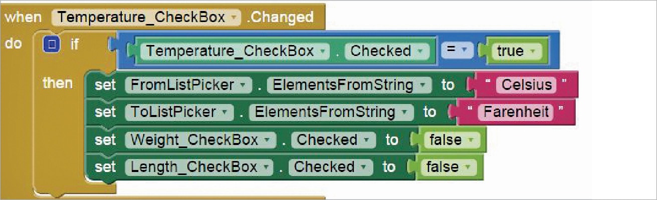
The code blocks in Figure 4 depict what should happen when the weight check box is selected. It is obvious that, at one time, we will have only one type of conversion; so, if any of the other two are selected, they should be deselected. And, accordingly, we will be setting the values for the ‘From’ and ‘To’ dropdown menus.
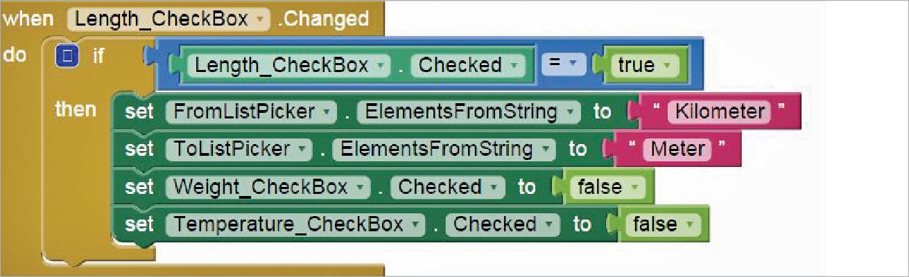
Figures 5 and 6 give the code for the other two check boxes.
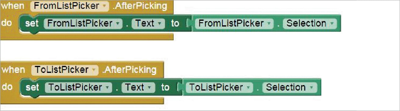
As soon as the user has selected the drop down value, it should be reflected as the text value of the same. The code given in Figure 7 makes this conversion.
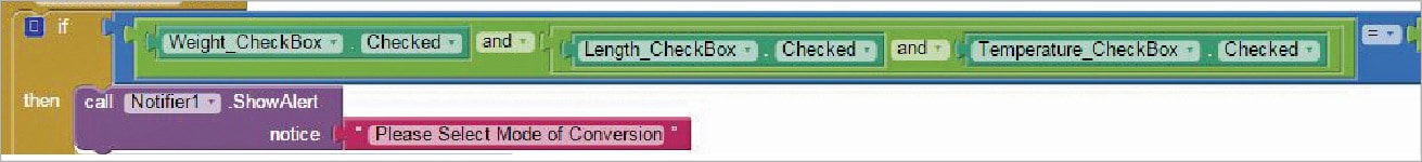
We want the conversion to happen as soon as the button is pressed, but we also need to make sure that the users have provided all the necessary inputs, i.e., they should have selected at least one of the conversion modes, have selected the ‘From’ unit from the first drop down box, provided some input value in the input text box and, finally, given the conversion unit for the ‘To’ drop down box. Listed below are the validations for each case.
- Checking the checkbox status (Figure 8).
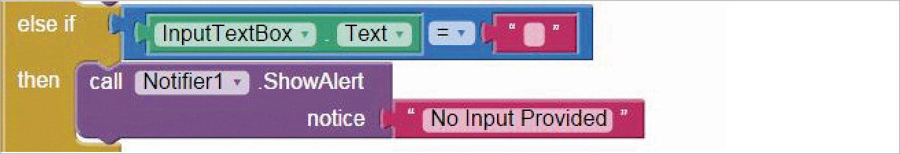
- Further checking whether or not the user has provided some input value (Figure 9).
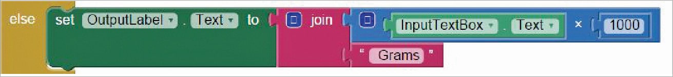
If everything seems okay, the output value should be calculated (Figure 10).
Now we are done with the block editor too. Let us move to downloading and installing the app on the phone to check how it works.
Packaging and testing
To test the app, you need to get it on your phone. First, you have to download it to your computer and then move it to your phone via Bluetooth or USB cable. I’ll tell you how to download it.
1. On the top row, clicking on the ‘Build’ button will show you the option to download the APK to your computer.
2. You can watch the progress of the download and, after it is successfully done, the application will be placed in the Download folder of your directory or the preferred location you have set for it.
3. Now you need to get this APK file to your mobile phone either via Bluetooth or via USB cable. Once you have placed the APK file on your SD card, you need to install it. Follow the on-screen instructions to install it. You might get some notification or warning like, ‘Install from un-trusted source’. Allow this from the Settings and after the successful installation, you will see the icon of your application in the menu of your mobile. This will be the default icon, and I will tell you how it can be changed as we move ahead.
As you can see, we have put in place the logic to convert units of weight. Now you need to think about the logic for the remaining conversions.
I hope your application is working exactly according to the specs you have given. Now, depending upon your usability and customisation requirements, you can change various things like the image, sound and behaviour too.
Debugging the application
We have just created the prototype of the application with very basic functionality, but what else might the user be interested in? There are various use cases that require serious thought so as not to annoy the user. Consider the following use cases:
1. How will you code it to pick the conversion type and then apply the multiplication factor?
2. If there is more than one value in the drop down menu, how will the multiplication factor be decided?
3. What if the user doesn’t select the drop down value and it remains with the default ‘Select’ text?
These are some of the scenarios that might occur and users will be pretty happy seeing these addressed.
Think over all these scenarios— how can you integrate them into the application? Do ask me if you fail to accomplish any of the above use cases.
You have successfully built another useful Android app for yourself. Happy inventing!


