

The demand for machine learning engineers and data scientists has increased exponentially over the years. This is justified because machine learning is being applied in almost every field to solve real world problems. It is expected that worldwide data creation will grow to an enormous 163 zettabytes (ZB) by 2025. This article introduces Orange, a visual programming software package released under the GPL, and focused on components for data visualisation, machine learning, data mining, and analysis of data.
There are very good programming languages like Python and R to acquire the skills required for machine learning engineers and data scientists. But people need to spend a good amount of time learning these programming languages before practising data analysis techniques. Machine learning engineers and data scientists need to apply different visualisation techniques to understand the data, and test different models to get accurate results. In this situation, having a GUI based tool that needs minimum programming can lead to good productivity.
Such tools offer easy to use visual portrayals consisting of components like symbols, menus, tabs, pointers and windows, which permit users to effortlessly analyse data. This article introduces such a free and open source tool called ‘Orange’. It features a visual programming frontend for explorative rapid qualitative data analysis and interactive data visualisation.
Orange is a visual programming software package released under GPL, focused on components for data visualisation, machine learning, data mining, and analysis of data. The developers of Orange at the University of Ljubljana in Slovenia built the core components in C++ with wrappers in Python, which are available on GitHub. Orange is available for Mac, Linux and Windows users.
On Linux it can be installed using the following command:
pip install orange3
Or, if you are using Python provided by the Anaconda distribution, you are almost ready to go. Add conda-forge to the list of channels you can install packages from (from conda config –add channels conda-forge), and run conda install orange3.
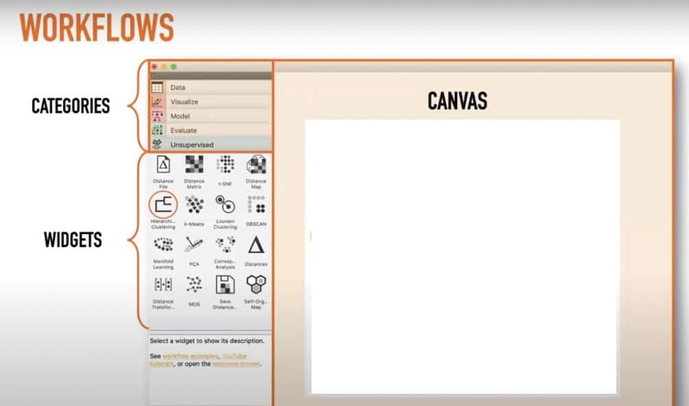
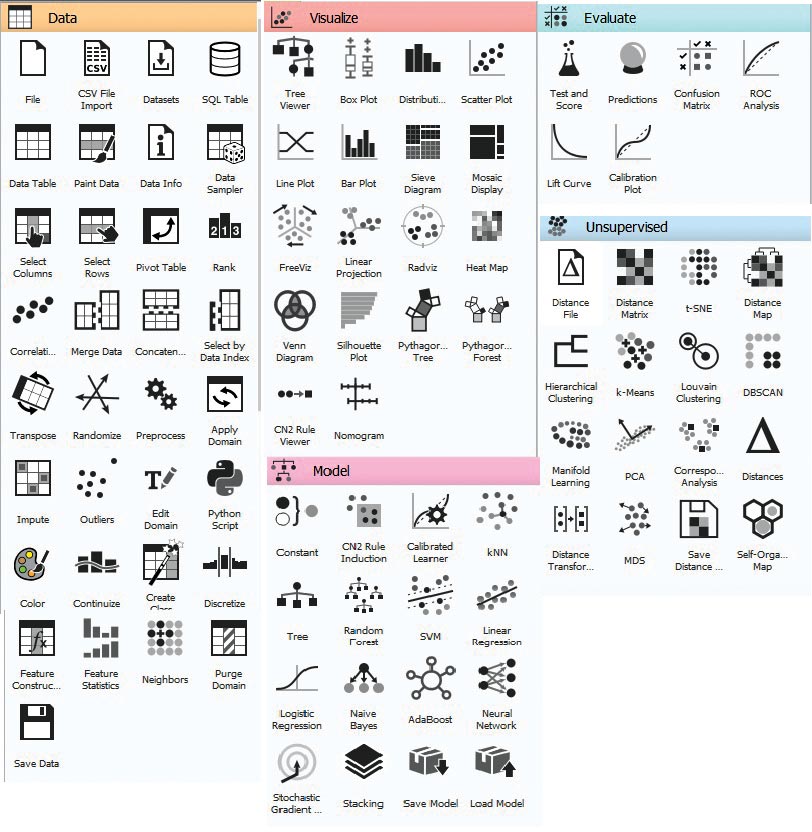
When we open Orange, it offers a very simple and easy to use GUI, as shown in Figure 1.This GUI is divided into three sections, namely, categories, widgets and canvas. By default, Orange 3 comes with five categories called Data, Visualize, Model, Evaluate and Unsupervised — each having different widgets, as shown in Figure 2. To perform any kind of task with Orange, we need to construct a workflow by dragging widgets onto the canvas from the respective categories, and connecting them by drawing a line from the transmitting widget to the receiving widget.
Let’s build a machine learning classifier using Orange. Follow the steps given below.
Step 1: Download the iris flower data set from https://www.kaggle.com/uciml/iris.
Step 2: Load the data set into Orange
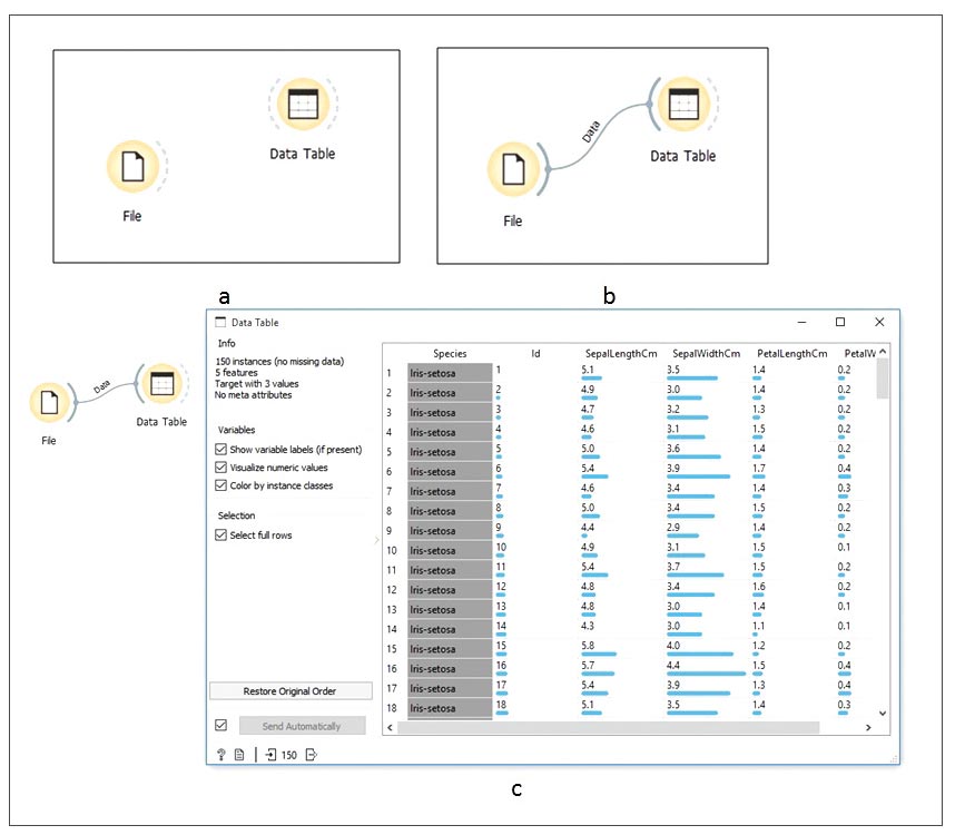
Open Orange, drag the File widget from the Data category, and place it on the canvas. Data category widgets offer multiple options to load the data into Orange. It is not possible to introduce all those options in this article. So we select the most common widget, i.e., the File widget, to load the data as shown in Figure 3a. Now double click the File widget to select and load the downloaded data set, as shown in Figure 3b.
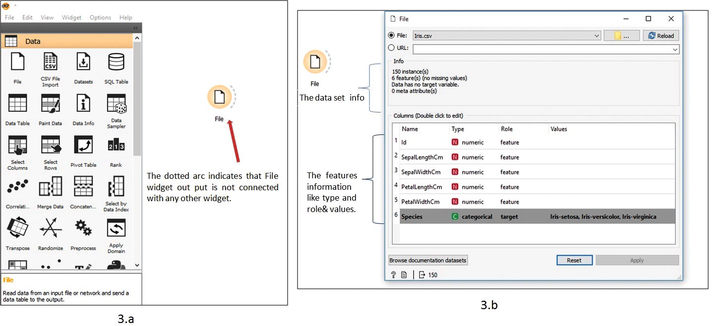
The iris data set contains 150 samples with six features. Any feature can be skipped by clicking on the role and selecting skip. We can make any feature act as a target variable for predictions. Here, we make the feature ‘Species’ a target.
Step 3: Explore the data set with Orange
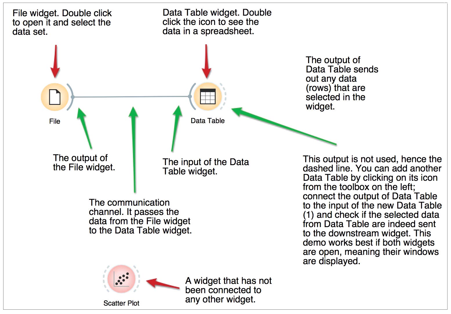
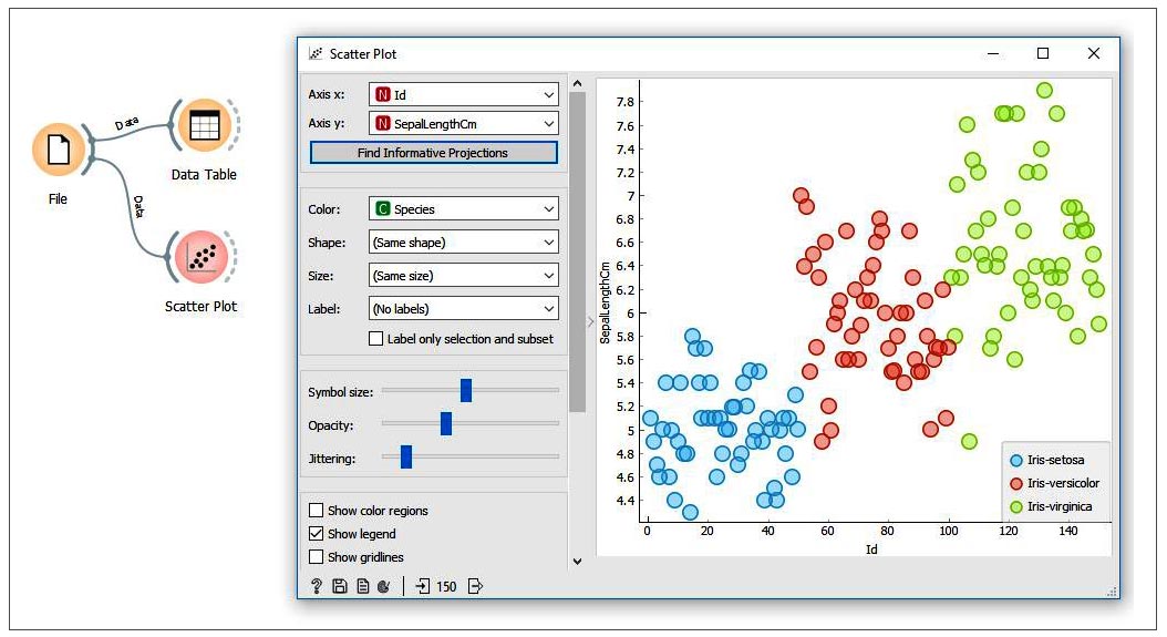
Now select and drag the ‘Data Table’ widget onto the canvas and connect the File widget’s output to the input of ‘Data Table’, as shown in Figure 4. Double click the ‘Data Table’ widget to open the data set in the spreadsheet, as shown in Figure 5. Now to plot the data set, select and drag the ‘Scatter Plot’ widget from the Visualize category, place it on the canvas and connect it with the File widget. Double click on the ‘Scatter Plot’ widget to get the samples plotted on the graph, as shown in Figure 6.
Step 4: Prepare the training set and testing set
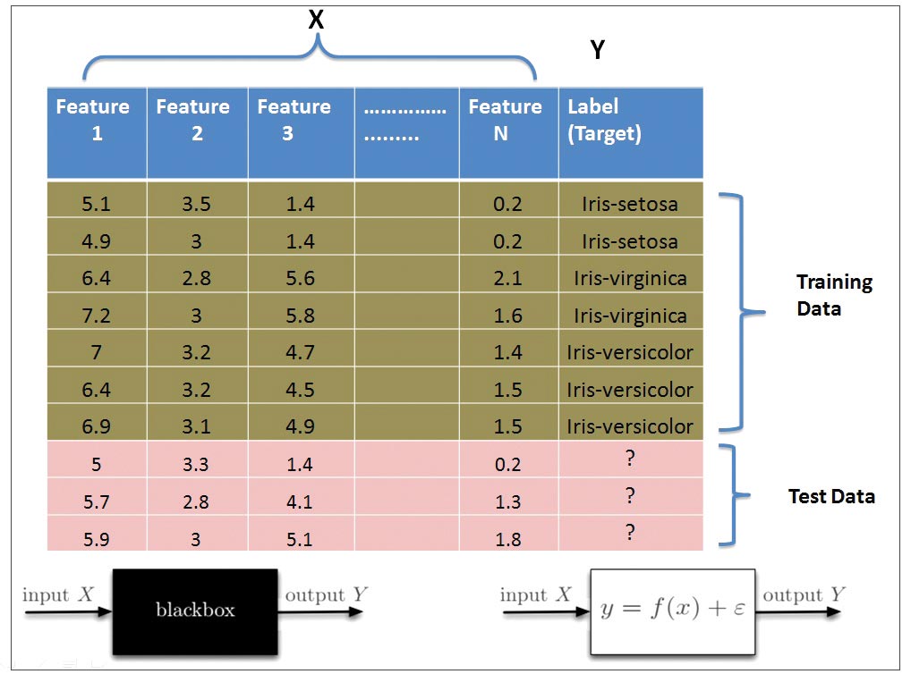
Machine learning classifier takes known samples (training data) and predicts the output for any new unknown sample. At the outset, the machine learning classifier looks like a black box that takes some input sample and predicts the corresponding output label. Mathematically, it approximates the mapping function f:X→Y from the input sample feature’s values to discrete output labels, as shown in Figure 7.
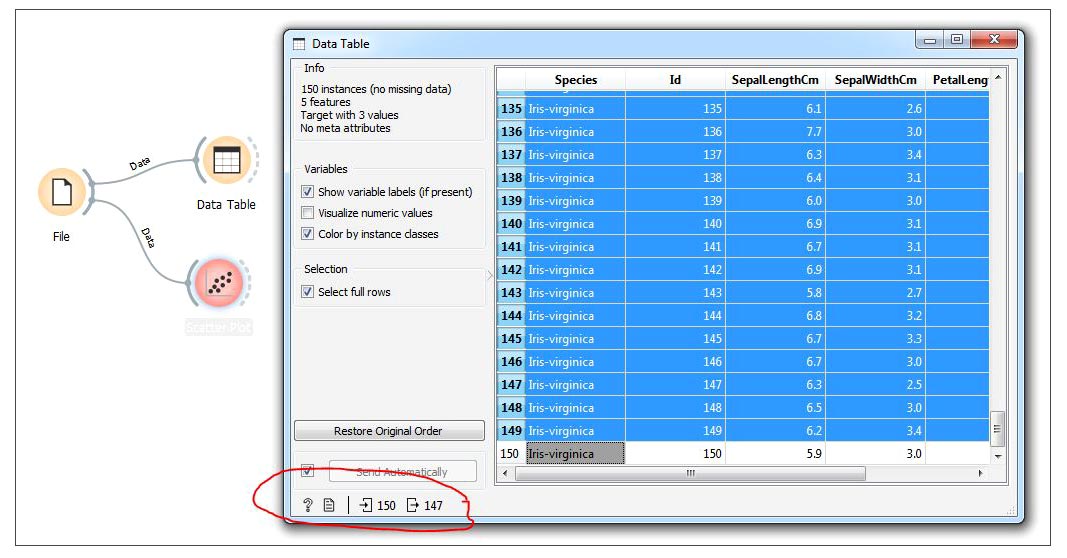
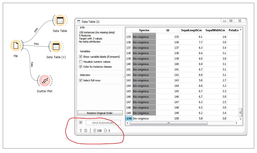
So let’s prepare the training data and test data. Of the 150 samples available in the iris data set, we will take 147 samples as training data and three samples as testing data. Click on the Data Table present on the canvas; 150 samples will be opened in a separate window as a spreadsheet. Now press Ctrl+A to select all the 150 samples. Next, holding the Ctrl button, click on the 50th, 100th and 150th samples to select 147 samples as training data (see Figure 8). Now select and drag another Data Table widget from the Data category to the canvas. Connect the File widget output to Data Table(1)’s input as shown in Figure 9, and click on it. Now 150 samples will be opened as a spreadsheet in a separate window. Holding the Ctrl button on the keyboard, select the 50th row, 100th row and 150th row as shown in Figure 9, to prepare the testing data.
Now select and drag the ‘SVM’ widget from the ‘Model’ category to the canvas. Connect the Data Table output to the SVM widget input arc. To make predictions, select the Predictions widget from the Evaluate category and drag it to the canvas. Connect the SVM widget output arc to the Predictions widget’s input arc. Connect Data Table(1)’s output arc to the input arc of the Predictions widget, as shown in Figure 10. Click on the Predictions widget to check the classifier results, as shown in Figure 10.
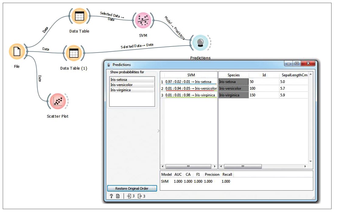
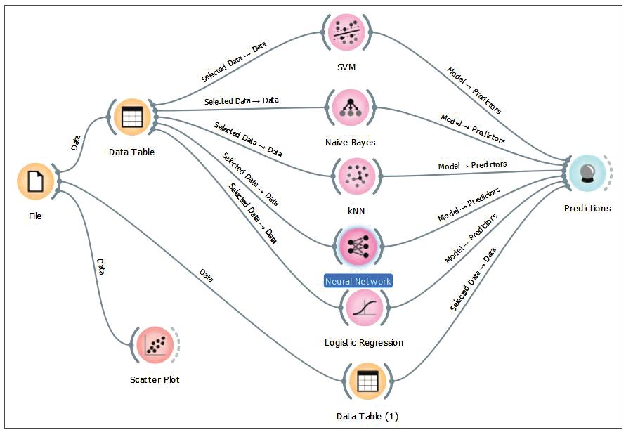
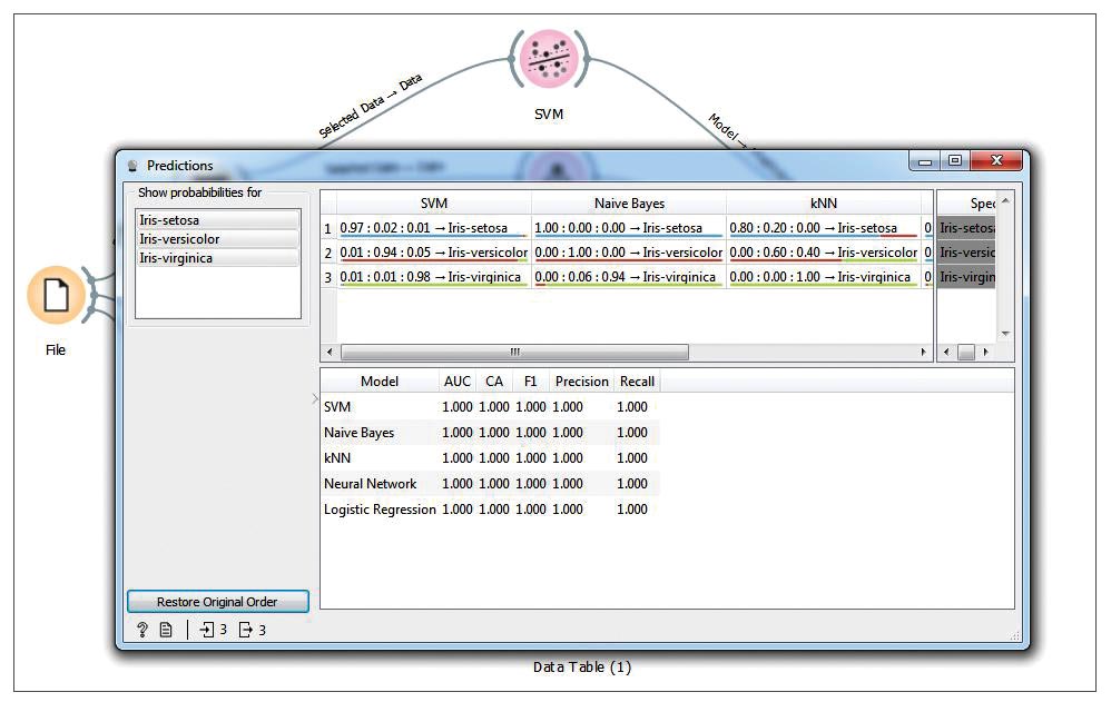
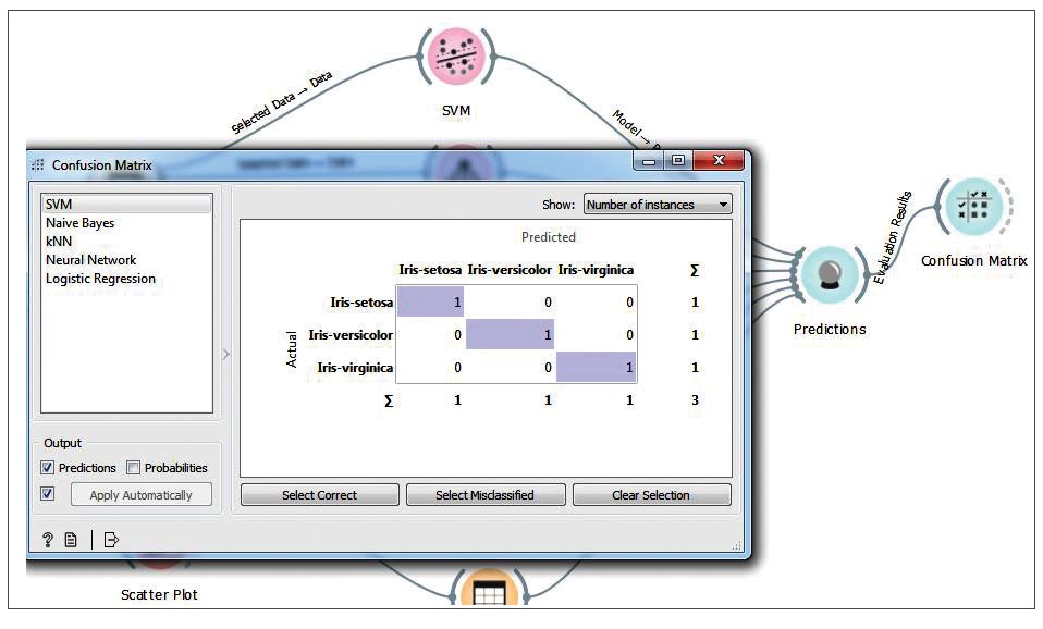
In the results, we check different parameters like classifier accuracy, F1 score, precision, recall, etc. Now connect other classifiers from the Model category, as shown in Figure 11, to make a comparative study (as shown in Figure 12). we can connect the confusion matrix widget from the Evaluate category to the Predictions widget, as shown in Figure 13.
Using the Orange tool you can easily apply different machine learning classifiers on the data set, and make a comparative study to find out the best classifier for the given data set without writing any line of code. Orange can be used for unsupervised learning, image analytics, time series analysis, mining, bioinformatics, etc. For more details, do visit the official documentation and tutorials listed under References below.


