Open source offers a varied range of tools to help interpret data better by visualising it. These tools offer customisation, cost-effectiveness, and community-backed development.
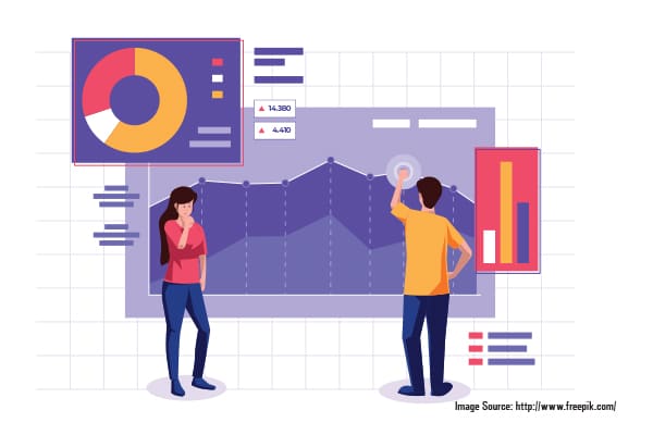
Data visualisation skills matter more than ever in a world where data generation has exploded and decision-makers require fast yet informed choices. A properly designed bar chart delivers information that far exceeds what 100 rows of Excel data can communicate.
Enterprise-grade data visualisation tools no longer require expensive investments. The open source movement has led to the creation of accessible and powerful tools based on community-driven development.
What makes open source stand out is:
- You’re not locked into a vendor’s roadmap.
- The software provides users with complete flexibility to customise their tools according to their needs.
- The software requires no payment from users regardless of their project size.
- Thousands of contributors in the open source community continually work to enhance a platform’s features.
- Open source technology creates equal opportunities for startup data analysts and university researchers who work independently. The tools offer users flexible APIs combined with robust visualisation libraries and expanding ecosystems to create better data stories without requiring expensive investments.
Tools of the trade
Here are the best open source tools that are shaping the future of data visualisation and storytelling—from notebooks to dashboards, and everything in between.
Jupyter Notebooks: Still the data scientist’s best friend
Today, Jupyter Notebooks is the leading development environment for data science. Within a web browser, users can record live coding, visualisations, and narrative text and equations in one document. This flexible format is useful for either collaborative and reproducible analysis working with data exploration or for data communication.
Historically, Jupyter began with support for Python, but now supports R, Julia and SQL, allowing teams across numerous disciplines to use it. It is simple to conduct data analyses, model development, and data visualisation with library dependencies for pandas, seaborn and Matplotlib within the Jupyter Notebook environment.
What is compelling about Jupyter Notebooks is its ability to log the reasoning behind code execution and thinking in the same document. Analysts can document their exploratory analysis thoughts, the reasoning behind their assumptions, and the graphical representation of discovered patterns in public documentation for other team members to follow.
The functionality of Jupyter Notebooks can be expanded with JupyterLab, Voila and nbconvert. Notebooks can be converted into applications, published as reports and dashboards, etc.
Dashboards vs notebooks: Choosing the right tool for the job
| Criteria | Dashboards | Notebooks |
| Primary use | Monitoring KPIs, reporting, executive summaries | Data exploration, analysis, storytelling |
| Target audience | Business users, decision-makers | Data scientists, analysts, researchers |
| User interaction | Interactive filters, drill-downs (GUI-based) | Interactive via code (Python, R, JS) |
| Coding required | Minimal or none | Yes, code-based |
| Visual customisation | Limited to tool’s UI capabilities | Highly customisable using code and libraries |
| Real-time data | Easily supports real-time updates and live data sources | Requires manual or script-based refresh |
| Shareability | Easily shared via web or embedded in portals | Shared as files (e.g., .ipynb) or converted to HTML/PDF |
| Tool examples | Apache Superset, Metabase, Grafana, Power BI | Jupyter, Google Colab, Observable |
| Best suited for | Summarising and presenting insights | Exploring and generating insights |
| Output format | Visual dashboards, web-based interfaces | Notebook files with narrative, code, and output |
Apache Superset: The open source BI alternative
Superset is an open source business intelligence (BI) application that allows users to build interactive dashboards. It excels at providing enterprise-grade features that do not require any licensing fees.
Superset offers two pathways to analyse data. Users can either drag-and-drop objects into their visualisations or they can use the SQL Lab for writing SQL queries. Superset can connect to dozens of databases, such as PostgreSQL, MySQL, Snowflake, and others, including role-based access.
There are many reasons Superset is gaining traction, one of them being that it is able to generate dynamic dashboards, which can serve live data that refreshes automatically and is aesthetically pleasing. Superset can produce a myriad of chart types, i.e., line graphs, pie charts, heatmaps, treemaps, and time-series analysis. Users can utilise filters on dashboards, drill into data, and link charts together.
Metabase: Simple yet powerful dashboarding
Metabase is an open source BI tool designed for simplicity and speed. It is designed so that users, specifically without great technical skill, can ask questions of their data and receive meaningful answers in beautiful visualisations. The display is intuitive, allowing users to either write SQL or utilise a graphical query builder to search databases, filter tables, and create reports.
Metabase connects to multiple data sources such as PostgreSQL, MySQL, MongoDB, BigQuery, and so on. After being connected, it provides instant visualisations with little configuration—ideal for thought-provoking insights or light dashboarding.
The power of Metabase is its accessibility. Fellow team members across departments can schedule reports, create notifications based on alerts, and share live dashboards without asking engineers for help.
While it may not have the deep analytics or customisation features of heavier BI platforms, Metabase is perfect for organisations that want to move fast, answer everyday questions, and reduce dashboard development friction.
Grafana for metrics and monitoring
Grafana has become the de facto platform for visualising metrics, logs, and time-series data in real-time. Grafana was originally a darling of the DevOps and infrastructure monitoring world, but it has grown so popular that it’s now being used in many different industries for diverse tasks such as monitoring server health, visualising environmental sensor data, and much more.
This robust platform integrates with a multitude of data sources ranging from Prometheus to InfluxDB, Elasticsearch, PostgreSQL, and even Google Sheets! Users can create highly customisable dashboards visualising real-time graphs/alerts that can spike or channel a series of events based on specified thresholds. Its array of dynamic querying options and templated dashboards make Grafana an excellent use case for large-scale monitoring solutions.
Grafana is not limited to visualisation; it is powerful in alerting and observability too. Grafana supports multi-channel alerts to streamline how you respond to incidents. There are also several plugins available to add to your experience with unique visualisations, data sources and authentication methods.
Overall, what really makes Grafana stand out is its extensibility and flexibility. It can act as a centralised source for figuring out complex systems, and it keeps things straightforward so that operational data is easily accessible for everyone including engineers and executives.
Plotly and Dash: Building interactive web-based visuals
Plotly and Dash are a powerful combination for developing interactive, web-based data applications. Plotly is the plotting library that can make high-quality plots—everything from simple line and bar charts to complex 3D graphs and choropleth maps. It’s flexible and works not only in Python but also in R and JavaScript too. It is widely appreciated for its aesthetics and interactivity.
Dash is based on Plotly and gives developers the ability to build full-fledged data applications in Python. Setting up controls such as buttons, sliders, and dropdowns, and linking them to your visualisations is incredibly easy! It allows quick prototyping of dashboards, modelling tools, and applications in the analytics space. What distinguishes Dash from notebooks or static reports is that it is easy to interact with even if a user doesn’t have a technical background. Furthermore, Dash supports authentication, theming, and access to deployment options such as Flask and Docker.
Polars + Jupyter: High-speed DataFrames meet visualisation
As datasets keep growing, pandas can reach limits. Enter Polars, a lightning-fast DataFrame library, built in Rust and made for heavy lifting of data. If you pair it with Jupyter, Polars can preserve that exploratory experience, while enhancing performance when it counts (10x faster), especially on multi-core machines.
Polars emphasises lazy evaluation (you won’t execute anything until you are ready), memory efficiency, and parallelism by default. It can be used for very large CSVs, time series data, or streaming logs that would either overwhelm or crash pandas (and Python).
Although Polars is very fast, it uses a syntax that feels familiar to pandas users, which also helps learn Polars. When analysts use it with Jupyter, they can issue rapid queries, create visualisations in Plotly or seaborn, and iterate quickly on very large data.
In summary, Polars provides a Jupyter experience with the best of both worlds — a fast backend, and an effective and interactive caching frontend for analysis and story-telling. It is quickly becoming an analyst and data engineer’s choice when performance is the priority.
Top open source libraries for plotting in Python, R, and JavaScript
| Language | Library | Best for |
| Python | Matplotlib | Static, detailed scientific plots |
| Seaborn | Statistical charts and aesthetics | |
| Plotly | Interactive dashboards and notebooks | |
| Altair | Declarative, concise syntax | |
| R | ggplot2 | Grammar of graphics, elegant plots |
| Plotly R API | Interactive visuals for Shiny apps | |
| Lattice | Multivariate plots, conditioning | |
| JavaScript | D3.js | Web-first, highly customisable visuals |
| Chart.js | Quick charts for web dashboards | |
| Vega-Lite | Simpler, declarative syntax for the web |
Troubleshooting common visualisation pitfalls
| Pitfall | Fix |
| Cluttered visuals | Remove gridlines, reduce chart ink |
| Too many colours or labels | Stick to a colour palette and label key items |
| Misleading axis scales | Use zero-baselines for bar/line charts |
| Inconsistent units or timeframes | Normalise data before comparing |
| Ambiguous legends or titles | Use descriptive labels and chart titles |
Free public datasets to practice your skills
| Source | What you’ll find |
| Kaggle datasets | Crowdsourced, beginner to advanced datasets |
| data.gov.in | Indian government datasets, health, education |
| UCI ML repository | Classic academic datasets for ML and EDA |
| FiveThirtyEight | Journalism-ready CSVs with context |
| Google Dataset Search | Searchable index of open data |
Hands-on projects: A few examples
The following hands-on projects mix storytelling with technology. These examples illustrate how open source tools can transform raw data into engaging narratives.
Visualising IPL stats using Python and Matplotlib
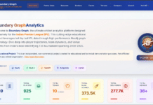
Cricket is a sport that lends itself easily to data, especially when we talk about the IPL (Indian Premier League). This data project with Python, pandas and Matplotlib can help explore player performance, team wins, and matches using datasets from the IPL. First, we need to clean the IPL CSV data and then use groupby functions and pivot tables to summarise and report statistics (for example, total runs, strike rates, and wickets). After the data is summarised, Matplotlib and seaborn can be used to visualise it using colourful bar plots, pie charts and line graphs. You can track Virat Kohli’s run totals over seasons, and identify which teams are better at chasing runs. This project helps with data wrangling and visualising data in a sport that has millions of fans.
Real-time IoT sensor data with Grafana and InfluxDB
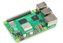
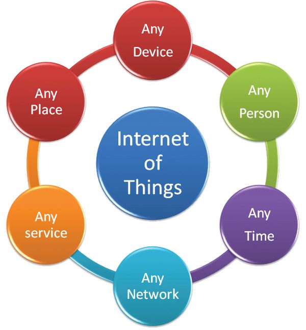
IoT devices generate a lot of data—typically, time series data for things like temperature, humidity, motion, or CO₂ levels. In this project, we can collect sensor data using a Raspberry Pi or simulate the inputs, send it over to InfluxDB (a time series database), and visualise all of it in Grafana. InfluxDB can be used to set things up, configure measurement tags, and send sensor data using either Python or the HTTP API. After getting something set up in InfluxDB, some of the cool visualisations in Grafana can be used to create dashboards that visualise real-time data with live updating graphs, colour thresholds, and alert notifications. This practical setup can have a wide range of applications — from smart home dashboards and environmental monitoring to industrial IoT applications.
From CSV to storyboard: A notebook-first approach
Believe it or not, some of the most interesting stories come out of spreadsheets. In this project, we can begin with a raw CSV file (could be from the government or customer feedback) and go through each phase: loading, cleaning, exploring, visualising, and finally, documenting our findings. The goal is to take our notebook and create a short story (report) that combines code, visuals, and clear language—a powerful tool for internal presentations or your blog.
Learning path: Becoming a data visualisation pro
Want to delve into creating jaw-dropping plots, dashboards, and data stories that really connect with people? Begin with basic plotting. Become comfortable plotting bar charts, line graphs, or pie charts in Excel, seaborn, or ggplot2. Get accustomed to the principles of scales, colour theory, and where each chart fits best. While fully grasping interactiveness and storytelling may be still a bit beyond you, tools like Plotly, Altair, or Streamlit should be where you practice how raw data insights can turn into engaging visual experiences. Build a dashboard that lets people explore trends through filters, sliders, or search boxes. For the real deal, go real-time with Dash, Grafana, or D3.js and learn chart animations, handling of user input, and connecting to live databases or APIs. Of course, document your projects! Share on GitHub, publish via Streamlit Cloud, or embed within your blog posts. Nothing would impress your future employers or clients more than well-documented, interactive showcases of your work.


