


The hunt for data visualisation tools that can present huge data sets on Web based platforms can be tedious, since a number of software frameworks and tools are available for plotting data and for dynamic graph generation. In this article, we will cover the free and open source resources that can be used for the visualisation of big data sets.
The libraries and toolkits discussed in this article can be used for rendering dynamic plots on desktop, mobile and Web based platforms so that a quick summary of results can be presented. These tools can be used by data scientists and researchers for an effective analysis of dynamic data.
Key features of plotting libraries
The key features and characteristics that are generally required for the tasks associated with data science, analytics and knowledge discovery, and are directly related to effective visualisation and plotting are:
- Free and open source without any licensing issues
- Programmer-friendly drag and drop editor
- Support for assorted Web standards
- Animated charts and plots for better analysis of data
- Integrated wizards and templates
- Data imports from multiple sources
- Integration of application programmer interfaces (APIs) to third party channels
- Responsive outputs
- Multi-colour plots with multiple dimensional views
Use cases and features for Web applications
The real-world scenarios of desktop and Web based applications need different types of visual components so that the application can be built with a user-friendly interface. To develop such applications with high performance and better understanding, there is a need to integrate the visualisation and plotting modules.
A few scenarios and use cases where the need comes up for plotting, visualisation and dynamic graphs in software applications are:
- Real-time maps and street views for mobile app based delivery systems (examples are Zomato, Swiggy, Uber Eats, Amazon, etc)
- Dynamic graphs and plots for predictions (examples are the stock market, health services, e-governance, commodity prices, and weather forecasting)
- Knowledge discovery and predictive mining (examples are machine learning algorithms and time series)
- A few popular, free, open source and online libraries for graphical representations and visualisations are listed below.
- They are quite powerful and widely used for Web based applications and multi-dimensional views of data. These platforms can be used to view, analyse, and evaluate big as well as massive data sets.
Candela
URL: https://candela.readthedocs.io/en/latest/index.html
Candela is certainly one of the best free and open source data visualisation packages. It can be integrated into the data science tasks for visualisation using multiple programming interfaces, including JavaScript, Python and R. Candela supports assorted plots and graphical segments, including BoxPlot, BarChart, GanttChart, Geo, Histogram, GLO (Graph-Level Operations), GeoDots, LineUp, LineChart, TreeHeatmap, OnSet, ScatterPlotMatrix, ScatterPlot, SentenTree, SimilarityGraph, and UpSet, using which easily understandable plots can be generated.
Charted
URL: https://github.com/charted-co
Charted is an open source tool that plots data on multiple axes and requirements as per the tasks associated with data analytics. This tool is very popular and is being used in data processing for high-performance data science projects. Charted currently supports multiple file formats, including comma separated values (CSVs) and tab separated values (TSVs), as many real-world data sets are in these formats.
D3.js
URL: https://d3js.org/
D3.js is a free and open source JavaScript library distribution that is used to manage data of multiple dimensions — even big data sets can be plotted. The library supports data visualisation through Web based standards, including HTML, SVG and CSS. The key goal of this platform is to provide the maximum capability of the current browser, including strong viewing components and an approach focused on the Document Object Model (DOM) without a proprietary system.
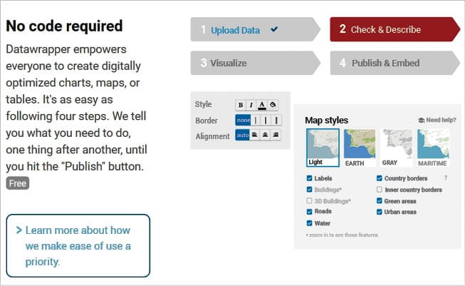
Datawrapper
URL: https://www.datawrapper.de/
Datawrapper is an open source data visualisation tool for anyone to create easy, realistic and embeddable charts quickly. This platform is available in both free and premium versions. The free version of Datawrapper is very powerful, and has a huge number of features.
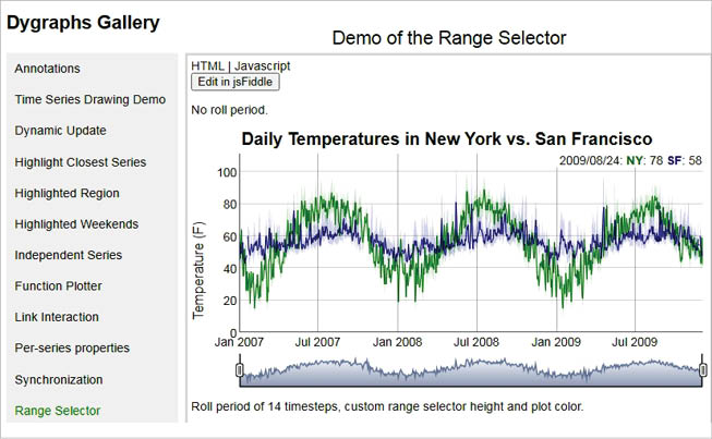
Dygraphs
URL: http://dygraphs.com/
Dygraphs is a flexible and fast library written in JavaScript and is friendly with assorted Web browsers. The charts and plots can be generated with a high resolution. On mouseover on the individual points of graphs, the values and data points can be analysed, which is useful for data analytics and knowledge discovery.
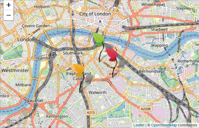
Leaflet
URL: http://leafletjs.com/
The Leaflet library is built to be quick, powerful, and user-friendly for data scientists and researchers. It runs easily across all major desktop and mobile platforms, and can be expanded with several plugins. It has a powerful, easy-to-use, and well-documented API and easy-to-read source code so that advanced data science applications can be worked out. The Leaflet is an open source and collaborative charts library written in JavaScript. It is also very lightweight for the deployment of real-world applications, and operates effectively on computer, mobile and tablet devices. The APIs and functions of Leaflet are quite powerful and efficient for smart graphics and geometrical renderings with a modular architectural framework for high performance.
A number of dynamic graphs and maps can be generated by Leaflet with the OpenStreetView, so that real-time locations and positions can be plotted on different types of display devices.
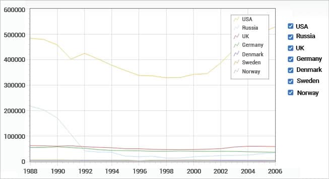
Flot
URL: http://www.flotcharts.org/
Flot is a plotting library developed with the integration of jQuery and JavaScript to focus on the generation of high performance and interactive plots. It is compatible with multiple Web browsers, including Internet Explorer 6+, Firefox 2+, Chrome, Safari 3+, and Opera 9.5+, and has an enormous set of features to display and analyse the graphs.
Dynamic graphs that have powerful features like panning, zooming, redraw, tick labels, log scales, etc, can be generated using FlotCharts.
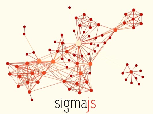
Sigma.js
URL: http://sigmajs.org/
Sigma is a free and open source JavaScript based library for the drawing of graphs, networks and dynamic plots. It can be downloaded from https://github.com/jacomyal/sigma.js/ releases. It allows networks to be published on websites, and lets developers integrate network searching into rich Web applications.
Sigma works as a rendering engine in which the data sets can be linked, and real-time graphs and networks can be plotted for multiple applications, including social network analysis, wireless networks, street maps, and many others.


