


Reduction of dimensionality is one of the important processes in machine learning and deep learning. It involves the transformation of input data from high dimensional space to low dimensional space, and retaining meaningful information from the initial input data. Let’s look at how this is done.
data arising out of supervised learning is in the form of attributes and labels. Attributes are independent variables with which we must predict the labels or dependent variables. They are called inputs, predictors, features or independent variables. Labels are called outputs, targets, outcomes or dependent variables. If the labels are categorical, the problem becomes a classification problem, and if they are numerical it becomes a regression problem. The number of input variables is called the dimensionality of the input data.
The need for reduction of dimensionality
The storage space for the input variables is reduced with reduction in dimensionality. This improves the performance of the model. When the number of input variables is more, the computation also increases a lot. In the input data, there may be many features that are correlated while some features may be redundant. The techniques of dimensionality reduction remove the redundant features. They take care of removing the multicollinearity between the features. They also help clustering of the data and make it easier to visualise it in lesser dimensions.
So, apart from speeding up the training time, the reduction of dimensionality helps in data visualisation. Plotting the high dimensional training set on a graph, by reducing it to around two or three dimensions, allows one to gain a few significant insights by data visualisation. This enables observation of patterns and clusters in data.
As the number of dimensions in the data increases, the machine learning problems become more difficult to solve. This particular problem is called curse of dimensionality. As the number of dimensions increase in the training data, the machine learning problem requires a greater number of training examples to generalise the problem. There are many techniques available in machine learning, which allow one to handle the curse of dimensionality and reduce computing costs.
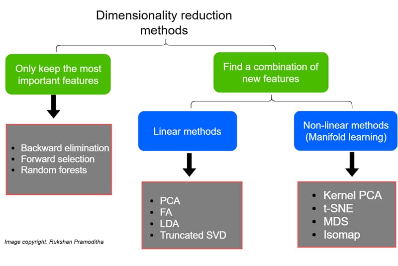
Dimensionality reduction techniques
The various dimensionality reduction techniques available in machine learning can be classified based on how they handle the number of features and the methods they use. Figure 1 gives the different techniques of dimensionality reduction and their classification. These techniques are divided into linear methods and non-linear methods. Linear methods transform the data into linear dimensions. Principle component analysis (PCA), linear discriminant analysis (LDA), non-negative matrix and factorisation are some of the linear methods. Kernel PCA, t-distributed stochastic neighbour embedding (t-SNE), and uniform manifold approximation and projection (UMAP ) are some of the non-linear methods. To get a basic understanding of these methods, PCA, LDA, t-SNE and Kernel PCA are briefly described here with an example and a corresponding code snippet.
Principal component analysis (PCA)
PCA performs orthogonal transformation of the data such that the correlation between the data is minimised or zero, and the variance is maximised. The basis of the transformation is computation of Eigen values for the data.
The principal components are formed by the following rules:
- The translations are performed such that the centre of the data passes through the origin.
- The rotation is done such that the variance is maximised.
Singular value decomposition is used to find the principal components. These components are orthogonal to each other. Principal components are a linear combination of the original attributes.
Let’s take an example of PCA with the wine data set from the scikit-learn library. Load the wine data set from sklearn:
from sklearn.datasets import load_wine
data = load_wine()
Scale the data so that the data is normalised:
From sklearn.preprocessing import StandarScaler
import pandas as pa
features = [‘Alcohol’, ‘Malic acid’, ‘Ash’, Alcalinity of ash’, ‘Magnesium’, ‘Total phenols’,
                  ‘Flavanoids’, ‘NonFlavanoid phenols’, Proanthocyanins’, ‘Color intensity’, ‘Hue’,
                 ‘00280/0D315 of diluted wines’, ‘Proline’]

#Separating out the features
x = pd.DataFrame(data.data)
# Separating out the target
y = pd.DataFrame(data.target.columns = [‘target’])

# Standardizing the features
x = StandardScaler().fit_transform(x)
Perform PCA as follows:
from sklearn.decomposition import PCA
pca = PCA(n_Components=2)
principalComponents = pca.fit_transform(x)
principalDf = pd.DataFrame(data = principalComponents
, columns = [‘principal component 1’, ‘principal component 2’])
Visualise the data with the plots:
finalDF = pd.concat([principalDF, y], axis = 1)
finalDf.head()

fig = pyplot.figure(figsize = (7,7))
ax = fig.add_subplot(1,1,1)
ax.set_xlabel(‘Principal Component 1’, fontsize = 15)
ax.set_title(‘2 component PCA’, fontsize = 20)
targets = [0, 1, 2]
colors = [‘r’, ‘g’, ‘b’]
for target, color in zip(targets, colors)
indicesToKeep = finalDf[‘target’] == target
ax.scatter(finalDf.loc[indicesToKeep, ‘principal component 1’]
, finalDf.loc[indicesTokeep, ‘principal component 2’]
, c = color
, s = 50
ax.legend(targets)
ax.grid()
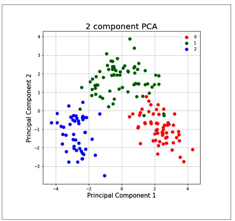
As the PCA reduces the correlation between the principal components, it removes the correlated variables. This helps in computing costs and sometimes improves the performance of algorithms. It also reduces over-fitting and improves visualisation.
We have used a standard scaler before performing the PCA. This is a must before applying PCA, as it cannot find the proper principal components if the data set is not standardised. There will be some information loss if the number of principal components selected is less than the number of features, and that can compromise the computing costs and performance of the algorithm.
Applications of PCA: PCA has applications other than dimensionality reduction, such as:
- Image compression
- Facial recognition — it is the heart of the Eigen faces algorithm for facial recognition
- Clustering of data
- Anomaly detection
Linear discriminant analysis (LDA)
Linear discriminant analysis is another dimensionality reduction technique and can be applied only on labelled data. Hence, it is also a supervised dimensionality reduction technique. It concentrates on maximising the separability among classes in the training data.
LDA follows the rules given below for projecting the data sets on the new axis:
- It maximises the distance between the means across the samples of classes.
- It minimises the scatter among the samples of one class.
LDA creates a new axis such that the value ( µ¹ – µ² )2 / ( s1² + s2² ) is maximum, where µ¹ and µ¹ are the means of the category, while s1 and s2 are the standard deviations of the category.
Let’s take the same example of the wine data set from the sklearn package and apply LDA:
from sklearn.discriminant_analysis import LinearDiscriminantAnalys1s as LDA
lda = LDA(n_components=Z) #2-dimensional LDA
lda_transformed = pd.DataFrame(lda,fit_transform(x, data target))
# Plot all three series
pyplot.scatter(lda_transformed[data.target==0][0], lda_transformed[data target==B][1], label= ‘Class 1’ , c= ‘red’
pyplot.scatter(1da_transformed[data.target==1][B], lda_transformed[data target==1][1]_, label= ‘Class 2’ = ‘blue’
pyplot.scatter(lda_transformed[data.target==2][B], lda_transformed[data target==2][1], label= ‘Class 3’= ‘lighttgreen’ )
# Display Legend and show plot
pyplot.title(‘2 component LDA’, fontsize = 15)
pyplot.xlabel(‘LD component l’, fontsize = 15)
pyplot.y1abel(‘LD component 2’, fontsize = 15)
pyplot.legend(loc=3)
pyplot.show()
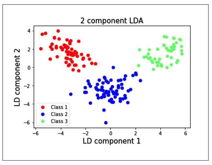
We see from the plot that the individual classes are separated from each other using LDA rather than PCA. This is because the LDA maximises the separation between the classes, whereas PCA creates the components such that the variances of the samples are maximised. PCA is an unsupervised learning algorithm, whereas LDA is a supervised learning algorithm.
Applications of LDA: LDA can be used for classification problems. It can be used to predict which class the new sample belongs to. For example, if you have attributes for classifying a disease, then we can classify a new sample to check if it belongs to the disease. LDA can also be used for pattern recognition — for example, for detecting an object like a door, tyre, etc.
The t-distributed stochastic neighbour embedding (t-SNE)
The t-distributed stochastic neighbour embedding (t-SNE) is an unsupervised non-linear technique developed by Laurens van der Maaten and Geoffrey Hinton in 2008, which can be used for exploring high dimensional data. It does dimensionality reduction for data visualisation. t-SNE not only captures the local structure of the higher dimension but also preserves the global structures of the data such as clusters. The t-SNE is based on the stochastic neighbour embedding algorithm (SNE) and is an improvement on the latter.
Let us understand the SNE algorithm in brief. Let us assume there are sets of data points in higher dimensions, which need to be mapped to lower dimensions while preserving the neighbourhood structure of the data set. The conditional probability for two points xi and xj in the higher dimension is given by:
P(j|i) = exp (−||xi − xj ||2 / 2σ2 ) / ∑ k != i exp (−||xi − xk ||2/2σ2 )
…where σ 2 is the variance of the Gaussian distribution centred on datapoint xi. The main idea behind the SNE algorithm is that two data points xi and xj, which are neighbours, will be close if Pji is high and will be separate if Pji is almost zero.
In the lower dimension, the conditional probability for the same two points yi and yj is given by:
Q(j|i) = exp (−||yi − yj ||2 ) / ∑ k != i exp (−||yi − yk ||2 )
…where σ2 is set to some constant like 1/√2 to model the similarity of points yi and yj.
So, these two probabilities have to be equal to allow the similarities of data points in both the high and low dimensions. SNE achieves this by minimising the difference between these two distributions. But when the Gaussian distribution is used in SNE, there is a problem called the crowding problem. That is, if the data set has a huge number of data points that are closer in the higher dimension, then it tries to crowd them in a lower dimension. To solve this problem, the Student-t distribution was used instead of Gaussian distribution for a lower dimension, and hence the name t-SNE for this technique.
To achieve the similarities between the data points in the higher and lower dimensions using these two distributions, t-SNE uses the Kullback-Liebler (KL) divergence.
For two discrete distributions P and Q, KL divergence (DKL) is given by:
DKL(P || Q) = ΣiPi (Pi / Qi)
The t-SNE defines a cost function based on the difference between P(j|i) and Q(j|i), which is given by:
C = Σi Σj (P(j|i) log(P(j|i) / Q(j|i)))
The algorithm uses the gradient update to minimise the cost function, so that the distributions in the higher and lower dimensions become similar.
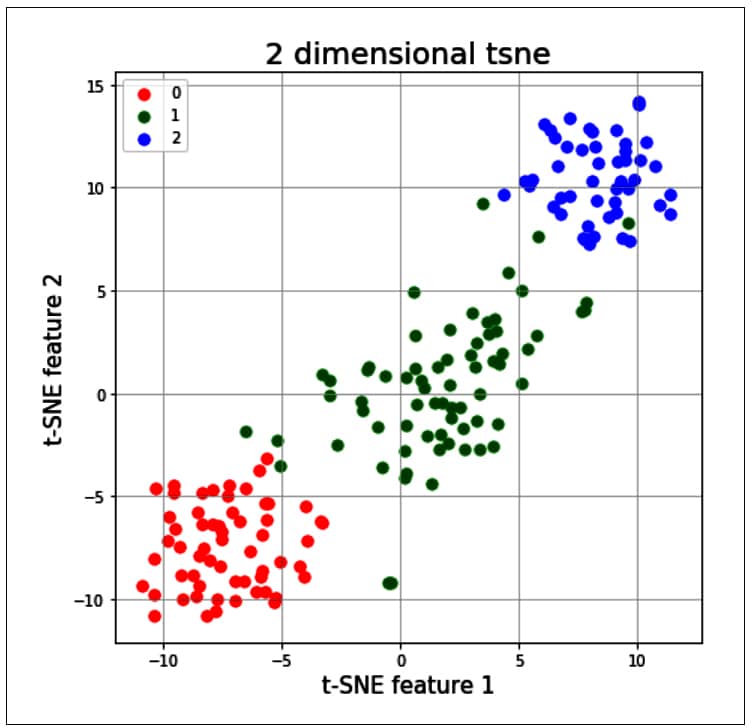
Let us now try to apply t-SNE to the wine data, as done earlier for PCA and LDA:
from sklearn.manifold import TSNE
tsne = T5NE(random_state=2l)
# use fit_transform instead of fit, as TSNE has no transform method
trainX_tsne = tsne.fit_transform(x)
#print(len(trainX_tsne))
tsDf = pd.DataFrame(data = trainX_tsne
, columns = [‘t-SNE feature 1’, ‘t-SNE feature 2’]}
tsneDf = pd.concat([tsDf, y], axis = 1)

fig = pyplot.figure(figsize = (7,7))
ax = fig.add_subplot(l,1,1)
ax.set_xlabel(‘t-SNE feature 1’ , fontslze = 15)
ax.set_ylabel(‘t-SNE feature 2’, fontslze = 15)
ax.set_title(‘2 dimensional tsne , fontslze = 20)
targets = [0,1,2]
colors = [‘r’, ‘g’, ‘b’]
for target, color in zip(targets,colors)
	indicesToKeep = tsneDf[‘target ‘] == target
	ax.scatter(tsneDf.loc[1nd1cesToKeep, ‘t-SNE feature 1’ ]
		, tsneDf.loc[1nd1cesToKeep, t-SNE feature 2 ]
		, c = color
		, s = 50
ax.legend(targets)
ax.grid()
The t-SNE technique is significantly useful when the number of input features is more — for example, as in the MNIST data set, in which each input sample is an image of size 28 x 28 pixels. So, each sample has around 784 features, and it will be very difficult to visualise the patterns of all 10 digits by using traditional clustering techniques. Given below is the code sample in which the t-SNE method is applied; it allows a user to visualise the data and its patterns in a very simple way:
import numpy as np
import pandas as pd
import seaborn as sns
import matplotlib.pyplot as plt
from sklearn.preprocessing import StandardScaler
from sklearn.manifold import TSNE

from keras.datasets import mnist

(train_X,train_y),(test_X,test_y)=mnist.load_data()

x_train = train_X[:1000]
y_train = train_y[:1000]
print(x_train.shape)
(1000, 28, 28)

x_mnist = np.reshape(x_train, [x_train.shape[0], x_train.shape[1]*x_train.shape[2]])
print(x_mnist.shape)
(1000, 784)

tsne = TSNE(n_components=2, verbose=1, random_state=123)
k = tsne.fit_transform(x_mnist)
dfmnist = pd.DataFrame()
dfmnist[“y”] = y_train
dfmnist[“dimension-1”] = k[:,0]
dfmnist[“dimension-2”] = k[:,1]
sns.scatterplot(x=”dimension-1”, y=”dimension-2”, hue=dfmnis5t.y.tolist(),
                palette=sns.color_palette(“Set2”, 10),
                data=dfmnis5t).set(title=”MNIST data T-SNE projection”)
plt.show()
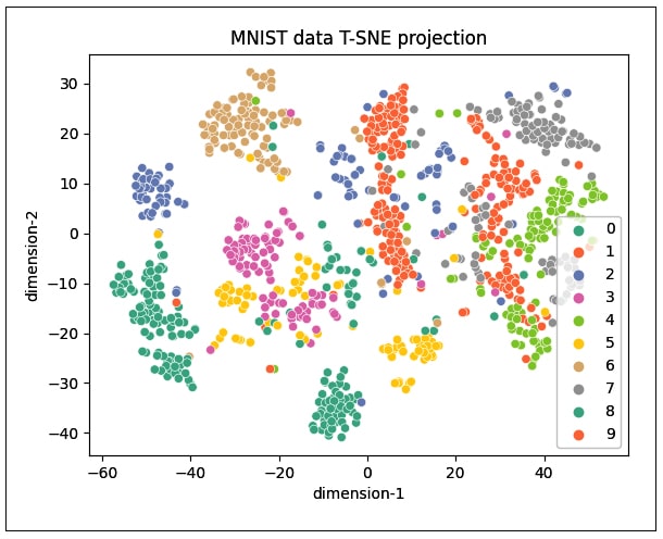
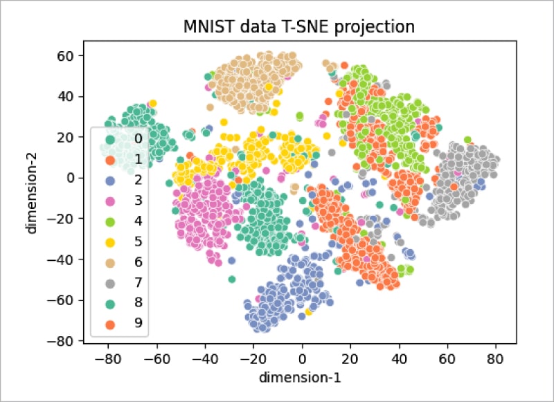
As can be seen, the distribution does not cluster better with 1000 samples (Figure 5), but increasing the number of samples to 3000 gives the plot shown in Figure 6. It can be seen that the clustering of data points is better visualised in this plot.
Kernel PCA
This method can be applied to data sets that are non-linearly separable, as the PCA method works only on linearly separable data. Kernel PCA separates the non-linear samples in the data set by projecting them into the higher dimensional space. It uses a kernel function to transform dimensions of the original data set into a higher dimensional space where the samples are linearly separable. Post that, the PCA method can be applied on the transformed data to generate the Eigen vectors and Eigen values to perform dimensionality reduction.
While the kernel function transforms the original dimensions into the higher dimensional space, the samples in the original dimensions increase the number of variables in higher dimensions and hence increase the computational complexity of the problem. This problem can be solved by using the kernel trick, which helps to generate the kernel matrix in lesser variables compared to the number of variables if these are directly transformed to a higher dimensional space. A commonly used kernel trick is the Gaussian kernel or polynomial kernel. The kernel trick is similar to the one used in support vector machines.
The code sample given below illustrates how PCA fails to separate the non-linear data and Kernel PCA succeeds in separating it. The sklearn methods used earlier are applied on the standard moons data set to illustrate this:
from sklearn.decomposition import KernelPCA
from sklearn.decomposition import PCA
import matplotlib.pyplot as plt
from sklearn.datasets import make_moons

train_X, train_y = make_moons(n_samples = 500, noise = 0.03, random_state = 510)

plt.scatter(train_X[:, 0], train_X[:, 1], c = train_y*10)
plt.show()
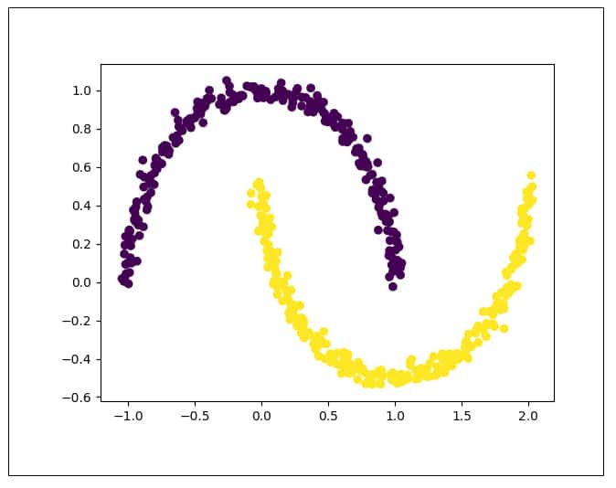
Figure 7 shows the distribution of the original moons data set. It can be seen that the data is non-linearly separable. Now let us try to apply PCA on this data:
moon_pca = PCA(n_components = 2)
X_pca = moon_pca.fit_transform(train_X)

plt.title(“Moon PCA”)
plt.scatter(X_pca[:, 0], X_pca[:, 1], c = train_y*10)
#plt.scatter(X_pca[:, 0], X_pca[:, 1], color=”#88c999”)
plt.xlabel(“PCA Component 1”)
plt.ylabel(“PCA Component 2”)
plt.show()
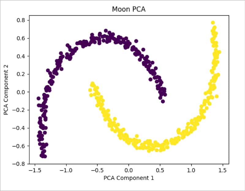
Figure 8 shows the distribution of data after applying PCA. It can be seen that data is still not separable and needs transformation. Let us now apply the Kernel PCA method from sklearn and check the results:
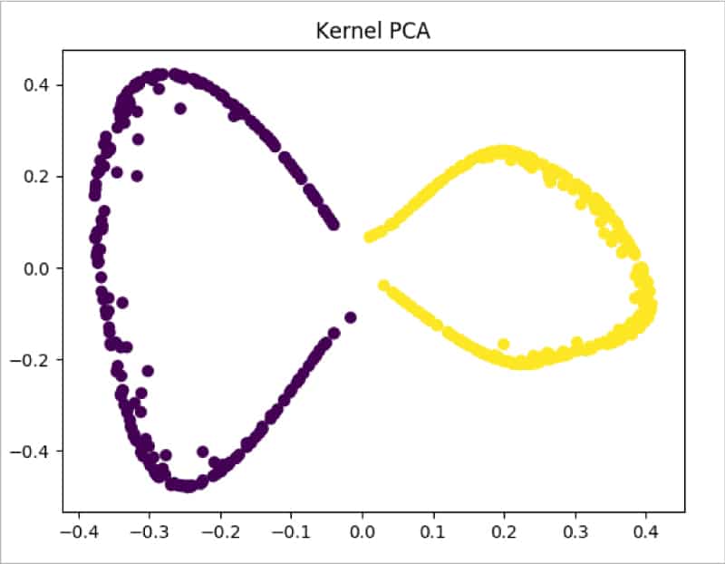
moon_kpca = KernelPCA(kernel =’rbf’, gamma = 15)
X_kpca = moon_kpca.fit_transform(train_X)

plt.title(“Kernel PCA”)
plt.scatter(X_kpca[:, 0], X_kpca[:, 1], c = train_y*10)
plt.show()
From Figure 9 it is clearly visible that Kernel PCA is able to successfully make the data separable.
To sum up, dimensionality reduction techniques are used to solve the problem of curse of dimensionality. Each method has its own advantages, and can be used based on the characteristics of the data samples, like being linearly separable or being non-linearly separable. Most of the dimensionality reduction techniques are readily available in the sklearn library package, and can be applied and visualised. By reducing the dimensions of original data, these techniques reduce computing costs, improve performance and enable insights into data.


